


 本文介绍了HTML5的弹性布局,包括基本概念、方向、使用方法及父容器和子项目的属性设置,帮助开发者掌握弹性布局在网页设计中的应用。
弹性布局说明
弹性布局,又称“flex布局”,是由W3C老大哥于2009年瑞出的一种布局方式。可以简便、完整、响应式地实现各种页面布局。而且已经得到所有主流浏览器的支持,我们可以放心大胆的使用。
弹性布局的基本概念
1、容器:需要添加弹性布局的父元素;
2、项目:弹性布局容器中的每一个子元素,称为项目;
弹性布局的基本方向
1、主轴:在弹性布局中,我们会通过属性规定水平/垂直方向为主轴;
2、交叉轴:与主轴垂直的另一个方向,称为交叉轴。
弹性布局的使用
1、给父容器添加display:flex/inline-flex属性,即可使用容器内采用弹性布局显示,而不遵循常规文档流的显示方式;
2、容器添加弹性布局后,仅仅是容器内容采用弹性布局,而容器自身在文档流中的定位方式依然遵循常规文档流;
3、display:flex;容器添加弹性布局后,显示为块级元素;
display:inline-flex;容器添加弹性布局后,显示为行级元素;
4、设为flex布局后,子元素的float,clear和vertica-align属性将失效。但是position属性,依然生效。
##代码案例
	<div id="div">
			<div class="div1">1</div>
			<div class="div2">2</div>
			<div class="div3">3</div>
			<div class="div4">4</div>
			<div class="div5">5</div>
		</div>
		<div id="div2"></div>
<style>
		#div{
			width: 400px;
			height: 400px;
			background-color: yellow;
			display: flex;
		}
		#div div{
			width: 100px;
			height: 100px;
			background-color: blueviolet;
			color: wheat;
			font-size: 30px;
			/* float: right; */
			/* position: absolute; */
			/* left: 500px;
		} */
		#div2{
			width: 400px;
			height: 400px;
			background-color: hotpink;
			display: flex;
		}
	</style>
父容器的六大属性
1.flex-direction属性决定主轴的方向(即项目的排列方向)。
- row(默认值):主轴为水平方向,起点在左端;
- row-reverse:主轴在水平方向,起点在右端;
- column:主轴为垂直方向,起点在上沿。
- column-reverse:主轴为垂直方向,起点在下沿。
<style>
		#div{
			width: 300px;
			height: 400px;
			background-color: yellow;
			display: flex;
		 	 flex-direction: row-reverse;/*左右颠倒方向 */
		/* 	flex-direction: column-reverse; */
			/* 上下颠倒方向,假设原来是1-5,现在从上到下变成5-1 */
		}
		#div div{
			width: 100px;
			height: 100px;
			background-color: blueviolet;
			color: wheat;
			font-size: 30px;
		/* 	flex-direction: :row-reverse; */
			/* float: right; */
			/* position: absolute; */
			/* left: 500px;
		} */
		#div2{
			width: 400px;
			height: 400px;
			background-color: hotpink;
			display: flex;
		}
	</style>
	</head>
	<body>
		<div id="div">
			<div class="div1">1</div>
			<div class="div2">2</div>
			<div class="div3">3</div>
			<div class="div4">4</div>
			<div class="div5">5</div>
		</div>
		<div id="div2"></div>
	</body>
2.flex-wrap属性定义,如果一条轴线拍不下,如何换行。
- nowrap(默认):不换行。当容器宽度不够时,每个项目会被挤压宽度;
- wrap:换行,并且第一行在容器最上方。
- wrap-reverse:换行,并且第一行在容器最下方。
<style>
			#div{
				width: 300px;
				height: 400px;
				background-color: yellow;
				display: flex;
			/* 决定主轴是水平或垂直还有它的方向 */
			flex-wrap: wrap;
		/* 	换行,并且第一行在容器的最上方 */
			/* flex-wrap: wrap-reverse; */
			/* 换行,第一行在容器的最下方 */
			}
			#div div{
				width: 100px;
				height: 100px;
				background-color: blueviolet;
				color: wheat;
				font-size: 30px;
			/* 因为设置成flex-wrap:wrap,多余出来的部分会换行 */
			#div2{
				width: 400px;
				height: 400px;
				background-color: hotpink;
				display: flex;
			}
		</style>
	</head>
	<body>
		<div id="div">
			<div class="div1">1</div>
			<div class="div2">2</div>
			<div class="div3">3</div>
			<div class="div4">4</div>
			<div class="div5">5</div>
		</div>
		<div id="div2"></div>
	</body>
3、flex-flow是flex-direction和flex-wrap的缩写形式,默认值为:flex-flow:row wrap;不做过多解释
4、justify-content属性定义了项目在主轴上的对齐方式。
此属性与主轴方向息息相关。
主轴方向:row-起点在最左边,row-reverse-起点在右边,column-起点在上边,column-reverse-起点在下边
- flex-start(默认值):项目位于主轴起点。
- flex-end:项目位于主轴终点。
- center:居中
- space-between:两端对齐,项目之间的间隔都相等。(开头和最后的项目,与父容器边缘没有间隔)
- space-around:每个项目两侧的间隔相等。所以,项目之间的间隔比项目与边框的间隔大一倍。(开头和最后的项目,与父容器边缘有一定的间隔)
<style>
			#div{
				width: 600px;
				height: 400px;
				background-color: yellow;
				display: flex;
		justify-content: space-around;

			}
			#div div{
				width: 100px;
				height: 100px;
				background-color: blueviolet;
				color: wheat;
				font-size: 30px;
			/* 因为设置成flex-wrap:wrap,多余出来的部分会换行 */
			#div2{
				width: 400px;
				height: 400px;
				background-color: hotpink;
				display: flex;
			}
		</style>
	</head>
	<body>
		<div id="div">
			<div class="div1">1</div>
			<div class="div2">2</div>
			<div class="div3">3</div>
			<div class="div4">4</div>
			<div class="div5">5</div>
		</div>
		<div id="div2"></div>
	</body>
5、align-items属性定义项目在交叉抽上如何对齐。
- flex-start:交叉抽的起点对齐。
- flex-end:交叉轴的终点对齐。
- center交叉轴的中点对齐。
- baseline:项目的第一行文字的基线对齐。(文字的行高、字体大小会影响每行的基线)
- stretch(默认值):如果项目未设置高度或设为auto,将沾满整个容器的高度。
<style>
			#div{
				width: 500px;
				height: 400px;
				background-color: yellow;
				display: flex;
				/* align-items: flex-start; */
				/* 这里的起点是指从左上角那个点开始的,把数字div里的
				height去掉会看的更明显. */
				/* align-items: flex-end;
				终点刚好与起点相反,坠到外部大div的底部 */
			/* 	align-items: center;
				起点与终点之间的位置对折就是center的位置,注意也是数字
				div的终点. */
				/* align-items: baseline;
				项目的第一行文字的基线对齐。将数字1的div的字体大小设成3em
				就可以看出,这里文字的基线是文字本身下面的那个高度/位置. */
			}
			#div div{
				width: 100px;
				/* height: 100px; */
				/* 如果用align-items: auto;后,将这个div里面的
				 height去掉,就会发现新世界,1-5的紫色会占领
				 div内的所有空间 */
				background-color: blueviolet;
				color: wheat;
				font-size: 30px;

			#div2{
				width: 400px;
				height: 400px;
				background-color: hotpink;
				display: flex;
			}
		</style>
	</head>
	<body>
		<div id="div">
			<!-- <div class="div1" style="font-size: 5em;">1</div> -->
			<div class="div1">1</div>
			<div class="div2">2</div>
			<div class="div3">3</div>
			<div class="div4">4</div>
			<div class="div5">5</div>
		</div>
		<div id="div2"></div>
	</body>
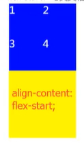
6、align-content属性定义了多根轴线的对齐方式。如果项目只有一根轴线,该属性不起作用。
(当项目换为多行时,可食用align-content取代align-items)
- flex-start:与交叉轴的起点对齐。
- flex-end:与交叉轴的终点对齐。
- center:与交叉轴的中点对齐。
- space-between:与交叉轴两端对齐,轴线之间的间隔平均分布。
- space-around:每根轴线两侧的间隔都相等。所以,轴线之间的间隔比轴线与边框的间隔大一倍。
- strech(默认值):轴线占满整个交叉轴。
<style>
		#div{
			width: 100px;
			height: 500px;
			background-color: yellow;
			display: flex;
			flex-wrap: wrap;
			align-content:stretch;
			}
		#div div{
			width: 100px;
			height: 100px;
			background-color: blueviolet;
			color: wheat;
			font-size: 30px;
		}
		#div2{
			width: 400px;
			height: 400px;
			background-color: hotpink;
			display: flex;
		}
	</style>
	</head>
	<body>
		<div id="div">
			<div class="div1">1</div>
			<div class="div2">2</div>
			<div class="div3">3</div>
			<div class="div4">4</div>

		</div>
		<div id="div2"></div>
	</body>
Android作用于子项目的六大属性
1、order属性定义项目的排列顺序。数值越小,排列越靠前,默认为0;
2、flex-grow属性定义项目的放大比例,默认为0,即如果存在剩余空间,也不放大。
3、flex-shrink属性定义了项目的缩小比例,默认为1,即如果空间不足,该项目将缩小。
4、flex-basis定义项目占据的主轴空间。(如果主轴为水平,则设置这个属性,相当于设置项目的宽度。原width将会失效)
5、flex属性是flex-grow,flex-shrink和flex-basis的简写,默认值为0 1.后两个属性可选。
此属性有两个快捷设置:auto=(1 1 auto)/none=(0 0 auto)
6、align-self:定义单个项目自身在交叉轴上的排列,可以覆盖掉容器上的align-items属性。
属性值:与align-items相同,默认值为auto,表示集成父容器的align-items属性值。


 扫一扫
扫一扫


 1536
1536

 被折叠的 条评论
为什么被折叠?
被折叠的 条评论
为什么被折叠?
 到【灌水乐园】发言


