


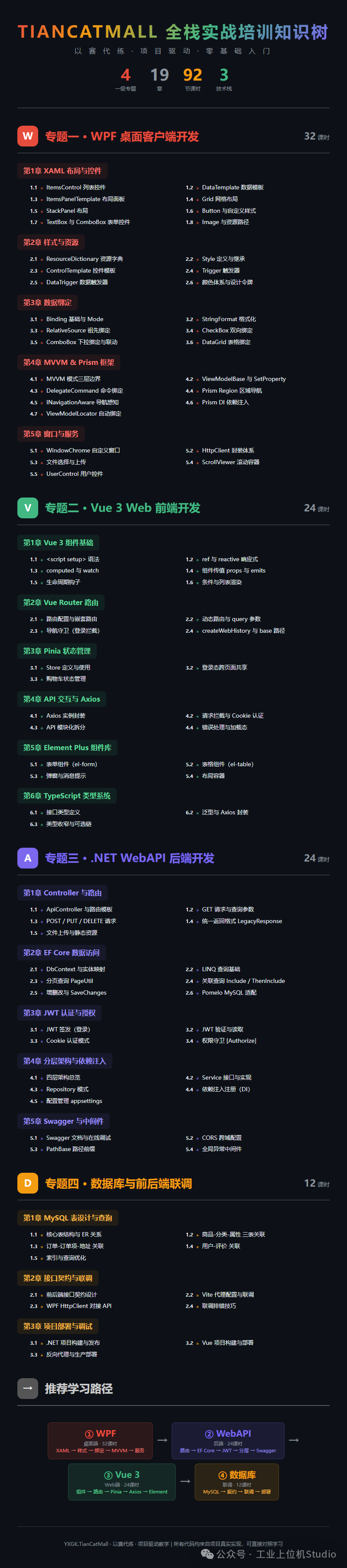
项目规划
-
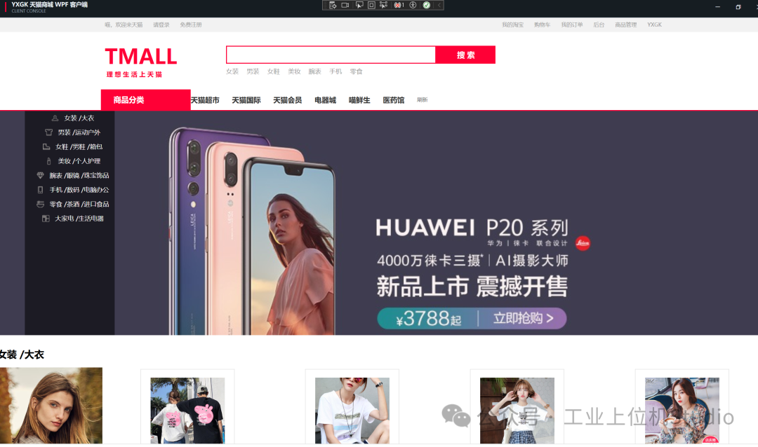
前端:WPF/Vue
-
后端:WebAPI
项目体验
- 注册和登录
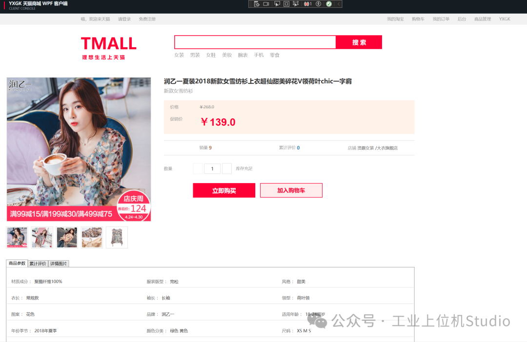
- 选择商品到购物车
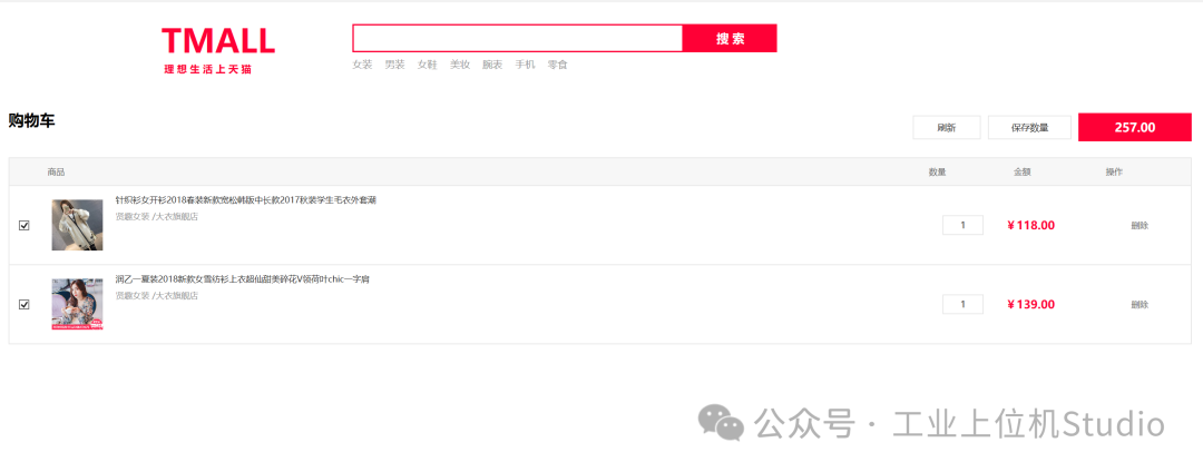
- 购物车结算
项目成果
-
目录
-
小节1
01 · ItemsControl 列表控件
难度 ⭐⭐ | 应用页面 首页、商品列表、商品详情、购物车、下单、支付、订单列表、Dashboard 等 8+ 页面 | 代码出现 60+ 处
一、官方定义
ItemsControl 是 WPF 中最基础的集合控件——把一组数据(集合/数组)渲染成一组 UI 元素。
它本身只负责"遍历数据、逐个生成容器",不管数据怎么排列,也不管每个元素长什么样。排列方式交给 ItemsPanel,元素外观交给 ItemTemplate。
┌──────────────── ItemsControl ────────────────┐
│  ItemsSource  ←── ObservableCollection<T>     │
│  ItemsPanel    ←── 控制布局(横/竖/网格/换行) │
│  ItemTemplate  ←── 控制每个元素长什么样        │
└──────────────────────────────────────────────┘
一句话:
ItemsControl= 一个你可以完全控制布局和外观的for循环。
和它的"亲戚"对比:
|
控件
|
特点
|
| — | — |
| ListBox |
ItemsControl + 选中高亮
|
| ListView |
ListBox + 列头排序
|
| DataGrid |
表格,自带行列结构
|
| ComboBox |
下拉选择
|
大多数场景下,ItemsControl 足够用,不需要上 ListBox/ListView。
二、项目实战
2.1 基础用法——商品分类导航(首页左侧黑底栏)
源码位置:Views/Fore/ForeHomeView.xaml:41-68
<ItemsControl ItemsSource="{Binding Categories}">
    <ItemsControl.ItemTemplate>
        <DataTemplate>
            <Button Height="31"
                    Background="Transparent"
                    BorderThickness="0"
                    Command="{Binding DataContext.OpenCategoryCommand,
                              RelativeSource={RelativeSource AncestorType=UserControl}}"
                    CommandParameter="{Binding CategoryId}"
                    Cursor="Hand">
                <Grid>
                    <Grid.ColumnDefinitions>
                        <ColumnDefinition Width="42" />
                        <ColumnDefinition Width="*" />
                    </Grid.ColumnDefinitions>
                    <Image Width="16" Height="16" Source="{Binding IconUri}" />
                    <TextBlock Grid.Column="1"
                               VerticalAlignment="Center"
                               Text="{Binding CategoryName}"
                               Foreground="White" FontSize="14" />
                </Grid>
            </Button>
        </DataTemplate>
    </ItemsControl.ItemTemplate>
</ItemsControl>
数据源(ViewModel):ObservableCollection<ForeCategoryFloor> Categories
// ViewModels/Fore/ForeHomeViewModel.cs
public ObservableCollection<ForeCategoryFloor> Categories { get; } = [];

// 从 API 获取数据
var data = await _catalogApiClient.HomeAsync();
foreach (var categoryElement in data.EnumerateArrayOrEmpty("categoryList"))
{
    Categories.Add(MapCategory(categoryElement));
}
关键点:
-
ItemsSource="{Binding Categories}"—— 绑定集合,集合变化 UI 自动刷新 -
ItemTemplate内的按钮通过RelativeSource找到父级UserControl上的 ViewModel 命令 -
这里没有指定
ItemsPanel,默认是垂直 StackPanel
2.2 自定义布局——首页商品楼层(UniformGrid 4列排列)
源码位置:Views/Fore/ForeHomeView.xaml:92-130
<ItemsControl Grid.Column="1" ItemsSource="{Binding Products}">
    <!-- ★ 关键:用 ItemsPanelTemplate 自定义布局 -->
    <ItemsControl.ItemsPanel>
        <ItemsPanelTemplate>
            <UniformGrid Columns="4" />
        </ItemsPanelTemplate>
    </ItemsControl.ItemsPanel>
    <ItemsControl.ItemTemplate>
        <DataTemplate>
            <Border Width="210" Height="286" Margin="13,0,0,16"
                    Background="White" BorderBrush="..." BorderThickness="1">
                <StackPanel>
                    <Image Width="165" Height="165"
                           Source="{Binding ImageUri}" ... />
                    <Button Command="..." CommandParameter="{Binding ProductId}">
                        <TextBlock Text="{Binding ProductName}" ... />
                    </Button>
                    <TextBlock Text="{Binding SalePrice, StringFormat=¥{0:F1}}"
                               Foreground="Red" FontSize="18" />
                </StackPanel>
            </Border>
        </DataTemplate>
    </ItemsControl.ItemTemplate>
</ItemsControl>
关键点:
-
ItemsPanelTemplate换成UniformGrid→ 每行 4 列自适应 -
每个商品卡是 210×286 的 Border,内有图片、名称、价格
-
StringFormat=¥{0:F1}直接在 XAML 格式化价格显示
2.3 换行布局——商品列表页(WrapPanel)
源码位置:Views/Fore/ForeProductListView.xaml:108-229
<ItemsControl Margin="0,10,0,30" ItemsSource="{Binding Products}">
    <ItemsControl.ItemsPanel>
        <ItemsPanelTemplate>
            <WrapPanel />
        </ItemsPanelTemplate>
    </ItemsControl.ItemsPanel>
    <!-- 空数据 / 加载中 状态切换 -->
    <ItemsControl.Style>
        <Style TargetType="ItemsControl">
            <Setter Property="Visibility" Value="Visible" />
            <Style.Triggers>
                <DataTrigger Binding="{Binding HasProducts}" Value="False">
                    <Setter Property="Visibility" Value="Collapsed" />
                </DataTrigger>
            </Style.Triggers>
        </Style>
    </ItemsControl.Style>
    ...
</ItemsControl>
三种布局对比(项目中实际使用的):
|
ItemsPanelTemplate
|
效果
|
使用场景
|
| — | — | — |
| StackPanel
(默认)
|
垂直堆叠
|
分类导航、订单列表、购物车
|
| UniformGrid Columns="4" |
固定列数网格
|
首页商品楼层(4列)
|
| WrapPanel |
自动换行流式
|
商品列表(窗口拉宽就多展示)
|
| StackPanel Orientation="Horizontal" |
水平排列
|
排序按钮栏、缩略图条
|
2.4 嵌套 ItemsControl——商品列表中的缩略图条
源码位置:Views/Fore/ForeProductListView.xaml:146-166
<!-- 外层 ItemsControl:遍历商品列表 -->
<ItemsControl ItemsSource="{Binding Products}">
    <ItemsControl.ItemTemplate>
        <DataTemplate>
            <Border Width="220" Height="372" ...>
                <StackPanel>
                    <!-- 商品主图 -->
                    <Image ... Source="{Binding ImageUri}" />
                    <!-- ★ 内层 ItemsControl:每个商品的多张缩略图 -->
                    <ItemsControl Height="42" ItemsSource="{Binding Thumbnails}">
                        <ItemsControl.ItemsPanel>
                            <ItemsPanelTemplate>
                                <StackPanel HorizontalAlignment="Center"
                                            Orientation="Horizontal" />
                            </ItemsPanelTemplate>
                        </ItemsControl.ItemsPanel>
                        <ItemsControl.ItemTemplate>
                            <DataTemplate>
                                <Border Width="34" Height="34"
                                        BorderBrush="#CCCCCC" BorderThickness="1">
                                    <Image Width="30" Height="30"
                                           Source="{Binding ImageUri}" />
                                </Border>
                            </DataTemplate>
                        </ItemsControl.ItemTemplate>
                    </ItemsControl>
                    <!-- 价格、名称、成交数、评价数... -->
                </StackPanel>
            </Border>
        </DataTemplate>
    </ItemsControl.ItemTemplate>
</ItemsControl>
关键点:ItemsControl 可以任意嵌套——外层遍历商品、内层遍历缩略图,数据到哪一层就渲染到哪一层。
2.5 购物车——每个 Item 有 CheckBox 双向绑定
源码位置:Views/Fore/ForeCartView.xaml:63-118
<ItemsControl ItemsSource="{Binding Items}">
    <ItemsControl.ItemTemplate>
        <DataTemplate>
            <Border MinHeight="112" ...>
                <Grid>
                    <CheckBox VerticalAlignment="Center"
                              IsChecked="{Binding IsSelected, Mode=TwoWay}" />
                    <Image ... Source="{Binding Product.ImageUri}" />
                    <TextBlock ... Text="{Binding Product.ProductName}" />
                    <TextBox ... Text="{Binding Quantity,
                                      UpdateSourceTrigger=PropertyChanged}" />
                    <TextBlock ... Text="{Binding Price, StringFormat=¥{0:F2}}" />
                    <Button Content="删除"
                            Command="{Binding DataContext.DeleteItemCommand,
                                      RelativeSource={RelativeSource AncestorType=UserControl}}"
                            CommandParameter="{Binding}" />
                </Grid>
            </Border>
        </DataTemplate>
    </ItemsControl.ItemTemplate>
</ItemsControl>
关键点:
-
IsChecked="{Binding IsSelected, Mode=TwoWay}"—— 勾选状态实时回写 Model -
UpdateSourceTrigger=PropertyChanged—— 输入数量即时更新 -
CommandParameter="{Binding}"—— 把当前 Item 对象传给删除命令
三、核心要点
|
要点
|
说明
|
| — | — |
| 数据源 |
用 ObservableCollection<T>,不要用 List<T>。Observable 才能在增删时自动刷新 UI
|
| 布局三件套 | ItemsPanel
管排列、ItemTemplate 管样式、ItemContainerStyle 管容器样式
|
| Command 穿透 |
模板内的按钮用 RelativeSource AncestorType=UserControl 找到页面级 ViewModel
|
| State 可视 |
空数据/加载中/错误态用 DataTrigger 切换 Visibility,不要留白屏
|
| 先面板后模板 |
开发顺序:先把 ItemsPanel 布局调好,再填 ItemTemplate 内容
|
四、练习任务
-
[ ] 入门:建一个
List<string>用 ItemsControl 展示,尝试把默认的垂直排列改成水平排列 -
[ ] 进阶:仿照
ForeHomeView商品楼层,做一个 3 列的 UniformGrid 商品卡列表 -
[ ] 挑战:实现一个嵌套 ItemsControl——外层是分类、内层是商品缩略图(参考商品列表页)
📖 下一篇:02 · DataTemplate 数据模板


 扫一扫
扫一扫


 548
548

 被折叠的 条评论
为什么被折叠?
被折叠的 条评论
为什么被折叠?
 到【灌水乐园】发言


