Webデザイナーに教えるThree.jsとReactを使った一段上のWebページ制作

Webデザインを学んでいると、きれいな配色やレイアウトだけでは、他のサイトとの差を出しにくいと感じることがあります。
特に、制作会社やクリエイターのポートフォリオサイトでは、次のような表現を見かけます。
マウスの動きに反応する立体オブジェクト
ゆっくり回転する3Dグラフィック
スクロールに合わせて変化する背景
奥行きを感じるパーティクル
光沢や発光を使った近未来的な表現
ページを移動しても滑らかにつながるアニメーション
これらの表現は、動画やGIFを背景に置くだけでも似た雰囲気を作れます。
しかし、動画は基本的に決められた内容を再生するだけです。
Three.jsを使うと、ユーザーのマウス操作やスクロール量に応じて、3Dオブジェクトをリアルタイムに動かせます。
今回作るWebページ
今回のWebページは、次のセクションで構成します。
Header
・ロゴ
・ナビゲーション
・お問い合わせボタン

Hero
・大きなキャッチコピー
・説明文
・CTAボタン
・回転する3Dオブジェクト
・背景パーティクル

Works
・制作実績カード
・3つのプロジェクト

Features
・Three.jsで実現できること
・3D、動き、没入感、拡張性

CTA
・お問い合わせへの誘導
・技術スタック
・実績数

Footer
・ナビゲーション
・SNSリンク
Webページ全体は黒を基調とし、青、紫、水色の光をアクセントとして使用します。
3Dオブジェクトには、複数のリングと多面体を組み合わせます。
中心
発光する多面体
周囲
複数の金属リング
さらに外側
小さな発光パーティクル
マウスを左右に動かすとオブジェクトが傾き、スクロールすると少し上へ移動しながら小さくなるようにします。
Three.jsとは
Three.jsは、ブラウザ上で3Dグラフィックスを扱うためのJavaScriptライブラリです。
本来、ブラウザで3Dを表示するには、WebGLという仕組みを扱う必要があります。
しかし、WebGLを直接記述するのは簡単ではありません。
Three.jsを使うと、次のような要素を比較的分かりやすく扱えます。
3Dオブジェクト
カメラ
ライト
マテリアル
影
テクスチャ
パーティクル
アニメーション
3D空間は、主に次の要素で成り立っています。
Scene
3Dオブジェクトを配置する空間

Camera
3D空間をどの位置から見るか

Light
オブジェクトを照らす光

Mesh
形状と質感を組み合わせた物体

Renderer
3D空間をブラウザへ描画する仕組み
通常のWebデザインに置き換えると、次のようなイメージです。
HTMLのページ全体 → Scene
ユーザーの視点 → Camera
照明や影 → Light
画面上の要素 → Mesh
ブラウザ表示 → Renderer
なぜReactと組み合わせるのか
Three.jsだけでもWebページは作れます。
ただし、ヘッダー、作品一覧、ボタン、フォームなど、通常のWebページ部分までThree.jsで作る必要はありません。
そこで、役割を分けます。
React
・ヘッダー
・文章
・ボタン
・カード
・セクション構成
Three.js
・3Dオブジェクト
・ライト
・パーティクル
・立体アニメーション
CSS
・レイアウト
・余白
・タイポグラフィ
・レスポンシブ
・背景グラデーション
React Three Fiberを使うと、Three.jsのオブジェクトをReactコンポーネントのように記述できます。
例えば、Three.jsで箱を作る場合も、ReactのJSX内で次のように表現できます。
<mesh>
  <boxGeometry args={[1, 1, 1]} />
  <meshStandardMaterial color="#6c5ce7" />
</mesh>
通常のHTMLに近い見た目で、3Dシーンを組み立てられることが大きな特徴です。
今回使う技術
使用する技術は次のとおりです。
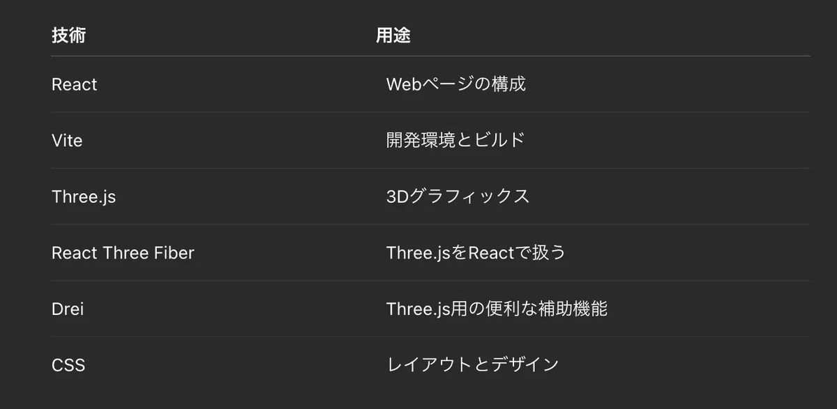
React Three Fiberを使用していても、実際に描画しているのはThree.jsです。
そのため、Three.jsの基本となる形状、マテリアル、ライト、カメラの考え方はそのまま使えます。
1.Reactプロジェクトを作成する
まず、Viteを使ってReactプロジェクトを作成します。
ターミナルを開き、次のコマンドを実行します。
npm create vite@latest threejs-design-site -- --template react作成したフォルダへ移動します。
cd threejs-design-site必要なパッケージをインストールします。
npm install
npm install three @react-three/fiber @react-three/drei
開発サーバーを起動します。
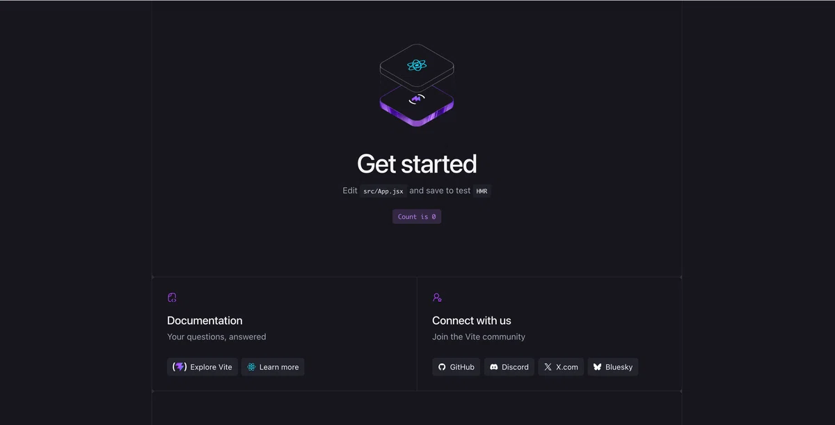
npm run devターミナルに表示されたURLをブラウザで開きます。
2.フォルダ構成を整理する
今回のプロジェクトは、次の構成にします。
threejs-design-site/
├── public/
├── src/
│   ├── components/
│   │   ├── Header.jsx
│   │   ├── HeroScene.jsx
│   │   ├── Orb.jsx
│   │   ├── Particles.jsx
│   │   ├── Works.jsx
│   │   ├── Features.jsx
│   │   └── ContactSection.jsx
│   ├── App.jsx
│   ├── main.jsx
│   └── styles.css
├── index.html
└── package.json
通常の画面要素と3D要素を、別々のコンポーネントへ分けます。
通常のUI
Header
Works
Features
ContactSection
3D関連
HeroScene
Orb
Particles
3D部分を分離することで、デザインを変更するときも、どのファイルを触ればよいか分かりやすくなります。
3.ページ全体の構成を作る
まず、src/App.jsxを作成します。
import Header from "./components/Header";
import HeroScene from "./components/HeroScene";
import Works from "./components/Works";
import Features from "./components/Features";
import ContactSection from "./components/ContactSection";
import "./styles.css";

function App() {
  return (
    <div className="site">
      <Header />

      <main>
        <section className="hero" id="home">
          <div className="hero__glow hero__glow--blue" />
          <div className="hero__glow hero__glow--purple" />

          <div className="hero__content">
            <p className="eyebrow">CREATIVE DEVELOPMENT</p>

            <h1>
              Design × 3D × Code
              <span>その先の、体験をつくる。</span>
            </h1>

            <p className="hero__description">
              Three.jsとReactで、見るだけでは終わらない、
              インタラクティブなWeb体験を設計します。
            </p>

            <a className="button button--primary" href="#works">
              View Works
              <span aria-hidden="true">→</span>
            </a>
          </div>

          <div className="hero__scene" aria-hidden="true">
            <HeroScene />
          </div>

          <a className="scroll-guide" href="#works">
            <span>Scroll</span>
            <span aria-hidden="true">↓</span>
          </a>
        </section>

        <Works />
        <Features />
        <ContactSection />
      </main>

      <footer className="footer">
        <p>Beyond Design.</p>

        <nav aria-label="フッターナビゲーション">
          <a href="#home">Home</a>
          <a href="#works">Works</a>
          <a href="#features">Features</a>
          <a href="#contact">Contact</a>
        </nav>
      </footer>
    </div>
  );
}

export default App;
ここでは、3Dシーンを次の部分へ配置しています。
<div className="hero__scene" aria-hidden="true">
  <HeroScene />
</div>
文章やボタンは通常のHTMLとして表示し、3D部分だけを別レイヤーとして重ねます。
これにより、3Dの描画に失敗した場合でも、文章やボタンは利用できます。
4.ヘッダーを作る
src/components/Header.jsxを作成します。
function Header() {
  return (
    <header className="header">
      <a className="logo" href="#home" aria-label="トップへ戻る">
        Beyond
        <span>Design.</span>
      </a>

      <nav className="header__nav" aria-label="メインナビゲーション">
        <a href="#home">Home</a>
        <a href="#works">Works</a>
        <a href="#features">About</a>
        <a href="#contact">Contact</a>
      </nav>

      <a className="button button--header" href="#contact">
        Contact
        <span aria-hidden="true">↗</span>
      </a>
    </header>
  );
}

export default Header;
ヘッダーは、3Dシーンより手前に表示するため、CSSで高いz-indexを設定します。
5.Three.jsの表示領域を作る
src/components/HeroScene.jsxを作成します。
import { Canvas } from "@react-three/fiber";
import { Suspense } from "react";
import Orb from "./Orb";
import Particles from "./Particles";

function HeroScene() {
  return (
    <Canvas
      camera={{
        position: [0, 0, 7],
        fov: 42,
      }}
      dpr={[1, 1.5]}
      gl={{
        antialias: true,
        alpha: true,
        powerPreference: "high-performance",
      }}
    >
      <Suspense fallback={null}>
        <ambientLight intensity={0.45} />

        <directionalLight
          position={[4, 5, 5]}
          intensity={4}
          color="#8dd8ff"
        />

        <pointLight
          position={[-4, -1, 3]}
          intensity={35}
          distance={10}
          color="#8b5cf6"
        />

        <pointLight
          position={[3, 1, 2]}
          intensity={28}
          distance={8}
          color="#1d9bf0"
        />

        <Orb />
        <Particles />
      </Suspense>
    </Canvas>
  );
}

export default HeroScene;
Canvasが、3Dを表示する領域です。
今回のカメラは、次の位置に置いています。
position: [0, 0, 7]3D空間では、一般的に次の方向を使います。
X:左右
Y:上下
Z:前後
カメラをZ方向の手前に置き、原点付近にある3Dオブジェクトを見ています。
dprを制限する理由
dpr={[1, 1.5]}高解像度の画面で、端末の解像度をそのまま使うと、描画負荷が大きくなることがあります。
そこで、最大値を1.5程度に制限しています。
3D表現では、見た目だけでなく、動作の軽さもデザインの一部です。
6.メインとなる3Dオブジェクトを作る
今回の中心となるオブジェクトは、次の要素を組み合わせます。
発光する多面体
+
複数の金属リング
+
外側を回る小さな球体
src/components/Orb.jsxを作成します。
import { Float } from "@react-three/drei";
import { useFrame, useThree } from "@react-three/fiber";
import { useEffect, useMemo, useRef } from "react";
import * as THREE from "three";

function Orb() {
  const groupRef = useRef();
  const coreRef = useRef();
  const ringRefs = useRef([]);
  const satelliteRef = useRef();

  const { pointer, viewport } = useThree();

  const scrollState = useRef({
    progress: 0,
  });

  useEffect(() => {
    const updateScroll = () => {
      const scrollRange = window.innerHeight * 1.2;

      scrollState.current.progress = THREE.MathUtils.clamp(
        window.scrollY / scrollRange,
        0,
        1,
      );
    };

    updateScroll();

    window.addEventListener("scroll", updateScroll, {
      passive: true,
    });

    return () => {
      window.removeEventListener("scroll", updateScroll);
    };
  }, []);

  const ringSettings = useMemo(
    () => [
      {
        radius: 1.55,
        tube: 0.16,
        rotation: [0.45, 0.25, 0.2],
        color: "#84d8ff",
      },
      {
        radius: 1.85,
        tube: 0.12,
        rotation: [-0.6, 0.4, -0.45],
        color: "#6d5dfc",
      },
      {
        radius: 2.1,
        tube: 0.08,
        rotation: [0.8, -0.4, 0.6],
        color: "#c061ff",
      },
      {
        radius: 1.35,
        tube: 0.07,
        rotation: [-0.3, -0.8, 0.2],
        color: "#40cfff",
      },
    ],
    [],
  );

  useFrame((state, delta) => {
    if (!groupRef.current) {
      return;
    }

    const scrollProgress = scrollState.current.progress;

    const targetRotationX = pointer.y * 0.22;
    const targetRotationY = pointer.x * 0.38;

    groupRef.current.rotation.x = THREE.MathUtils.damp(
      groupRef.current.rotation.x,
      targetRotationX,
      4,
      delta,
    );

    groupRef.current.rotation.y = THREE.MathUtils.damp(
      groupRef.current.rotation.y,
      targetRotationY,
      4,
      delta,
    );

    const responsiveX = viewport.width < 7 ? 0.45 : 1.15;

    groupRef.current.position.x = THREE.MathUtils.damp(
      groupRef.current.position.x,
      responsiveX + pointer.x * 0.18,
      3,
      delta,
    );

    groupRef.current.position.y = THREE.MathUtils.damp(
      groupRef.current.position.y,
      scrollProgress * 1.4,
      3,
      delta,
    );

    const targetScale = 1 - scrollProgress * 0.28;

    groupRef.current.scale.setScalar(
      THREE.MathUtils.damp(
        groupRef.current.scale.x,
        targetScale,
        3,
        delta,
      ),
    );

    if (coreRef.current) {
      coreRef.current.rotation.x += delta * 0.2;
      coreRef.current.rotation.y += delta * 0.35;
    }

    ringRefs.current.forEach((ring, index) => {
      if (!ring) {
        return;
      }

      const direction = index % 2 === 0 ? 1 : -1;
      const speed = 0.12 + index * 0.035;

      ring.rotation.z += delta * speed * direction;
      ring.rotation.y += delta * speed * 0.35;
    });

    if (satelliteRef.current) {
      const time = state.clock.elapsedTime * 0.55;

      satelliteRef.current.position.x =
        Math.cos(time) * 2.55;

      satelliteRef.current.position.y =
        Math.sin(time * 1.25) * 0.75;

      satelliteRef.current.position.z =
        Math.sin(time) * 1.25;
    }
  });

  return (
    <Float
      speed={1.4}
      rotationIntensity={0.16}
      floatIntensity={0.35}
    >
      <group ref={groupRef}>
        <mesh ref={coreRef}>
          <icosahedronGeometry args={[1.15, 4]} />

          <meshPhysicalMaterial
            color="#4d43e8"
            emissive="#24105f"
            emissiveIntensity={1.4}
            metalness={0.75}
            roughness={0.2}
            clearcoat={1}
            clearcoatRoughness={0.15}
          />
        </mesh>

        {ringSettings.map((ring, index) => (
          <mesh
            key={ring.radius}
            ref={(element) => {
              ringRefs.current[index] = element;
            }}
            rotation={ring.rotation}
          >
            <torusGeometry
              args={[
                ring.radius,
                ring.tube,
                32,
                160,
              ]}
            />

            <meshPhysicalMaterial
              color={ring.color}
              emissive={ring.color}
              emissiveIntensity={0.35}
              metalness={0.95}
              roughness={0.18}
              clearcoat={1}
            />
          </mesh>
        ))}

        <mesh ref={satelliteRef}>
          <sphereGeometry args={[0.13, 24, 24]} />

          <meshStandardMaterial
            color="#9be8ff"
            emissive="#3d8cff"
            emissiveIntensity={2}
          />
        </mesh>
      </group>
    </Float>
  );
}

export default Orb;
7.3Dアニメーションを理解する
今回のアニメーションで重要なのが、useFrame()です。
useFrame((state, delta) => {
  // 毎フレーム実行される処理
});
画面が描画されるたびに、この中の処理が呼び出されます。
常に回転させる
coreRef.current.rotation.y += delta * 0.35;deltaは、前のフレームからどれだけ時間が経過したかを表します。
端末によってフレームレートが違っても、動きの速さが大きく変わらないように、deltaを使って回転量を決めます。
マウスに追従させる
const targetRotationY = pointer.x * 0.38;pointer.xとpointer.yには、Canvas上のマウス位置が入ります。
おおよそ次の範囲です。
左端  :-1
中央  : 0
右端  : 1
その値をオブジェクトの回転に使うことで、マウスに反応する表現になります。
動きを滑らかにする
マウス位置をそのまま回転へ設定すると、動きが急になります。
そこで、THREE.MathUtils.damp()を使用します。
groupRef.current.rotation.y = THREE.MathUtils.damp(
  groupRef.current.rotation.y,
  targetRotationY,
  4,
  delta,
);
現在値から目標値へ少しずつ近づけることで、余韻のある滑らかな動きになります。
デザインでは、動くことよりも、どのように止まるかが重要です。
すぐ止まる動きは機械的に見え、少し遅れて追従する動きは上質に見えます。
8.スクロールと3Dを連動させる
スクロール量を取得し、0から1の範囲へ変換しています。
const scrollRange = window.innerHeight * 1.2;

scrollState.current.progress = THREE.MathUtils.clamp(
  window.scrollY / scrollRange,
  0,
  1,
);
スクロール前は0、一定量スクロールすると1になります。
この値を、位置や大きさへ反映します。
上へ移動する
groupRef.current.position.y = THREE.MathUtils.damp(
  groupRef.current.position.y,
  scrollProgress * 1.4,
  3,
  delta,
);
少し小さくする
const targetScale = 1 - scrollProgress * 0.28;スクロールすると3Dオブジェクトが上へ移動しながら少し小さくなり、次のコンテンツへ視線を誘導します。
スクロールアニメーションでは、すべてを大きく動かす必要はありません。
今回のように、
少し移動
少し縮小
少し回転
を組み合わせるだけでも、奥行きのある表現になります。
9.背景パーティクルを作る
次に、3Dオブジェクトの周囲へ小さな光を配置します。
src/components/Particles.jsxを作成します。
import { useFrame } from "@react-three/fiber";
import { useMemo, useRef } from "react";

function seededRandom(seed) {
  const value = Math.sin(seed * 12.9898) * 43758.5453;

  return value - Math.floor(value);
}

function createParticlePositions(count) {
  const positions = new Float32Array(count * 3);

  for (let index = 0; index < count; index += 1) {
    const offset = index * 3;
    const seed = index + 1;

    positions[offset] =
      (seededRandom(seed) - 0.5) * 11;

    positions[offset + 1] =
      (seededRandom(seed + 1000) - 0.5) * 7;

    positions[offset + 2] =
      (seededRandom(seed + 2000) - 0.5) * 5;
  }

  return positions;
}

function Particles() {
  const pointsRef = useRef();

  const positions = useMemo(
    () => createParticlePositions(140),
    [],
  );

  useFrame((state, delta) => {
    if (!pointsRef.current) {
      return;
    }

    pointsRef.current.rotation.y += delta * 0.018;

    pointsRef.current.rotation.x =
      Math.sin(
        state.clock.elapsedTime * 0.12,
      ) * 0.04;
  });

  return (
    <points ref={pointsRef}>
      <bufferGeometry>
        <bufferAttribute
          attach="attributes-position"
          args={[positions, 3]}
        />
      </bufferGeometry>

      <pointsMaterial
        color="#8b7cff"
        size={0.035}
        sizeAttenuation
        transparent
        opacity={0.72}
        depthWrite={false}
      />
    </points>
  );
}

export default Particles;
小さな点を一つずつReactコンポーネントとして作ると、要素数が増えて重くなります。
そこで、座標をまとめてbufferGeometryへ渡しています。
パーティクルは主役ではありません。
目立たせすぎず、3D空間の奥行きを感じさせるために使用します。
10.作品紹介セクションを一段上の見た目にする
Heroセクションに3Dオブジェクトを入れると、ファーストビューの印象はかなり強くなります。
ただし、その下のWorksセクションが普通のカードデザインのままだと、ページ全体のテンションが少し落ちて見えます。
そこで、作品紹介カードにも次の要素を加えます。
奥行きのあるカード
発光するグラデーション
重なったレイヤー
ホバー時の浮遊感
プロジェクトごとのタグ
実績らしく見えるメタ情報
Three.jsを使うのはHeroだけですが、Worksセクションにも3D的な雰囲気を持たせることで、ページ全体の世界観がつながります。
src/components/Works.jsxを次のように作成します。
const projects = [
  {
    title: "Immersive World",
    category: "WebGL / Three.js",
    description:
      "ブランドの世界観を3D空間として表現した、没入型のランディングページ。",
    tags: ["3D Hero", "Scroll", "WebGL"],
    year: "2026",
    role: "Art Direction",
    className: "work-card__visual--rings",
  },
  {
    title: "Crystal Gallery",
    category: "Three.js / React",
    description:
      "透明感のある3Dオブジェクトと、滑らかなUIを組み合わせたギャラリーサイト。",
    tags: ["React", "Shader", "Gallery"],
    year: "2026",
    role: "Frontend Design",
    className: "work-card__visual--crystal",
  },
  {
    title: "Beyond the Horizon",
    category: "Interaction / Motion",
    description:
      "スクロールと視差演出で、物語のように展開するプロモーションページ。",
    tags: ["Motion", "Parallax", "Brand"],
    year: "2025",
    role: "Creative Coding",
    className: "work-card__visual--space",
  },
];

function Works() {
  return (
    <section className="section works" id="works">
      <div className="section__intro works__intro">
        <p className="eyebrow">FEATURED WORKS</p>

        <h2>
          静止画ではなく、
          <span>体験として見せる。</span>
        </h2>

        <p>
          Three.jsを使うと、Webサイトはただ読むものではなく、
          触れて、動いて、印象に残る体験へ変わります。
        </p>

        <div className="works__summary">
          <div>
            <strong>3</strong>
            <span>Selected Works</span>
          </div>

          <div>
            <strong>8+</strong>
            <span>Interactive Ideas</span>
          </div>
        </div>

        <a className="button button--secondary" href="#contact">
          Discuss Project
          <span aria-hidden="true">→</span>
        </a>
      </div>

      <div className="works__grid">
        {projects.map((project, index) => (
          <article
            className="work-card"
            key={project.title}
            style={{
              "--delay": `${index * 80}ms`,
            }}
          >
            <div
              className={`work-card__visual ${project.className}`}
            >
              <span className="work-card__orb" />
              <span className="work-card__ring work-card__ring--one" />
              <span className="work-card__ring work-card__ring--two" />
              <span className="work-card__shape" />

              <div className="work-card__meta">
                <span>{project.year}</span>
                <span>{project.role}</span>
              </div>
            </div>

            <div className="work-card__body">
              <div className="work-card__heading">
                <div>
                  <p>{project.category}</p>
                  <h3>{project.title}</h3>
                </div>

                <span className="work-card__arrow" aria-hidden="true">
                  ↗
                </span>
              </div>

              <p className="work-card__description">
                {project.description}
              </p>

              <div className="work-card__tags">
                {project.tags.map((tag) => (
                  <span key={tag}>{tag}</span>
                ))}
              </div>
            </div>
          </article>
        ))}
      </div>
    </section>
  );
}

export default Works;
このWorksセクションでは、カードの中に疑似的な3Dレイヤーを作っています。
背景グラデーション
↓
発光する球体
↓
回転して見えるリング
↓
中心のオブジェクト
↓
作品情報
実際にはCSSで作っていますが、見た目としてはThree.jsのHeroとつながるようにしています。
Webデザインでは、すべてを本物の3Dで作る必要はありません。
重要なのは、ページ全体の世界観が途中で切れないことです。
11.Featuresセクションを体験設計にする
次に、Featuresセクションを作ります。
元のFeaturesセクションは、Three.jsの強みを説明するカードとしては分かりやすいですが、やや説明的で、ビジュアルのインパクトが弱くなりやすい構成でした。
今回は、Featuresセクションを次のような見せ方にします。
左側
大きなコピーと説明

右側
4つの機能カード

中央
軌道・点・線を使った3D風の図
src/components/Features.jsxを次のように作成します。
const features = [
  {
    number: "01",
    title: "Depth",
    label: "奥行きをつくる",
    description:
      "平面のレイアウトに、前後関係と空間の広がりを加えます。",
  },
  {
    number: "02",
    title: "Motion",
    label: "動きで引き込む",
    description:
      "スクロールやマウス操作に合わせて、自然に反応する動きを作ります。",
  },
  {
    number: "03",
    title: "Focus",
    label: "視線を誘導する",
    description:
      "光、回転、拡大縮小を使って、見てほしい場所へ視線を集めます。",
  },
  {
    number: "04",
    title: "Story",
    label: "体験として伝える",
    description:
      "セクションごとに変化する演出で、ブランドの世界観を物語にします。",
  },
];

function Features() {
  return (
    <section className="section features" id="features">
      <div className="section__intro features__intro">
        <p className="eyebrow">WHY THREE.JS</p>

        <h2>
          ただ動くのではなく、
          <span>意味のある動きを設計する。</span>
        </h2>

        <p>
          Three.jsの魅力は、派手な3Dを置けることだけではありません。
          ユーザーの操作に合わせて、情報の見え方や印象を変えられることです。
        </p>

        <div className="features__diagram" aria-hidden="true">
          <span className="features__core" />
          <span className="features__orbit features__orbit--one" />
          <span className="features__orbit features__orbit--two" />
          <span className="features__dot features__dot--one" />
          <span className="features__dot features__dot--two" />
          <span className="features__dot features__dot--three" />
        </div>
      </div>

      <div className="features__grid">
        {features.map((feature) => (
          <article className="feature" key={feature.number}>
            <div className="feature__top">
              <span className="feature__number">
                {feature.number}
              </span>

              <span className="feature__title-en">
                {feature.title}
              </span>
            </div>

            <h3>{feature.label}</h3>

            <p>{feature.description}</p>

            <span className="feature__line" aria-hidden="true" />
          </article>
        ))}
      </div>
    </section>
  );
}

export default Features;
この構成では、単に「3Dで魅せる」「動きで惹きつける」と説明するだけではなく、Webデザイナーが考えるべき観点へ変えています。
奥行き
動き
視線誘導
体験設計
Three.jsを学ぶ目的は、派手なオブジェクトを置くことではありません。
ユーザーがページを見たときに、
どこへ視線が向くか
どの順番で情報を理解するか
どの瞬間に印象が残るか
を設計できるようになることです。
12.CTAセクションを印象に残る締めにする
最後のCTAセクションも、通常の見出しと実績数だけでは少し弱く見えます。
ページ全体を締める場所なので、ここでは次の要素を入れます。
大きなグラデーション背景
浮遊するガラスカード
技術スタックのバッジ
プロジェクト相談への導線
背景のワイヤーフレーム表現
src/components/ContactSection.jsxを次のように作成します。
const stats = [
  {
    label: "PROJECTS",
    value: "24+",
    note: "Creative Builds",
  },
  {
    label: "EXPERIENCE",
    value: "5+",
    note: "Years",
  },
  {
    label: "STACK",
    value: "R3F",
    note: "Three.js / React",
  },
];

const techs = [
  "React",
  "Three.js",
  "R3F",
  "GSAP",
  "WebGL",
  "Vite",
];

function ContactSection() {
  return (
    <section className="contact" id="contact">
      <div className="contact__background" aria-hidden="true">
        <span className="contact__beam contact__beam--one" />
        <span className="contact__beam contact__beam--two" />
        <span className="contact__planet" />
        <span className="contact__grid" />
      </div>

      <div className="contact__content">
        <p className="eyebrow">LET'S CREATE</p>

        <h2>
          ありきたりなWebから、
          <span>記憶に残る体験へ。</span>
        </h2>

        <p>
          デザイン、3D、アニメーション、Reactを組み合わせて、
          スクロールしたくなるWebページを一緒に作りましょう。
        </p>

        <div className="contact__actions">
          <a
            className="button button--primary"
            href="mailto:hello@example.com"
          >
            Start a Project
            <span aria-hidden="true">→</span>
          </a>

          <a className="contact__text-link" href="#works">
            View selected works
          </a>
        </div>

        <div className="contact__techs" aria-label="使用技術">
          {techs.map((tech) => (
            <span key={tech}>{tech}</span>
          ))}
        </div>
      </div>

      <div className="contact__panel">
        <div className="contact__panel-header">
          <span className="contact__status-dot" />
          <span>Interactive Web Studio</span>
        </div>

        <div className="contact__stats">
          {stats.map((stat) => (
            <div key={stat.label}>
              <span>{stat.label}</span>
              <strong>{stat.value}</strong>
              <small>{stat.note}</small>
            </div>
          ))}
        </div>

        <div className="contact__preview">
          <div className="contact__preview-orbit" />
          <div className="contact__preview-card contact__preview-card--one">
            3D Hero
          </div>
          <div className="contact__preview-card contact__preview-card--two">
            Motion UI
          </div>
          <div className="contact__preview-card contact__preview-card--three">
            Brand Story
          </div>
        </div>
      </div>
    </section>
  );
}

export default ContactSection;
CTAセクションでは、単に「お問い合わせはこちら」と言うだけではなく、ページ全体のテーマをもう一度強く見せます。
普通のWebサイト
↓
3Dと動きを加える
↓
記憶に残る体験になる
この流れを最後にもう一度伝えることで、記事のテーマとも完成ページの印象ともつながります。
13.CSSをデザインを整える
次のsrc/style.cssを作成してください
:root {
  color: #f7f8ff;
  background: #05060a;
  font-family:
    Inter,
    "Noto Sans JP",
    system-ui,
    -apple-system,
    BlinkMacSystemFont,
    "Segoe UI",
    sans-serif;
  font-synthesis: none;
  text-rendering: optimizeLegibility;

  --background: #05060a;
  --surface: #0b0d13;
  --surface-light: #111520;
  --text: #f7f8ff;
  --muted: #9ca3b5;
  --line: rgba(255, 255, 255, 0.11);
  --purple: #8b5cf6;
  --blue: #2596ff;
  --cyan: #58dcff;
}

* {
  box-sizing: border-box;
}

html {
  scroll-behavior: smooth;
  background: var(--background);
}

body {
  margin: 0;
  min-width: 320px;
  background:
    radial-gradient(
      circle at 70% 10%,
      rgba(27, 92, 177, 0.16),
      transparent 32%
    ),
    var(--background);
  color: var(--text);
}

body,
button,
a {
  font: inherit;
}

a {
  color: inherit;
  text-decoration: none;
}

button,
a {
  -webkit-tap-highlight-color: transparent;
}

img,
svg,
canvas {
  max-width: 100%;
}

.site {
  min-height: 100vh;
  overflow: hidden;
}

/* Header */

.header {
  position: absolute;
  z-index: 20;
  top: 0;
  left: 0;
  display: grid;
  grid-template-columns: 1fr auto 1fr;
  align-items: center;
  width: 100%;
  padding: 28px clamp(24px, 5vw, 76px);
}

.logo {
  display: inline-flex;
  flex-direction: column;
  width: fit-content;
  font-size: 19px;
  font-weight: 800;
  line-height: 0.85;
  letter-spacing: -0.06em;
}

.logo span {
  color: #cfd6ff;
}

.header__nav {
  display: flex;
  gap: 42px;
  color: #d5d7df;
  font-size: 13px;
}

.header__nav a {
  position: relative;
  transition: color 180ms ease;
}

.header__nav a::after {
  position: absolute;
  right: 0;
  bottom: -8px;
  left: 0;
  height: 1px;
  background:
    linear-gradient(
      90deg,
      var(--blue),
      var(--purple)
    );
  content: "";
  transform: scaleX(0);
  transform-origin: center;
  transition: transform 180ms ease;
}

.header__nav a:hover {
  color: #ffffff;
}

.header__nav a:hover::after {
  transform: scaleX(1);
}

/* Common button */

.button {
  display: inline-flex;
  align-items: center;
  justify-content: center;
  gap: 22px;
  min-height: 48px;
  padding: 0 24px;
  border: 1px solid rgba(119, 100, 255, 0.72);
  border-radius: 999px;
  background:
    linear-gradient(
      110deg,
      rgba(66, 133, 255, 0.09),
      rgba(176, 73, 255, 0.08)
    );
  color: #ffffff;
  font-size: 13px;
  font-weight: 650;
  transition:
    transform 180ms ease,
    border-color 180ms ease,
    box-shadow 180ms ease,
    background 180ms ease;
}

.button:hover {
  border-color: rgba(113, 218, 255, 0.9);
  background:
    linear-gradient(
      110deg,
      rgba(66, 133, 255, 0.16),
      rgba(176, 73, 255, 0.15)
    );
  box-shadow:
    0 0 28px rgba(68, 112, 255, 0.2),
    inset 0 0 20px rgba(139, 92, 246, 0.08);
  transform: translateY(-2px);
}

.button--header {
  justify-self: end;
  min-height: 42px;
  padding: 0 20px;
}

.button--secondary {
  border-color: var(--line);
  background: transparent;
}

/* Hero */

.hero {
  position: relative;
  display: flex;
  align-items: center;
  min-height: 100svh;
  padding:
    130px
    clamp(24px, 7vw, 110px)
    90px;
  isolation: isolate;
}

.hero::after {
  position: absolute;
  z-index: -1;
  inset: 0;
  background:
    linear-gradient(
      90deg,
      rgba(5, 6, 10, 0.96) 0%,
      rgba(5, 6, 10, 0.68) 42%,
      rgba(5, 6, 10, 0.08) 75%
    );
  content: "";
  pointer-events: none;
}

.hero__content {
  position: relative;
  z-index: 4;
  width: min(590px, 48vw);
}

.eyebrow {
  margin: 0 0 22px;
  color: #8978ff;
  font-size: 12px;
  font-weight: 750;
  letter-spacing: 0.15em;
}

.hero h1,
.section h2,
.contact h2 {
  margin: 0;
  font-weight: 650;
  letter-spacing: -0.055em;
  line-height: 1.08;
}

.hero h1 {
  font-size: clamp(45px, 5.5vw, 82px);
}

.hero h1 span,
.section h2 span,
.contact h2 span {
  display: block;
  margin-top: 14px;
  color: #dce2f5;
  font-size: 0.72em;
  font-weight: 500;
}

.hero__description {
  max-width: 510px;
  margin: 32px 0;
  color: var(--muted);
  font-size: clamp(14px, 1.35vw, 18px);
  line-height: 2;
}

.hero__scene {
  position: absolute;
  z-index: 2;
  inset: 0;
}

.hero__scene canvas {
  display: block;
  width: 100%;
  height: 100%;
}

.hero__glow {
  position: absolute;
  z-index: 1;
  border-radius: 50%;
  filter: blur(90px);
  opacity: 0.24;
  pointer-events: none;
}

.hero__glow--blue {
  top: 9%;
  right: 5%;
  width: 35vw;
  height: 35vw;
  background: #006eff;
}

.hero__glow--purple {
  right: 25%;
  bottom: 5%;
  width: 30vw;
  height: 30vw;
  background: #7117c7;
}

.scroll-guide {
  position: absolute;
  z-index: 5;
  bottom: 28px;
  left: 50%;
  display: flex;
  flex-direction: column;
  align-items: center;
  gap: 7px;
  color: #c7cad5;
  font-size: 11px;
  transform: translateX(-50%);
}

/* Common section */

.section {
  position: relative;
  display: grid;
  grid-template-columns:
    minmax(250px, 0.72fr)
    minmax(0, 1.6fr);
  gap: clamp(50px, 8vw, 140px);
  padding:
    clamp(90px, 11vw, 160px)
    clamp(24px, 7vw, 110px);
  border-top: 1px solid var(--line);
}

.section__intro h2 {
  font-size: clamp(34px, 4vw, 58px);
}

.section__intro > p:not(.eyebrow) {
  margin: 28px 0;
  color: var(--muted);
  line-height: 1.9;
}

/* Works */

.works {
  overflow: hidden;
  background:
    radial-gradient(
      circle at 86% 12%,
      rgba(95, 67, 255, 0.2),
      transparent 34%
    ),
    radial-gradient(
      circle at 36% 80%,
      rgba(35, 178, 255, 0.12),
      transparent 38%
    ),
    #050609;
}

.works::before {
  position: absolute;
  top: 12%;
  right: -18%;
  width: 46vw;
  height: 46vw;
  border: 1px solid rgba(96, 137, 255, 0.16);
  border-radius: 50%;
  content: "";
  transform: rotateX(72deg) rotateZ(-18deg);
}

.works__intro {
  position: sticky;
  top: 110px;
  align-self: start;
}

.works__summary {
  display: grid;
  grid-template-columns: repeat(2, minmax(0, 1fr));
  gap: 12px;
  margin: 34px 0;
}

.works__summary div {
  padding: 18px;
  border: 1px solid var(--line);
  border-radius: 18px;
  background:
    linear-gradient(
      145deg,
      rgba(255, 255, 255, 0.055),
      rgba(255, 255, 255, 0.015)
    );
  backdrop-filter: blur(18px);
}

.works__summary strong {
  display: block;
  margin-bottom: 6px;
  font-size: 30px;
  font-weight: 520;
  letter-spacing: -0.04em;
}

.works__summary span {
  color: var(--muted);
  font-size: 11px;
  letter-spacing: 0.06em;
  text-transform: uppercase;
}

.works__grid {
  display: grid;
  gap: 22px;
}

.work-card {
  position: relative;
  display: grid;
  grid-template-columns:
    minmax(260px, 0.95fr)
    minmax(0, 1fr);
  min-height: 310px;
  overflow: hidden;
  border: 1px solid rgba(255, 255, 255, 0.11);
  border-radius: 28px;
  background:
    linear-gradient(
      135deg,
      rgba(255, 255, 255, 0.075),
      rgba(255, 255, 255, 0.025)
    );
  box-shadow:
    0 24px 80px rgba(0, 0, 0, 0.24),
    inset 0 1px 0 rgba(255, 255, 255, 0.08);
  isolation: isolate;
  transition:
    transform 260ms ease,
    border-color 260ms ease,
    box-shadow 260ms ease;
}

.work-card::before {
  position: absolute;
  inset: -1px;
  z-index: -1;
  background:
    linear-gradient(
      120deg,
      rgba(80, 210, 255, 0.42),
      transparent 30%,
      transparent 70%,
      rgba(177, 90, 255, 0.38)
    );
  content: "";
  opacity: 0;
  transition: opacity 260ms ease;
}

.work-card:hover {
  border-color: rgba(135, 169, 255, 0.38);
  box-shadow:
    0 32px 90px rgba(0, 0, 0, 0.34),
    0 0 44px rgba(91, 108, 255, 0.16);
  transform: translateY(-8px);
}

.work-card:hover::before {
  opacity: 1;
}

.work-card__visual {
  position: relative;
  min-height: 310px;
  overflow: hidden;
  border-right: 1px solid var(--line);
  perspective: 900px;
}

.work-card__visual::before {
  position: absolute;
  inset: 16%;
  border: 1px solid rgba(255, 255, 255, 0.12);
  border-radius: 50%;
  content: "";
  transform: rotateX(70deg) rotateZ(-18deg);
}

.work-card__visual::after {
  position: absolute;
  inset: auto 10% 12% 10%;
  height: 34%;
  background:
    radial-gradient(
      ellipse at center,
      rgba(0, 0, 0, 0.36),
      transparent 70%
    );
  content: "";
  filter: blur(18px);
}

.work-card__orb,
.work-card__ring,
.work-card__shape {
  position: absolute;
}

.work-card__orb {
  top: 18%;
  left: 18%;
  width: 72px;
  height: 72px;
  border-radius: 50%;
  background:
    radial-gradient(
      circle at 35% 30%,
      #ffffff,
      #82eaff 24%,
      #7656ff 58%,
      transparent 70%
    );
  filter: blur(0.2px);
  opacity: 0.84;
}

.work-card__ring {
  top: 50%;
  left: 50%;
  border: 1px solid rgba(225, 235, 255, 0.46);
  border-radius: 50%;
  transform-style: preserve-3d;
}

.work-card__ring--one {
  width: 190px;
  height: 190px;
  transform:
    translate(-50%, -50%)
    rotateX(68deg)
    rotateZ(-26deg);
}

.work-card__ring--two {
  width: 250px;
  height: 250px;
  border-color: rgba(137, 109, 255, 0.44);
  transform:
    translate(-50%, -50%)
    rotateX(74deg)
    rotateZ(22deg);
}

.work-card__shape {
  top: 50%;
  left: 50%;
  z-index: 2;
  transform:
    translate(-50%, -50%)
    rotateX(58deg)
    rotateZ(-28deg);
  transition: transform 300ms ease;
}

.work-card:hover .work-card__shape {
  transform:
    translate(-50%, -55%)
    rotateX(62deg)
    rotateZ(-12deg)
    scale(1.04);
}

.work-card__visual--rings {
  background:
    radial-gradient(
      circle at 42% 38%,
      rgba(189, 205, 255, 0.34),
      transparent 24%
    ),
    linear-gradient(
      145deg,
      #11131b,
      #050609
    );
}

.work-card__visual--rings .work-card__shape {
  width: 126px;
  height: 126px;
  border: 20px solid rgba(230, 235, 255, 0.9);
  border-radius: 50%;
  box-shadow:
    28px 10px 0 -12px rgba(28, 30, 40, 0.96),
    -28px -7px 0 -13px rgba(255, 255, 255, 0.82),
    0 0 38px rgba(133, 158, 255, 0.25);
}

.work-card__visual--crystal {
  background:
    radial-gradient(
      circle at 76% 25%,
      rgba(255, 255, 255, 0.72),
      transparent 10%
    ),
    linear-gradient(
      145deg,
      #c8f0ff,
      #9f9df0 48%,
      #2c2d58
    );
}

.work-card__visual--crystal .work-card__shape {
  width: 116px;
  height: 150px;
  background:
    linear-gradient(
      140deg,
      #e6fbff,
      #77ecff 25%,
      #7552dd 58%,
      #ef69ff
    );
  clip-path: polygon(
    50% 0,
    90% 24%,
    82% 76%,
    50% 100%,
    16% 76%,
    7% 25%
  );
  filter:
    drop-shadow(
      0 26px 26px rgba(35, 17, 112, 0.42)
    )
    drop-shadow(
      0 0 24px rgba(255, 255, 255, 0.22)
    );
}

.work-card__visual--space {
  background:
    radial-gradient(
      circle at 52% 24%,
      rgba(217, 232, 255, 0.5),
      transparent 20%
    ),
    radial-gradient(
      circle at 50% 92%,
      #55606e,
      #171c26 45%,
      #07090d 78%
    );
}

.work-card__visual--space .work-card__shape {
  width: 78px;
  height: 154px;
  background:
    linear-gradient(
      160deg,
      #edf4ff,
      #5b6473 42%,
      #10131a
    );
  clip-path: polygon(
    50% 0,
    86% 40%,
    66% 100%,
    30% 88%,
    9% 35%
  );
  filter:
    drop-shadow(0 24px 26px #000000)
    drop-shadow(
      0 0 24px rgba(255, 255, 255, 0.12)
    );
}

.work-card__meta {
  position: absolute;
  top: 18px;
  right: 18px;
  left: 18px;
  z-index: 4;
  display: flex;
  justify-content: space-between;
  color: rgba(255, 255, 255, 0.66);
  font-size: 11px;
  letter-spacing: 0.08em;
  text-transform: uppercase;
}

.work-card__body {
  display: flex;
  flex-direction: column;
  justify-content: space-between;
  gap: 24px;
  padding: clamp(24px, 3vw, 38px);
}

.work-card__heading {
  display: flex;
  align-items: start;
  justify-content: space-between;
  gap: 24px;
}

.work-card__heading p {
  margin: 0 0 10px;
  color: #8da2ff;
  font-size: 12px;
  letter-spacing: 0.08em;
  text-transform: uppercase;
}

.work-card h3 {
  margin: 0;
  font-size: clamp(24px, 2.6vw, 38px);
  font-weight: 560;
  letter-spacing: -0.045em;
}

.work-card__arrow {
  display: grid;
  flex: 0 0 auto;
  place-items: center;
  width: 42px;
  height: 42px;
  border: 1px solid var(--line);
  border-radius: 50%;
  background: rgba(255, 255, 255, 0.035);
  transition:
    transform 240ms ease,
    background 240ms ease;
}

.work-card:hover .work-card__arrow {
  background: rgba(139, 92, 246, 0.2);
  transform: translate(3px, -3px);
}

.work-card__description {
  max-width: 520px;
  margin: 0;
  color: var(--muted);
  line-height: 1.85;
}

.work-card__tags {
  display: flex;
  flex-wrap: wrap;
  gap: 8px;
}

.work-card__tags span {
  padding: 8px 11px;
  border: 1px solid var(--line);
  border-radius: 999px;
  background: rgba(255, 255, 255, 0.035);
  color: #d7dcff;
  font-size: 11px;
}

/* Features */

.features {
  overflow: hidden;
  background:
    radial-gradient(
      circle at 12% 25%,
      rgba(105, 89, 255, 0.18),
      transparent 32%
    ),
    radial-gradient(
      circle at 80% 72%,
      rgba(55, 192, 255, 0.1),
      transparent 34%
    ),
    #080b0f;
}

.features__intro {
  position: relative;
}

.features__diagram {
  position: relative;
  width: min(360px, 80vw);
  aspect-ratio: 1;
  margin-top: 52px;
  border-radius: 50%;
  background:
    radial-gradient(
      circle at center,
      rgba(139, 92, 246, 0.2),
      transparent 30%
    );
}

.features__core {
  position: absolute;
  top: 50%;
  left: 50%;
  width: 86px;
  height: 86px;
  border-radius: 30%;
  background:
    linear-gradient(
      140deg,
      #89f2ff,
      #635bff 48%,
      #d56bff
    );
  box-shadow:
    0 0 40px rgba(105, 91, 255, 0.45),
    inset 0 1px 18px rgba(255, 255, 255, 0.42);
  transform:
    translate(-50%, -50%)
    rotate(24deg);
}

.features__orbit {
  position: absolute;
  inset: 14%;
  border: 1px solid rgba(150, 170, 255, 0.26);
  border-radius: 50%;
}

.features__orbit--one {
  transform: rotateX(68deg) rotateZ(-22deg);
}

.features__orbit--two {
  inset: 4%;
  border-color: rgba(80, 210, 255, 0.18);
  transform: rotateX(74deg) rotateZ(26deg);
}

.features__dot {
  position: absolute;
  width: 13px;
  height: 13px;
  border-radius: 50%;
  background: #80e8ff;
  box-shadow:
    0 0 22px rgba(82, 205, 255, 0.9);
}

.features__dot--one {
  top: 24%;
  right: 21%;
}

.features__dot--two {
  bottom: 24%;
  left: 18%;
  background: #a879ff;
}

.features__dot--three {
  right: 32%;
  bottom: 12%;
  background: #ffffff;
}

.features__grid {
  display: grid;
  grid-template-columns: repeat(2, minmax(0, 1fr));
  gap: 18px;
}

.feature {
  position: relative;
  min-height: 250px;
  overflow: hidden;
  padding: 28px;
  border: 1px solid var(--line);
  border-radius: 26px;
  background:
    linear-gradient(
      150deg,
      rgba(255, 255, 255, 0.075),
      rgba(255, 255, 255, 0.02)
    );
  box-shadow:
    inset 0 1px 0 rgba(255, 255, 255, 0.08);
  transition:
    transform 240ms ease,
    border-color 240ms ease,
    background 240ms ease;
}

.feature::before {
  position: absolute;
  top: -80px;
  right: -80px;
  width: 190px;
  height: 190px;
  border-radius: 50%;
  background:
    radial-gradient(
      circle,
      rgba(120, 99, 255, 0.28),
      transparent 68%
    );
  content: "";
}

.feature:hover {
  border-color: rgba(122, 178, 255, 0.34);
  background:
    linear-gradient(
      150deg,
      rgba(255, 255, 255, 0.1),
      rgba(255, 255, 255, 0.03)
    );
  transform: translateY(-6px);
}

.feature__top {
  position: relative;
  z-index: 1;
  display: flex;
  align-items: center;
  justify-content: space-between;
  margin-bottom: 46px;
}

.feature__number {
  display: grid;
  place-items: center;
  width: 54px;
  height: 54px;
  border: 1px solid rgba(255, 255, 255, 0.12);
  border-radius: 18px;
  background:
    radial-gradient(
      circle at 35% 28%,
      #a98cff,
      #15111f 62%
    );
  color: #ffffff;
  font-size: 12px;
  box-shadow:
    0 0 24px rgba(126, 92, 255, 0.18);
}

.feature__title-en {
  color: rgba(255, 255, 255, 0.26);
  font-size: 34px;
  font-weight: 700;
  letter-spacing: -0.06em;
}

.feature h3 {
  position: relative;
  z-index: 1;
  margin: 0 0 16px;
  font-size: 24px;
  font-weight: 560;
  letter-spacing: -0.04em;
}

.feature p {
  position: relative;
  z-index: 1;
  margin: 0;
  color: var(--muted);
  line-height: 1.85;
}

.feature__line {
  position: absolute;
  right: 28px;
  bottom: 28px;
  left: 28px;
  height: 1px;
  background:
    linear-gradient(
      90deg,
      rgba(85, 210, 255, 0),
      rgba(85, 210, 255, 0.5),
      rgba(139, 92, 246, 0)
    );
}

/* Contact */

.contact {
  position: relative;
  display: grid;
  grid-template-columns:
    minmax(0, 1.1fr)
    minmax(360px, 0.9fr);
  gap: clamp(40px, 7vw, 100px);
  min-height: 660px;
  padding:
    clamp(90px, 10vw, 150px)
    clamp(24px, 7vw, 110px);
  overflow: hidden;
  border-top: 1px solid var(--line);
  background:
    linear-gradient(
      120deg,
      rgba(76, 39, 153, 0.92),
      rgba(15, 46, 105, 0.9) 52%,
      rgba(6, 117, 145, 0.82)
    ),
    #101527;
  isolation: isolate;
}

.contact__background {
  position: absolute;
  inset: 0;
  z-index: -1;
  overflow: hidden;
}

.contact__beam {
  position: absolute;
  height: 1px;
  background:
    linear-gradient(
      90deg,
      transparent,
      rgba(168, 225, 255, 0.7),
      transparent
    );
  opacity: 0.44;
  transform-origin: center;
}

.contact__beam--one {
  top: 24%;
  right: -12%;
  width: 70%;
  transform: rotate(-18deg);
}

.contact__beam--two {
  bottom: 26%;
  left: -16%;
  width: 80%;
  transform: rotate(14deg);
}

.contact__planet {
  position: absolute;
  right: 12%;
  bottom: 16%;
  width: 280px;
  height: 280px;
  border: 1px solid rgba(200, 220, 255, 0.18);
  border-radius: 50%;
  background:
    radial-gradient(
      circle at 34% 28%,
      rgba(255, 255, 255, 0.32),
      rgba(112, 82, 255, 0.16) 32%,
      transparent 68%
    );
  filter: blur(0.1px);
}

.contact__grid {
  position: absolute;
  right: -8%;
  bottom: -30%;
  left: 8%;
  height: 58%;
  border-radius: 50%;
  background-image:
    linear-gradient(
      rgba(132, 220, 255, 0.28) 1px,
      transparent 1px
    ),
    linear-gradient(
      90deg,
      rgba(132, 220, 255, 0.28) 1px,
      transparent 1px
    );
  background-size: 28px 28px;
  opacity: 0.55;
  transform:
    perspective(520px)
    rotateX(64deg);
  mask-image:
    linear-gradient(
      to bottom,
      #000,
      transparent
    );
}

.contact__content,
.contact__panel {
  position: relative;
  z-index: 2;
}

.contact h2 {
  margin: 0;
  font-size: clamp(42px, 5.3vw, 82px);
  font-weight: 620;
  letter-spacing: -0.06em;
  line-height: 1.05;
}

.contact h2 span {
  display: block;
  margin-top: 14px;
  color: #e7edff;
  font-size: 0.72em;
  font-weight: 500;
}

.contact__content > p:not(.eyebrow) {
  max-width: 620px;
  margin: 30px 0;
  color: rgba(238, 241, 255, 0.76);
  font-size: 16px;
  line-height: 2;
}

.contact__actions {
  display: flex;
  align-items: center;
  flex-wrap: wrap;
  gap: 22px;
  margin: 34px 0;
}

.contact__text-link {
  color: rgba(255, 255, 255, 0.72);
  font-size: 13px;
}

.contact__text-link:hover {
  color: #ffffff;
}

.contact__techs {
  display: flex;
  flex-wrap: wrap;
  gap: 10px;
  max-width: 560px;
}

.contact__techs span {
  padding: 9px 13px;
  border: 1px solid rgba(255, 255, 255, 0.16);
  border-radius: 999px;
  background: rgba(255, 255, 255, 0.06);
  color: rgba(255, 255, 255, 0.8);
  font-size: 12px;
  backdrop-filter: blur(16px);
}

.contact__panel {
  align-self: center;
  overflow: hidden;
  border: 1px solid rgba(255, 255, 255, 0.18);
  border-radius: 32px;
  background:
    linear-gradient(
      145deg,
      rgba(255, 255, 255, 0.14),
      rgba(255, 255, 255, 0.045)
    );
  box-shadow:
    0 34px 100px rgba(0, 0, 0, 0.28),
    inset 0 1px 0 rgba(255, 255, 255, 0.16);
  backdrop-filter: blur(24px);
}

.contact__panel-header {
  display: flex;
  align-items: center;
  gap: 10px;
  padding: 18px 22px;
  border-bottom: 1px solid rgba(255, 255, 255, 0.13);
  color: rgba(255, 255, 255, 0.76);
  font-size: 12px;
}

.contact__status-dot {
  width: 9px;
  height: 9px;
  border-radius: 50%;
  background: #72f5ff;
  box-shadow:
    0 0 18px rgba(114, 245, 255, 0.9);
}

.contact__stats {
  display: grid;
  grid-template-columns: repeat(3, 1fr);
}

.contact__stats > div {
  min-height: 150px;
  padding: 22px;
  border-right: 1px solid rgba(255, 255, 255, 0.12);
}

.contact__stats > div:last-child {
  border-right: 0;
}

.contact__stats span {
  display: block;
  margin-bottom: 14px;
  color: #c9c8ff;
  font-size: 10px;
  letter-spacing: 0.12em;
}

.contact__stats strong {
  display: block;
  font-size: clamp(32px, 3.6vw, 54px);
  font-weight: 430;
  letter-spacing: -0.06em;
}

.contact__stats small {
  color: rgba(255, 255, 255, 0.58);
}

.contact__preview {
  position: relative;
  min-height: 260px;
  overflow: hidden;
  border-top: 1px solid rgba(255, 255, 255, 0.13);
}

.contact__preview::before {
  position: absolute;
  inset: 24%;
  border-radius: 50%;
  background:
    radial-gradient(
      circle,
      rgba(106, 240, 255, 0.28),
      transparent 68%
    );
  content: "";
  filter: blur(20px);
}

.contact__preview-orbit {
  position: absolute;
  top: 50%;
  left: 50%;
  width: 230px;
  height: 230px;
  border: 1px solid rgba(222, 235, 255, 0.22);
  border-radius: 50%;
  transform:
    translate(-50%, -50%)
    rotateX(68deg)
    rotateZ(-20deg);
}

.contact__preview-card {
  position: absolute;
  padding: 12px 14px;
  border: 1px solid rgba(255, 255, 255, 0.15);
  border-radius: 16px;
  background: rgba(5, 7, 14, 0.46);
  color: rgba(255, 255, 255, 0.86);
  font-size: 12px;
  box-shadow:
    0 18px 42px rgba(0, 0, 0, 0.22);
  backdrop-filter: blur(16px);
}

.contact__preview-card--one {
  top: 45px;
  left: 32px;
}

.contact__preview-card--two {
  top: 108px;
  right: 36px;
}

.contact__preview-card--three {
  bottom: 42px;
  left: 96px;
}

/* Footer */

.footer {
  display: flex;
  align-items: center;
  justify-content: space-between;
  min-height: 90px;
  padding:
    0
    clamp(24px, 5vw, 76px);
  border-top: 1px solid var(--line);
  background: #05060a;
  font-size: 13px;
}

.footer p {
  font-weight: 750;
}

.footer nav {
  display: flex;
  gap: 32px;
  color: var(--muted);
}

.footer a {
  transition: color 180ms ease;
}

.footer a:hover {
  color: #ffffff;
}

/* Tablet */

@media (max-width: 980px) {
  .header {
    grid-template-columns: 1fr auto;
  }

  .header__nav {
    display: none;
  }

  .hero {
    align-items: flex-end;
    padding-bottom: 110px;
  }

  .hero__content {
    width: min(680px, 100%);
  }

  .hero::after {
    background:
      linear-gradient(
        0deg,
        rgba(5, 6, 10, 0.98) 8%,
        rgba(5, 6, 10, 0.32) 67%,
        rgba(5, 6, 10, 0.25)
      );
  }

  .section,
  .contact {
    grid-template-columns: 1fr;
  }

  .works__intro {
    position: static;
  }

  .work-card {
    grid-template-columns: 1fr;
  }

  .work-card__visual {
    border-right: 0;
    border-bottom: 1px solid var(--line);
  }

  .features__diagram {
    margin-right: auto;
    margin-left: auto;
  }

  .contact {
    min-height: auto;
  }

  .contact__panel {
    align-self: stretch;
  }
}

/* Smartphone */

@media (max-width: 680px) {
  .header {
    padding: 22px 20px;
  }

  .button--header {
    min-height: 38px;
    padding: 0 15px;
  }

  .hero {
    min-height: 920px;
    padding-right: 20px;
    padding-left: 20px;
  }

  .hero__content {
    padding-bottom: 35px;
  }

  .hero h1 {
    font-size: 42px;
  }

  .hero h1 span {
    font-size: 0.66em;
  }

  .hero__description {
    max-width: 340px;
    font-size: 14px;
  }

  .hero__scene {
    top: -160px;
    bottom: 140px;
  }

  .scroll-guide {
    display: none;
  }

  .section,
  .contact {
    padding-right: 20px;
    padding-left: 20px;
  }

  .works__summary,
  .features__grid,
  .contact__stats {
    grid-template-columns: 1fr;
  }

  .work-card {
    border-radius: 22px;
  }

  .work-card__visual {
    min-height: 250px;
  }

  .work-card__body {
    padding: 24px;
  }

  .work-card__heading {
    gap: 14px;
  }

  .work-card h3 {
    font-size: 26px;
  }

  .features__diagram {
    width: min(300px, 88vw);
  }

  .feature {
    min-height: 220px;
  }

  .feature__title-en {
    font-size: 28px;
  }

  .contact {
    padding-top: 100px;
    padding-bottom: 100px;
  }

  .contact__actions {
    align-items: flex-start;
    flex-direction: column;
  }

  .contact__stats > div {
    min-height: auto;
    border-right: 0;
    border-bottom: 1px solid rgba(255, 255, 255, 0.12);
  }

  .contact__stats > div:last-child {
    border-bottom: 0;
  }

  .contact__preview {
    min-height: 240px;
  }

  .contact__preview-card--one {
    left: 20px;
  }

  .contact__preview-card--two {
    right: 20px;
  }

  .contact__preview-card--three {
    left: 40px;
  }

  .footer {
    align-items: flex-start;
    flex-direction: column;
    gap: 22px;
    padding-top: 30px;
    padding-bottom: 30px;
  }

  .footer nav {
    flex-wrap: wrap;
    gap: 18px;
  }
}

/* Reduced motion */

@media (prefers-reduced-motion: reduce) {
  html {
    scroll-behavior: auto;
  }

  *,
  *::before,
  *::after {
    scroll-behavior: auto !important;
    transition-duration: 0.01ms !important;
    animation-duration: 0.01ms !important;
    animation-iteration-count: 1 !important;
  }
}
この修正によって、Heroだけが目立つ構成ではなく、下層セクションにも次のような一体感が出ます。
Hero
本物のThree.jsによる3D表現

Works
3D作品のように見えるカード表現

Features
軌道や光を使った技術説明

CTA
ガラスカードとワイヤーフレームで締める構成
これで、記事全体のテーマである「Three.jsとReactを使った一段上のWebページ制作」に対して、完成ページの説得力がかなり上がります。
ポイントは、Three.jsを全セクションに使わないことです。
本当に重い3D表現はHeroに集中させ、Works、Features、CTAはCSSで3D的な質感を作ります。
この役割分担にすると、見た目のグレードを上げつつ、Webページ全体の表示負荷を抑えられます。
14.main.jsxを確認する
src/main.jsxは次のようにします。
import { StrictMode } from "react";
import { createRoot } from "react-dom/client";
import App from "./App.jsx";

createRoot(document.getElementById("root")).render(
  <StrictMode>
    <App />
  </StrictMode>,
);
これで必要なコードはそろいました。
開発サーバーを起動します。
npm run devさて、完成したのが以下のサイトです。
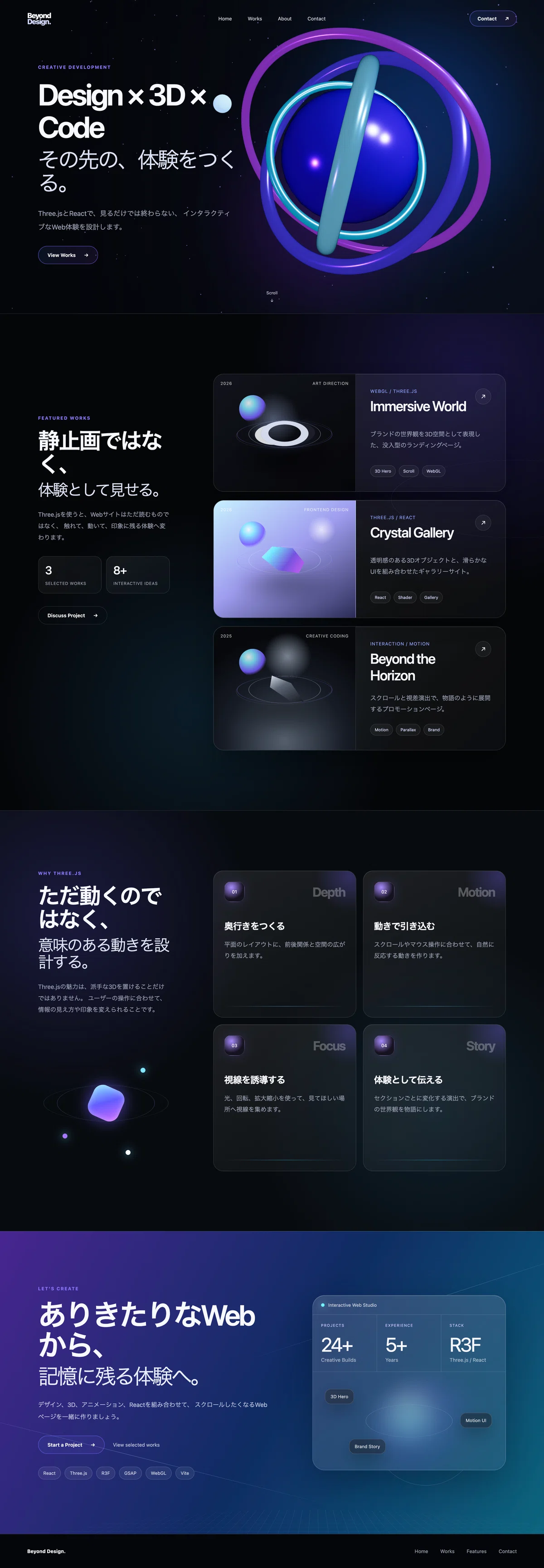
ぜひ以下の動画を見てください(3D感が伝わると思います)
いかがでしょうか?
割とこの程度の実装でも3D的なビジュアルになりましたね
このようにThree.jsを使うことでより優れたデザインを実装することができます
15.Three.jsらしさをさらに強くする方法
今回の実装でも、次の3D表現が入っています。
多面体の回転
複数リングの個別回転
上下に浮遊する動き
マウス追従
スクロール連動
周囲を回る小さな球体
背景パーティクル
複数ライトによる金属表現
さらに一段上を目指す場合は、次の機能を追加できます。
1.3Dモデルを読み込む
Blenderなどで作成したglTF形式のモデルを表示できます。
例えば、次のような表現です。
製品の3Dモデル
建築物
キャラクター
ブランドロゴ
家具
自動車
アート作品
ただし、3Dモデルはデータ容量が大きくなりやすいため、軽量化が必要です。
2.オブジェクトをクリック可能にする
3Dオブジェクトにもクリックイベントを設定できます。
<mesh
  onClick={() => {
    console.log("クリックされました");
  }}
>
例えば、3D作品をクリックすると詳細ページを開く、というUIを作れます。
3.マウス位置でライトを動かす
オブジェクトではなく、ライトをマウスに追従させる方法もあります。
ユーザーがマウスを動かすと、金属表面の反射位置が変わります。
オブジェクト自体を大きく動かさなくても、光だけでインタラクションを表現できます。
4.スクロールで形を変化させる
セクションごとに、3Dオブジェクトの状態を変えることもできます。
Hero
リングが一つに集まっている

Works
リングが広がる

Features
多面体が回転して形を見せる

Contact
オブジェクトが小さくなって背景へ溶ける
Webページ全体を、一つの3Dストーリーとして設計できます。
5.シェーダーを使う
シェーダーを使うと、既存のマテリアルだけでは作れない表現が可能になります。
水面
炎
ノイズ
波打つ形状
ホログラム
ディゾルブ
虹色の反射
液体のような変形
ただし、シェーダーは難易度が高いため、最初は今回のように既存のマテリアルとライトを組み合わせる方法がおすすめです。
16.3Dを使いすぎないことも重要
Three.jsを使えるようになると、さまざまな場所を動かしたくなります。
しかし、すべてが動くWebサイトは、必ずしも使いやすいとは限りません。
次のような問題が発生する可能性があります。
文章が読みにくい
ボタンが見つけにくい
どこを操作すればよいか分からない
スマートフォンで重い
ユーザーが疲れる
本来伝えたい情報が目立たない
今回のデザインでは、3DをHeroセクションへ集中させています。
最も目立つHero
Three.jsを使用

作品カード
CSSアニメーション

文章や説明
通常のHTML

CTA
グラデーションとCSS
3Dは、ページの目的を支えるために使用します。
3Dを見せること自体が目的にならないように注意します。
17.パフォーマンスを考える
3D Webサイトでは、デザインだけでなく描画負荷も確認します。
オブジェクトを増やしすぎない
オブジェクト数やポリゴン数が増えると、描画負荷も増えます。
最初は単純な形状を組み合わせる方法がおすすめです。
今回も、リングと多面体という基本形状だけで構成しています。
スマートフォンで確認する
PCで滑らかに動いても、スマートフォンでは重くなることがあります。
最低限、次の端末幅で確認します。
375px
768px
1024px
1440px
確認する項目は次のとおりです。
スクロールが重くないか
端末が熱くならないか
テキストと3Dが重ならないか
ボタンを押せるか
横スクロールが発生していないか
3Dが画面外へ出ていないか
Canvasの解像度を上げすぎない
今回のコードでは次の設定をしています。
dpr={[1, 1.5]}高解像度端末でも描画解像度を制限し、負荷を抑えます。
不要な再生成を防ぐ
リング設定やパーティクル座標は、useMemo()で一度だけ生成しています。
const positions = useMemo(() => {
  // 座標を作成
}, []);
Reactが再描画されるたびに、パーティクルの位置が作り直されるのを防ぎます。
18.アクセシビリティも忘れない
3D表現があるWebサイトでも、文章やボタンは通常のHTMLとして作ることが重要です。
今回の3Dシーンには、次の指定をしています。
<div className="hero__scene" aria-hidden="true">3Dオブジェクトは装飾目的なので、読み上げソフトの対象から外しています。
一方、キャッチコピー、説明文、リンクはHTMLとして残しています。
また、動きが苦手な利用者向けに、CSSで次の設定を追加しています。
@media (prefers-reduced-motion: reduce) {
  /* アニメーションを抑える */
}
より丁寧に対応する場合は、JavaScript側でもprefers-reduced-motionを確認し、3Dの回転速度やマウス追従を停止します。
WebデザイナーがThree.jsを学ぶメリット
Three.jsを学ぶ目的は、フロントエンドエンジニアになることだけではありません。
WebデザイナーがThree.jsを理解すると、デザインの段階で次のことを考えられるようになります。
どの要素を3Dにするか
どこに奥行きを持たせるか
マウス操作へどう反応させるか
スクロールでどんな物語を作るか
どの動きをCSSで作るか
どの動きをThree.jsで作るか
スマートフォンでは何を簡略化するか
静止画としてきれいな画面を作るだけでなく、
ユーザーが触ったときに、どう感じるか
まで設計できるようになります。
これは、Webデザイナーにとって大きな強みです。
最初から複雑な3Dモデルを作る必要はない
Three.jsというと、高度な3Dモデリングが必要だと思うかもしれません。
しかし、今回使用した形状は次の3つだけです。
icosahedronGeometry
多面体

torusGeometry
リング

sphereGeometry
球体
単純な形状でも、次の要素を組み合わせると印象が大きく変わります。
配置
回転
金属感
発光
ライト
マウス追従
スクロール連動
背景グラデーション
Webデザイナーは、複雑な形を一から作ることよりも、シンプルな要素をどう見せるかを考えることから始めるとよいでしょう。
まとめ
今回は、ReactとThree.jsを使って、3DアニメーションのあるWebページを制作しました。
実装した内容は次のとおりです。
Reactによるページ構成
React Three Fiberによる3D表示
多面体とリングを使った3Dオブジェクト
金属感と発光のあるマテリアル
複数ライトによる立体表現
オブジェクトの自動回転
マウスに追従する傾き
スクロールに連動する移動と縮小
周囲を回る球体
背景パーティクル
CSSによる作品カード
レスポンシブ対応
アニメーション軽減設定
Three.jsの強みは、単に立体を表示できることではありません。
ユーザーの操作に応じて、Webページがリアルタイムに反応することです。
見るだけのWebページ
        ↓
触ると反応するWebページ
        ↓
世界観を体験できるWebページ
すべてのWebサイトに3Dが必要なわけではありません。
しかし、ブランドサイト、ポートフォリオ、製品紹介、キャンペーンサイトなど、世界観が重要なWebページでは強力な表現手段になります。
まずは今回のように、Heroセクションへ一つの3Dオブジェクトを置くところから始めてみてください。
単純な形状でも、光と動き、ユーザー操作を組み合わせることで、通常のWebページとは異なる「一段上の体験」を作れます。
これからもこういった技術情報を発信していくので、
スキ・フォローよろしくお願いします🔥
いいなと思ったら応援しよう!
 応援をぜひよろしくお願いします🔥
いただいたチップでより素晴らしい記事を発信していけるよう精進してまいります!
応援をぜひよろしくお願いします🔥
いただいたチップでより素晴らしい記事を発信していけるよう精進してまいります!