Bootstrap's grid system is responsive. it's come with a flexbox and allows up to 12 columns across the page. you can also group the columns together.
Auto-layout columns: To create easy column sizes without an explicit numbered class like .col-sm-6, Use breakpoint-specific column classes.
- Equal-width: The equal-width grid system is basically used to create the grid in equal sizes. With the help of classes, we will manage the grid’s width.
- Setting one column width: In this feature of Bootstrap5, you can set one column width and have the sibling columns automatically resize around it.
- Variable width content: In this feature of Bootstrap5, you can set to size columns based on the natural width of their content to use col-{breakpoint}-auto classes.
Syntax:
  <div class="row">
    <div class="col">
     ...
    </div>
    <div class="col">
     ...
    </div>
  </div>
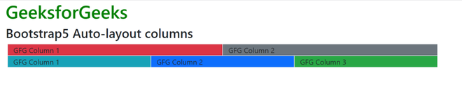
Example 1: Let's see an example of each column width being equal on each row.
<!DOCTYPE html>
<html>

<head>
    <!-- Bootstrap CDN -->
    <link href=
"https://stackpath.bootstrapcdn.com/bootstrap/5.0.0-alpha1/css/bootstrap.min.css"
          rel="stylesheet"
          crossorigin="anonymous">
    <script src=
"https://cdn.jsdelivr.net/npm/popper.js@1.16.0/dist/umd/popper.min.js"
            crossorigin="anonymous">
    </script>
</head>
<body>
    <div class="text-center">
        <h1 class="text-success">
            GeeksforGeeks
        </h1>
        <h3>Bootstrap5 Auto-layout columns</h3>

        <section class="container">
            <section class="row">
                <section class="col border
                    bg-danger">
                    GFG Column 1
                </section>
                <section class="col border
                    bg-secondary">
                    GFG Column 2
                </section>
            </section>
            <section class="row">
                <section class="col border
                    bg-info">
                    GFG Column 1
                </section>
                <section class="col border
                    bg-primary">
                    GFG Column 2
                </section>
                <section class="col border
                    bg-success">
                    GFG Column 3
                </section>
            </section>
        </section>
    </div>
</body>
</html>
Output:
Example 2: Let's see an example of setting one column width.
<!DOCTYPE html>
<html>

<head>
    <!-- Bootstrap CDN -->
    <link href=
"https://stackpath.bootstrapcdn.com/bootstrap/5.0.0-alpha1/css/bootstrap.min.css"
        rel="stylesheet"
        crossorigin="anonymous">
    <script src=
"https://cdn.jsdelivr.net/npm/popper.js@1.16.0/dist/umd/popper.min.js"
            crossorigin="anonymous">
    </script>
</head>
<body>
    <div class="text-center">
        <h1 class="text-success">
            GeeksforGeeks
        </h1>
        <h3>Bootstrap5 Auto-layout columns</h3>

        <section class="container">
            <section class="row">
                <section class="col border
                    bg-danger">
                    GFG Column 1
                </section>
                <section class="col-6 border
                    bg-light">
                    GFG Column 2 (wider)
                </section>
                <section class="col border
                    bg-info">
                    GFG Column 3
                </section>
            </section>
        </section>
    </div>
</body>
</html>
Output:

Reference: https://getbootstrap.com/docs/5.0/layout/grid/#auto-layout-columns
