Button Group Buttons toolbar components are used to create a toolbar of Button groups. It combines the sets of buttons in a group of button toolbars for complex components.
Pre-requisite: Bootstrap 5 Button Group to create a group of buttons.
Button Group Buttons toolbar Class:
- btn-toolbar: This class is used to give the Button group a toolbar look.
Syntax:
<div class="btn-toolbar" >
  <div class="btn-group ..." >
    <button type="button" class="...">....</button>
    ....
  </div>
Below example illustrate the Button Group Buttons toolbar:
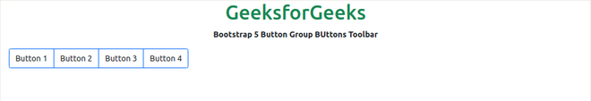
Example 1: In this example, we will create a single Button Group Toolbar. We used a border so you can distinguish the buttons.
<!DOCTYPE html>
<html>

<head>
    <link href=
"https://cdn.jsdelivr.net/npm/bootstrap@5.0.2/dist/css/bootstrap.min.css"
          rel="stylesheet"
          integrity=
"sha384-EVSTQN3/azprG1Anm3QDgpJLIm9Nao0Yz1ztcQTwFspd3yD65VohhpuuCOmLASjC"
          crossorigin="anonymous" />
    <title>Bootstrap 5 Button Group Buttons Toolbar</title>
</head>
<body>
    <center>
        <h1 class="text-success">GeeksforGeeks</h1>
        <strong>Bootstrap 5 Button Group BUttons Toolbar</strong>
        <!--Button Group Buttons Toolbar Class used -->
        <div class="btn-toolbar m-3">
            <div class="btn-group">
                <button type="button" class="btn border-primary">
                  Button 1
                 </button>
                <button type="button" class="btn border-primary">
                  Button 2
                 </button>
                <button type="button" class="btn border-primary">
                  Button 3
                 </button>
                <button type="button" class="btn border-primary">
                  Button 4
                 </button>
            </div>
        </div>
    </center>
</body>

</html>
Output:
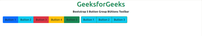
Example 2: In this example, we will create multiple Button Group Toolbars. We used background colors and border colors on another button group toolbar so you can differentiate the buttons.
<!DOCTYPE html>
<html>

<head>
    <link href=
"https://cdn.jsdelivr.net/npm/bootstrap@5.0.2/dist/css/bootstrap.min.css"
          rel="stylesheet"
          integrity=
"sha384-EVSTQN3/azprG1Anm3QDgpJLIm9Nao0Yz1ztcQTwFspd3yD65VohhpuuCOmLASjC"
          crossorigin="anonymous" />
    <title>Bootstrap 5 Button Group Buttons Toolbar</title>
</head>


<body>
    <center>
        <h1 class="text-success">GeeksforGeeks</h1>
        <strong>Bootstrap 5 Button Group BUttons Toolbar</strong>
        <!--Button Group Buttons Toolbar Class used -->
        <div class="btn-toolbar m-3">
            <div class="btn-group me-2">
                <button type="button" class="btn bg-primary">
                  Button 1
                </button>
                <button type="button" class="btn bg-info">
                  Button 2
                </button>
                <button type="button" class="btn bg-danger">
                  Button 3
                </button>
                <button type="button" class="btn bg-warning">
                  Button 4
                </button>
                <button type="button" class="btn bg-success">
                  Button 5
                </button>
            </div>

            <div class="btn-group me-2">
                <button type="button" class="border-success btn bg-info">
                  Button 1
                </button>
                <button type="button" class="border-success btn bg-info">
                  Button 2
                </button>
                <button type="button" class="border-success btn bg-info">
                  Button 3
                </button>
            </div>
        </div>

    </center>
</body>

</html>
Output:
Reference: https://getbootstrap.com/docs/5.0/components/button-group/#button-toolbar
