Bootstrap5 Flex Align Self property is used to change each item's alignment individually on the cross-axis. By default, it starts from the y-axis, if we want to change the alignment on the x-axis change the value of the class flex-direction to the column. There are some classes that can be used to set the alignment.
Flex Align Self class:
- align-self-*-**: This class is specifically used on the flexbox items, in order to change their alignment on the cross-axis individually, by specifying the various available options with the align-self class.
Syntax:
<div class="align-self-*-**">
    ...
</div>
The ** can be replaced by start/end/baseline/stretch where,
- start: It denotes the item is placed on the cross start line.
- end: It denotes item is placed on the cross-end line.
- center: It denotes item is placed on the center of cross-axis.
- baseline: It denotes that items are aligned as their baselines are aligned.
- stretch: It denotes that the item will be stretched to fill the container with respect to max-height & max-width.
The '*' can be replaced by sm/md/lg/xl/xxl for making the content responsive to different screen sizes and the '**' can be replaced with the above-mentioned Flex Align Self classes.
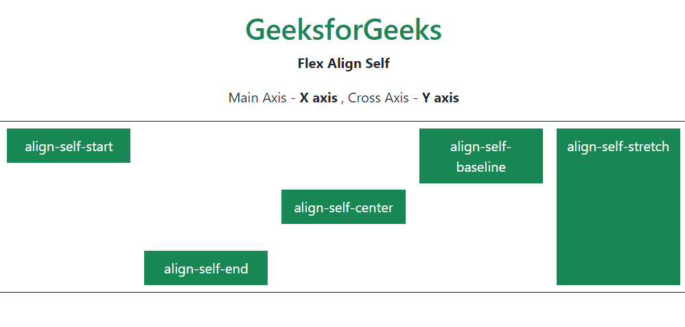
Example 1: In this example, the flex-direction is set to row. Hence, the main axis is the X axis and the cross axis is the Y axis. As a result, the flex items will be aligned with respect to the cross-axis when an align-self property is set.
<!DOCTYPE html>
<html>

<head>
    <link href=
"https://cdn.jsdelivr.net/npm/bootstrap@5.0.2/dist/css/bootstrap.min.css"
          rel="stylesheet"
          integrity=
"sha384-EVSTQN3/azprG1Anm3QDgpJLIm9Nao0Yz1ztcQTwFspd3yD65VohhpuuCOmLASjC"
          crossorigin="anonymous" />
    <title>Bootstrap 5 Flex - Align Self</title>
</head>

<body>
    <center class="m-3">
        <h1 class="text-success">
            GeeksforGeeks
        </h1>
        <strong>
            Flex Align Self
        </strong>
    </center>
    <p class="text-center">
        Main Axis - <b>X axis</b> , Cross Axis - <b>Y axis</b>
    </p>
    <div style="height: 12.5rem"
         class="d-flex flex-row text-white
                text-center border border-dark">
        <div class="w-25 bg-success p-2
                    m-2 align-self-start">
            align-self-start
        </div>
        <div class="w-25 bg-success p-2
                    m-2 align-self-end">
            align-self-end
        </div>
        <div class="w-25 bg-success p-2
                    m-2 align-self-center">
            align-self-center
        </div>
        <div class="w-25 bg-success p-2
                    m-2 align-self-baseline">
            align-self-baseline
        </div>
        <div class="w-25 bg-success p-2
                    m-2 align-self-stretch">
            align-self-stretch
        </div>
    </div>
</body>

</html>
Output:
Example 2: This is the example in which the flex-direction is set to the column. Hence, the main axis is the Y axis and the cross axis is the X axis. As a result, the flex items will be aligned with respect to the cross-axis when an align-self property is set.
<!DOCTYPE html>
<html>

<head>
    <link href=
"https://cdn.jsdelivr.net/npm/bootstrap@5.0.2/dist/css/bootstrap.min.css"
          rel="stylesheet"
          integrity=
"sha384-EVSTQN3/azprG1Anm3QDgpJLIm9Nao0Yz1ztcQTwFspd3yD65VohhpuuCOmLASjC"
          crossorigin="anonymous" />
    <title>Bootstrap 5 Flex - Align Self</title>
</head>

<body>
    <center class="m-3">
        <h1 class="text-success">
            GeeksforGeeks</h1>
        <strong>
            Flex Align Self
        </strong>
        <br />
    </center>
    <p class="text-center">
        Main Axis - <b>Y axis</b> , Cross Axis - <b>X axis</b>
    </p>
    <div class="d-flex flex-column text-white
                text-center border border-dark">
        <div class="bg-success p-2 m-2 align-self-start">
            align-self-start
        </div>
        <div class="bg-success p-2 m-2 align-self-end">
            align-self-end
        </div>
        <div class="bg-success p-2 m-2 align-self-center">
            align-self-center
        </div>
        <div class="bg-success p-2 m-2 align-self-baseline">
            align-self-baseline
        </div>
        <div class="bg-success p-2 m-2 align-self-stretch">
            align-self-stretch
        </div>
    </div>
</body>

</html>
Output:

Reference: https://getbootstrap.com/docs/5.0/utilities/flex/#align-self
