Bootstrap 5 Modal Static backdrop facilitates the modal that will not be going to be closed while clicking outside of the modal, by setting the backdrop to static.
Modal Static backdrop Classes: There are no specific classes used in Modal Static backdrop. Although, we can create the modal using Modal components classes.
Modal Static backdrop attribute:
- data-bs-backdrop: This attribute can be used to set the value as static, which will prevent the modal to be closed while clicking outside of it.
Syntax:
<div class="modal"
data-bs-backdrop="static" >
...
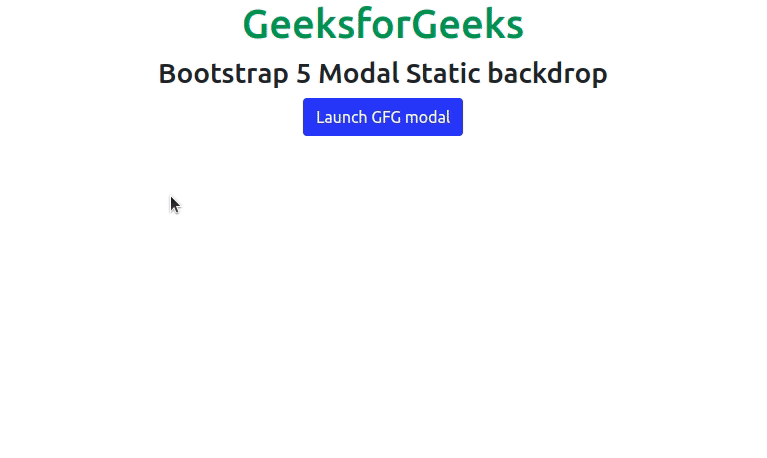
<div>Example 1: This example describes the basic usage of the Modal Static backdrop in Bootstrap 5, where we will create a static modal and use an image in the body.
<!DOCTYPE html>
<html>

<head>
    <link href=
"https://cdn.jsdelivr.net/npm/bootstrap@5.0.2/dist/css/bootstrap.min.css"
          rel="stylesheet"
          integrity=
"sha384-EVSTQN3/azprG1Anm3QDgpJLIm9Nao0Yz1ztcQTwFspd3yD65VohhpuuCOmLASjC"
          crossorigin="anonymous">
    <script src=
"https://cdn.jsdelivr.net/npm/bootstrap@5.0.2/dist/js/bootstrap.bundle.min.js"
        integrity=
"sha384-MrcW6ZMFYlzcLA8Nl+NtUVF0sA7MsXsP1UyJoMp4YLEuNSfAP+JcXn/tWtIaxVXM"
        crossorigin="anonymous">
    </script>
</head>

<body>
    <div class="container text-center">
        <h1 class="text-success">
            GeeksforGeeks
        </h1>
        <h3>
            Bootstrap 5 Modal Static backdrop
        </h3>

        <button type="button"
                class="btn btn-success"
                data-bs-toggle="modal"
                data-bs-target="#static">
            Launch GFG modal
        </button>

        <div class="modal fade"
             id="static"
             data-bs-backdrop="static">
            <div class="modal-dialog">
                <div class="modal-content">
                    <div class="modal-header">
                        <h5 class="modal-title">
                            Static Modal
                        </h5>
                        <button type="button"
                                class="btn-close btn-success"
                                data-bs-dismiss="modal"
                                aria-label="Close">
                        </button>
                    </div>
                    <div class="modal-body">
                        <p>
                              You cannot close this modal
                            by clicking outside
                        </p>
                        <img src=
"https://media.geeksforgeeks.org/wp-content/cdn-uploads/20210322182256/AngularJS-Tutorial.png"
                            class="card-img-bottom"
                            height="200px"
                            width="100px">
                    </div>
                </div>
            </div>
        </div>
    </div>
</body>

</html>
Output:

Example 2: This is another example that describes the basic usage of the Modal Static backdrop in Bootstrap 5, where we added a close button & removed the cross-mark(X) to close the Modal.
<!DOCTYPE html>
<html>

<head>
    <link href=
"https://cdn.jsdelivr.net/npm/bootstrap@5.0.2/dist/css/bootstrap.min.css"
         rel="stylesheet"
         integrity=
"sha384-EVSTQN3/azprG1Anm3QDgpJLIm9Nao0Yz1ztcQTwFspd3yD65VohhpuuCOmLASjC"
         crossorigin="anonymous">
    <script src=
"https://cdn.jsdelivr.net/npm/bootstrap@5.0.2/dist/js/bootstrap.bundle.min.js"
        integrity=
"sha384-MrcW6ZMFYlzcLA8Nl+NtUVF0sA7MsXsP1UyJoMp4YLEuNSfAP+JcXn/tWtIaxVXM"
        crossorigin="anonymous">
    </script>
</head>

<body>
    <div class="container text-center">
        <h1 class="text-success">
            GeeksforGeeks
        </h1>
        <h3>Bootstrap 5 Modal Static backdrop</h3>

        <button type="button"
                class="btn btn-primary"
                data-bs-toggle="modal"
                data-bs-target="#static">
            Launch GFG modal
        </button>

        <div class="modal fade"
             id="static"
             data-bs-backdrop="static"
             aria-hidden="true">
            <div class="modal-dialog">
                <div class="modal-content">
                    <div class="modal-header">
                        <h5 class="modal-title">
                            Static Modal
                        </h5>
                    </div>
                    <div class="modal-body">
                        <p>
                            You cannot close this modal
                            by clicking outside
                        </p>
                        <img src=
"https://media.geeksforgeeks.org/wp-content/cdn-uploads/20210322182256/AngularJS-Tutorial.png"
                            class="card-img-bottom"
                            height="200px"
                            width="100px">
                    </div>
                    <div class="modal-footer">
                        <button type="button"
                                class="btn btn-success"
                                data-bs-dismiss="modal">
                            Close
                        </button>

                    </div>
                </div>
            </div>
        </div>
    </div>
</body>

</html>
Output:
Reference: https://getbootstrap.com/docs/5.0/components/modal/#static-backdrop
