Ratios Sass map in Bootstrap 5 is a default list of aspect ratios. You can modify the aspect ratios you want to use.
Bootstrap 5 Ratios Sass map variables of Ratios:
- $ratio : This variable defines the percentage for 1x1, 4x3, 16x9, 21x9.
Steps to override SCSS of Bootstrap:
Step 1: Install bootstrap using the following command
npm i bootstrap
Step 2: Create your custom scss file and write the variable you want to override. Then include the bootstrap scss file using import.
@import "../node_modules/bootstrap/scss/bootstrap.scss";
$variable_to_override: value;
Step 3: Convert the SCSS file to CSS using live server extension.
Step 4: Include that CSS in your HTML file.
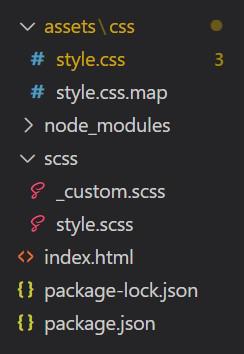
Project Structure :
Our default aspect-ratios map:
$aspect-ratios: (
 "1x1": 100%,
 "4x3": calc(3 / 4 * 100%),
 "16x9": calc(9 / 16 * 100%),
 "21x9": calc(9 / 21 * 100%)
);
Syntax :
@import "../node_modules/bootstrap/scss/bootstrap.scss";

$ratio: **;

.ratio-* {
  --#{$variable-prefix}aspect-ratio: #{$ratio};
}
The '*' is replaced by 1x1, 4x3, 16x9, 21x9 and '**' is replaced by whatever value you want to change the original variables by.
Example 1 : Modified .ratio-1x1 from 100% to 20%.
SCSS: style.scss
@import "../node_modules/bootstrap/scss/bootstrap.scss";

$ratio: 20%;

.ratio-1x1 {
  --#{$variable-prefix}aspect-ratio: #{$ratio};
}
CSS: style.css
.ratio-1x1 {
        --bs-aspect-ratio: 20%;
    }
HTML: index.html
<!DOCTYPE html>
<html lang="en">

<head>
    <meta charset="UTF-8">
    <meta http-equiv="X-UA-Compatible" content="IE=edge">
    <meta name="viewport" content="width=device-width, initial-scale=1.0">
    <link href=
"https://cdn.jsdelivr.net/npm/bootstrap@5.0.2/dist/css/bootstrap.min.css"
          rel="stylesheet">
    <style>
        .ratio-1x1 {
                --bs-aspect-ratio: 20%;
            }
    </style>
</head>

<body>
    <div class="text-center">
        <h1 class="text-success">GeeksforGeeks</h1>
        <strong>Bootstrap 5 Ratios Sass map</strong><br>
        <div class="ratio ratio-1x1">
            <div class="bg-primary">1x1</div>
        </div>
    </div>
</body>

</html>
Output :

Example 2: Modified .ratio-4x3 from 75% to 25% and .ratio-16x9 from (9/16 * 100%) to (1/16 * 100%).
SCSS: style.scss
@import "../node_modules/bootstrap/scss/bootstrap.scss";

$ratio : calc(1 / 4 * 100%);
.ratio-4x3 {
  --#{$variable-prefix}aspect-ratio: #{$ratio};
}
.ratio-16x9 {
  --#{$variable-prefix}aspect-ratio: #{$ratio/4};
}
CSS: style.css
.ratio-4x3 {
  --bs-aspect-ratio: 25%;
}

.ratio-16x9 {
  --bs-aspect-ratio: 6.25%;
}
HTML: index.html
<!DOCTYPE html>
<html lang="en">

<head>
    <meta charset="UTF-8">
    <meta http-equiv="X-UA-Compatible" content="IE=edge">
    <meta name="viewport" content="width=device-width, initial-scale=1.0">
    <link href=
"https://cdn.jsdelivr.net/npm/bootstrap@5.0.2/dist/css/bootstrap.min.css"
          rel="stylesheet">
    <style>
        .ratio-4x3 {
          --bs-aspect-ratio: 25%;
        }
        .ratio-16x9 {
          --bs-aspect-ratio: 6.25%;
        }
    </style>
</head>

<body>
    <div class="text-center">
        <h1 class="text-success">GeeksforGeeks</h1>
        <h2>Bootstrap 5 Ratios Sass map</h2><br>
        <div class="ratio ratio-4x3 bg-danger">
            <div>HTML</div>
        </div>
        <div class="ratio ratio-16x9 bg-primary">
            <div>CSS</div>
        </div>
    </div>
</body>

</html>
Output :

