Bootstrap 5 Form controls can be used to change the default values provided for the Form controls by customizing scss file of bootstrap 5.
SASS variables of Form controls:
- $input-color: This variable provides the cursor color and the font color of the text typed into the input fields. By default, it is gray.
- $input-border-width: This variable provides the border width of the input field. By default, it is 1px.
- $input-border-color: This variable provides the border color of the input field. By default, it is gray.
- $input-disabled-bg: This variable provides the background color of the input field when in a disabled state. By default, it is gray.
- $input-bg: This variable provides the background color of the input field. By default, it is white.
- $input-disabled-border-color: This variable provides the border color of the input field when in a disabled state. By default, it is null.
- $input-border-radius-*: This variable provides the border radius of the input field. By default, it is 0.375rem.
- $input-padding-y-*: This variable provides the top and bottom padding of the input field. By default, it is 0.375rem.
- $input-padding-x-*: This variable provides the left and right padding of the input field. By default, it is 0.75rem.
- $input-font-family: This variable provides the font family of the input field. By default, it is null.
- $input-font-size-*: This variable provides the font size of the input field. By default, it is 1rem.
- $input-focus-bg: This provides the background color of the input field when in focus. By default, it is white.
- $input-focus-color: This provides the font color in the input field when in focus. By default, it is gray.
- $input-focus-border-color: This provides the border color of the input field when in focus. By default, it is blue.
- $input-focus-box-shadow: This provides the box shadow of the input field when in focus. By default, it is 0px with blue color.
- $input-placeholder-color: This provides the color of the placeholder. By default, it is gray.
- $form-label-font-**: This variable provides values to change the font size, style, or weight of the form label.
- $form-label-color: This variable provides the font color of the form label. By default, it is null.
- $form-text-font-**: This variable provides values to change font size, style, or weight of form text
- $form-text-color: This variable provides the font color of the form text. By default, it is gray.
- $form-file-button-color: This variable provides the font color of the button in form file. By default, it is gray.
- $form-file-button-bg: This variable provides the background color of the button in form file. By default, it is gray.
- $form-file-button-hover-bg: This variable provides the background color of the button in form file when hovering on it. By default, it is gray.
The '*' can be replaced sm/lg to make the page responsive for different views.
The '**' can be replaced by size/style/weight to make changes to format different values of font
Steps to override scss of Bootstrap:
Step 1: Install bootstrap using following command:
npm i bootstrap
Step 2: Create your custom scss file and write the variable you want to override. Then include the bootstrap scss file using import.
$class_to_override: values;
@import "node_modules/bootstrap/scss/bootstrap"
Step 3: Convert the file to CSS using live server extension.
Step 4: Include the converted scss file to your HTML after the link tag of Bootstrap css
Project Structure: Here the custom scss file name is “custom.scss” and custom.css is converted file

Syntax:
$class_to_override: values;
@import "node_modules/bootstrap/scss/bootstrap"
Example 1: In this example, making use of some of the variables mentioned above their default values are changed as shown in the example.
custom.scss
$input-color:white;
$input-border-width:3px;
$input-border-color:rgb(180, 163, 224);
$input-disabled-bg:rgb(204, 235, 169);
$input-disabled-border-color:black;
$input-bg:rgb(149, 205, 196);
$input-placeholder-color:white;
$input-border-radius: 2rem;
$input-border-radius-sm:0.7rem;
$input-border-radius-lg:0.8rem;
$input-padding-y:1rem;
$input-padding-x:1rem;
$input-font-family:Lucida;
$input-font-size:18px;
$input-padding-y-sm:1.2rem;
$input-padding-x-sm:0.8rem;
$input-font-size-sm:1.1rem;
$input-padding-y-lg:1.2rem;
$input-padding-x-lg:1.8rem;
$input-font-size-lg:1.5rem;
$input-focus-border-color:rgb(235, 75, 75);
$input-focus-box-shadow: 5px 3px black;
@import "./node_modules/bootstrap/scss/bootstrap"
CSS file created after conversion
custom.css
.input-group-text {
    display: flex;
    align-items: center;
    padding: 1rem 1rem;
    font-size: 1.125rem;
    font-weight: 400;
    line-height: 1.5;
    color: white;
    text-align: center;
    white-space: nowrap;
    background-color: #e9ecef;
    border: 3px solid rgb(180, 163, 224);
    border-radius: 2rem;
}

.input-group-lg > .form-control,
.input-group-lg > .form-select,
.input-group-lg > .input-group-text,
.input-group-lg > .btn {
    padding: 1.2rem 1.8rem;
    font-size: calc(1.275rem + 0.3vw);
    border-radius: 0.8rem;
}
@media (min-width: 1200px) {
  .input-group-lg > .form-control,
.input-group-lg > .form-select,
.input-group-lg > .input-group-text,
.input-group-lg > .btn {
      font-size: 1.5rem;
  }
}

.input-group-sm > .form-control,
.input-group-sm > .form-select,
.input-group-sm > .input-group-text,
.input-group-sm > .btn {
    padding: 1.2rem 0.8rem;
    font-size: 1.1rem;
    border-radius: 0.7rem;
}

.input-group-lg > .form-select,
.input-group-sm > .form-select {
    padding-right: 4rem;
}
index.html
<!DOCTYPE html>
<html lang="en">
<head>
    <meta charset="UTF-8">
    <meta name="viewport"
          content="width=device-width, initial-scale=1.0">
    <title>Bootstrap 5 Form Controls SASS</title>
    <link href=
"https://cdn.jsdelivr.net/npm/bootstrap@5.2.3/dist/css/bootstrap.min.css"
          rel="stylesheet">
    <link rel="stylesheet"
          href="./custom.css">
    <script src=
"node_modules/bootstrap/dist/js/bootstrap.js">
      </script>
</head>
<body>
    <h1 class="text-success text-center">
        GeeksforGeeks
      </h1>
    <h5 class="text-success text-center">
        Form Controls
      </h5>
    <div class="container text-success mt-5"
         style="width: 970px;">
        <div class="row">
            <div class="col">
                <h6>
                      NORMAL SIZE
                  </h6>
                <div class="mb-3">
                    <label for="nameNormal"
                           class="form-label">
                          Name
                      </label>
                    <input type="email"
                           class="form-control"
                           id="nameNormal"
                           placeholder="Enter name">
                </div>
                <div class="mb-3">
                    <label for="ageNormal"
                           class="form-label">
                        Age
                      </label>
                    <input type="number"
                           class="form-control one"
                           id="ageNormal"
                           placeholder="Enter age">
                </div>
                <div class="mb-3">
                    <label for="dobNormal"
                           class="form-label">
                          Date of birth</label>
                    <input type="date"
                           class="form-control"
                           id="dobNormal"
                           placeholder="Enter date of birth"
                           disabled>
                </div>
            </div>
            <div class="col">
                <h6>
                      SMALL SIZE
                  </h6>
                <div class="mb-3">
                    <label for="ageNormal"
                           class="form-label">
                          Age
                      </label>
                    <input type="number"
                           class="form-control form-control-sm"
                           id="ageNormal"
                           placeholder="Enter age">
                </div>
                <div class="mb-3">
                    <label for="aboutMe"
                           class="form-label">
                        About
                      </label>
                    <textarea class="form-control form-control-sm"
                              id="aboutMe"
                              rows="3">
                      </textarea>
                </div>
            </div>

            <div class="col">
                <h6>
                      LARGE SIZE
                  </h6>
                <div class="mb-3">
                    <label for="nameNormal"
                           class="form-label">
                          Name
                      </label>
                    <input type="email"
                           class="form-control form-control-lg"
                           id="nameNormal"
                           placeholder="Enter name">
                </div>
                <div class="mb-3">
                    <label for="ageNormal"
                           class="form-label">
                          Age
                      </label>
                    <input type="number"
                           class="form-control form-control-lg"
                           id="ageNormal"
                           placeholder="Enter age">
                </div>
            </div>
        </div>
    </div>
</body>
</html>
Output:

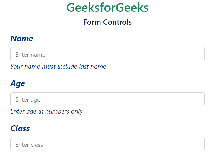
Example 2: In this example, we make use of the $form-label-font-size, $form-label-font-weight, $form-label-font-style, $form-label-color, $form-text-color, $form-text-font-size, $form-text-font-style variables and change their values as shown in the example.
custom.scss:
$form-label-font-size: 22px;
$form-label-font-weight:bolder;
$form-label-font-style:italic;
$form-label-color:green;
$form-text-color:green;
$form-text-font-size: 17px;
$form-text-font-style:italic;
@import "./node_modules/bootstrap/scss/bootstrap"
CSS file created after conversion
custom.css
.form-label {
    margin-bottom: 0.5rem;
    font-size: calc(1.2625rem + 0.15vw);
    font-style: italic;
    font-weight: bolder;
    color: rgb(0, 51, 128);
}

.form-text {
    margin-top: 0.25rem;
    font-size: 1.0625rem;
    font-style: italic;
    color: rgb(0, 51, 128);
}
index.html
<!DOCTYPE html>
<html lang="en">
<head>
    <meta charset="UTF-8">
    <meta name="viewport"
          content="width=device-width, initial-scale=1.0">
    <title>Bootstrap 5 Form Controls SASS</title>
    <link href=
"https://cdn.jsdelivr.net/npm/bootstrap@5.2.3/dist/css/bootstrap.min.css"
          rel="stylesheet">
    <link rel="stylesheet"
          href="./custom.css">
    <script src=
"node_modules/bootstrap/dist/js/bootstrap.js">
      </script>
</head>
<body>
    <h1 class="text-success text-center">
          GeeksforGeeks
      </h1>
    <h5 class="text-center">
          Form Controls
      </h5>
    <div class="container mt-3"
         style="width: 900px;">
        <div class="mb-3">
            <label for="name"
                   class="form-label">
                  Name
              </label>
            <input type="text"
                   class="form-control"
                   id="name"
                   placeholder="Enter name">
            <small class="form-text">
                  Your name must include last name
              </small>
        </div>
        <div class="mb-3">
            <label for="age"
                   class="form-label">
                  Age
              </label>
            <input type="number"
                   class="form-control one"
                   id="age"
                   placeholder="Enter age">
            <small class="form-text">
                  Enter age in numbers only
              </small>
        </div>
        <div class="mb-3">
            <label for="classInput"
                   class="form-label">
                  Class
              </label>
            <input type="number"
                   class="form-control one"
                   id="classInput"
                   placeholder="Enter class">
        </div>
    </div>
</body>
</html>
Output:
Example 3: In this example, making use of the $form-file-button-color, $form-file-button-bg and $form-file-button-hover-bg variables. Here in the scss file, the text color, the background of form file button and the background of form file button on hover is changed.
custom.scss
$form-file-button-color:white;
$form-file-button-bg:rgb(97, 179, 182);
$form-file-button-hover-bg:black;
@import "./node_modules/bootstrap/scss/bootstrap"
CSS file created after conversion
custom.css
.form-control::file-selector-button {
    padding: 0.375rem 0.75rem;
    margin: -0.375rem -0.75rem;
    -webkit-margin-end: 0.75rem;
            margin-inline-end: 0.75rem;
    color: white;
    background-color: rgb(97, 179, 182);
    pointer-events: none;
    border-color: inherit;
    border-style: solid;
    border-width: 0;
    border-inline-end-width: 1px;
    border-radius: 0;
    transition: color 0.15s ease-in-out, background-color 0.15s ease-in-out, border-color 0.15s ease-in-out, box-shadow 0.15s ease-in-out;
}

.form-control:hover:not(:disabled):not([readonly])::file-selector-button {
      background-color: black;
}
index.html
<!DOCTYPE html>
<html lang="en">
<head>
    <meta charset="UTF-8">
    <meta name="viewport"
          content="width=device-width, initial-scale=1.0">
    <title>Bootstrap 5 Form Controls SASS</title>
    <link href=
"https://cdn.jsdelivr.net/npm/bootstrap@5.2.3/dist/css/bootstrap.min.css"
          rel="stylesheet">
    <link rel="stylesheet"
          href="./custom.css">
    <script src=
"node_modules/bootstrap/dist/js/bootstrap.js">
      </script>
</head>
<body>
    <h1 class="text-success text-center">
          GeeksforGeeks
      </h1>
    <h5 class="text-center">
          Form Controls
      </h5>
    <div class="container mt-3"
         style="width: 700px;">
        <div class="mb-3">
            <label for="formFile"
                   class="form-label">
                  Choose file to upload
              </label>
            <input class="form-control"
                   type="file"
                   id="formFile">
        </div>
    </div>
</body>
</html>
Output: