A zebra-striped table is a table that has alternating shaded rows to provide visual distinction between rows and make the table easier to read and understand. This is commonly used in tables with a large number of rows.
Note: To create a zebra-striped table, use the nth-child() selector and add a background color to all even (or odd) table rows.
Syntax:
<table class="table table-striped">

  //table Data
</table>
Horizontal Zebra-Striped Table with dark-mode
- Create HTML structure by using <table> for the table container, <thead> for the table header, <tbody> for the table body, and <tr> for table rows.
- Apply CSS rules for styling such as colours, borders, and padding to achieve the desired appearance.
- Optionally, incorporate Bootstrap classes like 'table', 'table-striped', 'table-dark', and 'table-responsive' for enhanced styling and responsiveness.
- For better styling design with additional CSS for font size, alignment, or spacing as needed.
Example: Implementation to style horizontal zebra-striped table.
<!DOCTYPE html>
<html lang="en">

<head>
    <meta charset="UTF-8">
    <meta name="viewport"
          content="width=device-width, initial-scale=1.0">
    <title>Zebra-striped Table Example</title>

    <!-- Bootstrap CSS -->
    <link href=
"https://cdn.jsdelivr.net/npm/bootstrap@5.3.0-alpha1/dist/css/bootstrap.min.css"
          rel="stylesheet">
</head>

<body>
    <div class="container d-flex justify-content-center my-4">
        <h2 class="text-success">
              Horizontal Zebra-Striped Table
          </h2>
    </div>

    <div class="container">
        <div class="table-responsive mt-4">
            <table class="table table-dark table-striped">
                <thead>
                    <tr>
                        <th>#</th>
                        <th>Course</th>
                        <th>Price</th>
                        <th>Enrollment Date</th>
                    </tr>
                </thead>
                <tbody>
                    <tr>
                        <td>1</td>
                        <td>Web Development Bootcamp</td>
                        <td>15500</td>
                        <td>2024-01-15</td>
                    </tr>
                    <tr>
                        <td>2</td>
                        <td>Data Science Fundamentals</td>
                        <td>12600</td>
                        <td>2024-02-01</td>
                    </tr>
                    <tr>
                        <td>3</td>
                        <td>Mobile App Development Course</td>
                        <td>18000</td>
                        <td>2024-02-10</td>
                    </tr>
                    <tr>
                        <td>4</td>
                        <td>UX/UI Design Workshop</td>
                        <td>100000</td>
                        <td>2024-02-20</td>
                    </tr>
                </tbody>
            </table>
        </div>
    </div>

    <!-- Bootstrap JS -->
    <script src=
"https://cdn.jsdelivr.net/npm/bootstrap@5.3.0-alpha1/dist/js/bootstrap.bundle.min.js">
      </script>
</body>

</html>
Output:

Horizontal Zebra-Striped Table with light-mode
- Create HTML structure by using <table> for the table container, <thead> for the table header, <tbody> for the table body, and <tr> for table rows.
- Applies Bootstrap classes like
container,mt-5for margin top,mb-4for margin bottom, andtable,table-stripedfor zebra-striping. - Adds a custom CSS style to stripe the table rows with a light background color using nth-child selector.
- Populates the table with data including ID, Name, and Level for each row.
- Ensures responsiveness by utilizing Bootstrap's grid system and responsive classes.
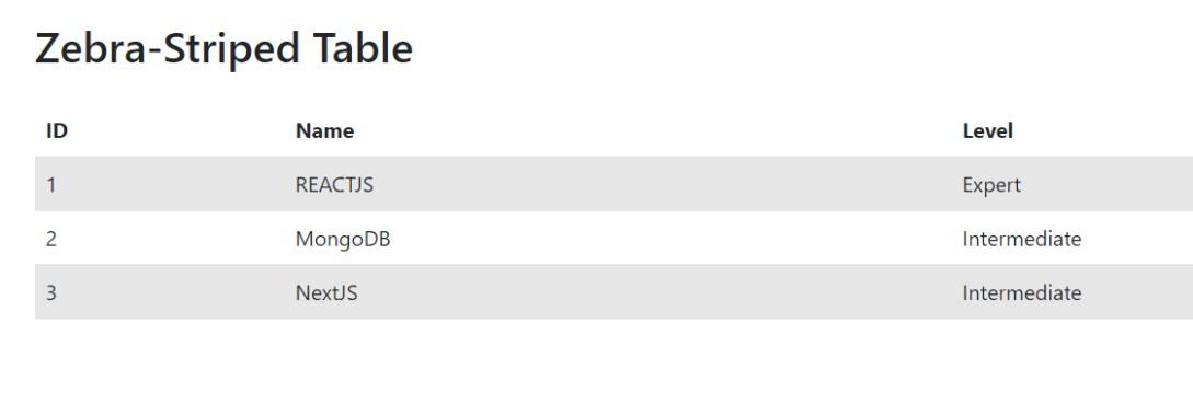
Example 2: Implementation to style horizontal zebra-striped table using nth selector.
<!DOCTYPE html>
<html lang="en">

<head>
    <meta charset="UTF-8">
    <meta name="viewport"
          content="width=device-width, initial-scale=1.0">
    <title>Zebra-Striped Table with Bootstrap 5</title>
    <!-- Bootstrap CSS -->
    <link href=
"https://cdn.jsdelivr.net/npm/bootstrap@5.3.0-alpha1/dist/css/bootstrap.min.css"
          rel="stylesheet">
    <style>
        .table-striped tbody tr:nth-child(odd) {
            background-color: #f2f2f2;
        }
    </style>
</head>

<body>

    <div class="container mt-5">
        <h2 class="mb-4">Zebra-Striped Table</h2>
        <table class="table table-striped">
            <thead>
                <tr>
                    <th>ID</th>
                    <th>Name</th>
                    <th>Level</th>
                </tr>
            </thead>
            <tbody>
                <tr>
                    <td>1</td>
                    <td>REACTJS</td>
                    <td>Expert</td>
                </tr>
                <tr>
                    <td>2</td>
                    <td>MongoDB</td>
                    <td>Intermediate</td>
                </tr>
                <tr>
                    <td>3</td>
                    <td>NextJS</td>
                    <td>Intermediate</td>
                </tr>
            </tbody>
        </table>
    </div>

    <!-- Bootstrap JS -->
    <script src=
"https://cdn.jsdelivr.net/npm/bootstrap@5.3.0-alpha1/dist/js/bootstrap.bundle.min.js">
      </script>

</body>

</html>
Output: