A game without buttons is like a TV without a remote i.e the player just watches, unable to interact. Buttons let players start games, pause action, buy items, or quit. This article shows how to create buttons and make them work.
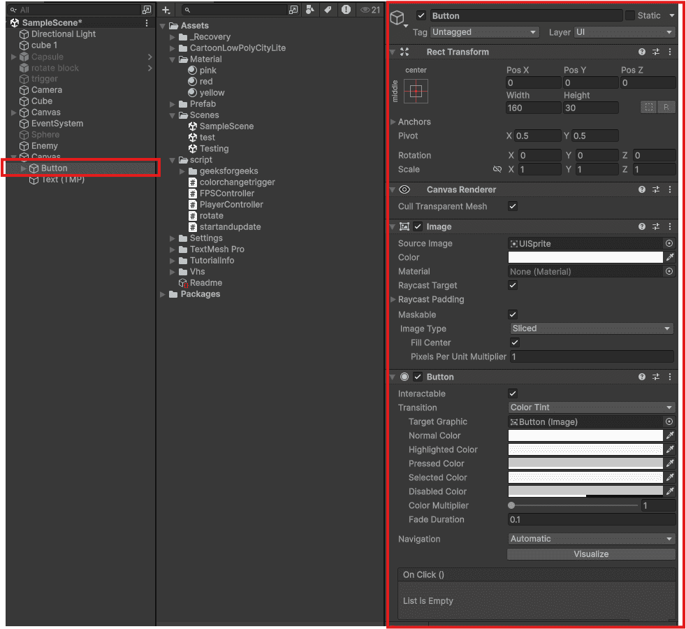
Button
A Button is a clickable UI element that triggers a function when pressed. Unity creates it with a background image and text label.
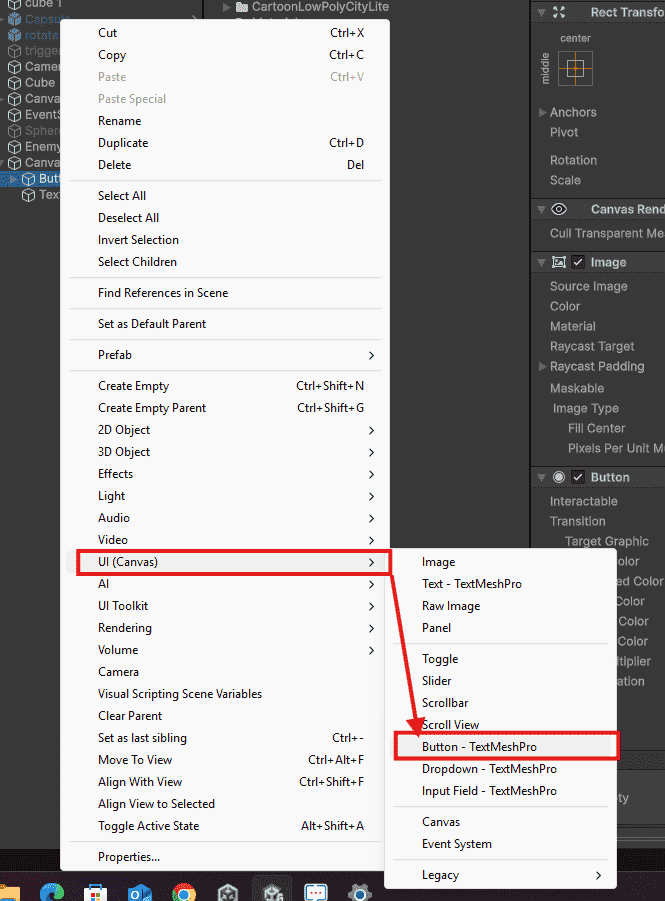
Creating a Button
- Right-click in Hierarchy - UI - Button - TextMeshPro
- Unity automatically creates Canvas, EventSystem, and the Button.
Connecting Button to Function
Step 1: Create a script with public methods
using UnityEngine.SceneManagement;
using UnityEngine;
public class MenuManager : MonoBehaviour
{
    public void StartGame()
    {
        SceneManager.LoadScene("GameLevel");
    }
    public void QuitGame()
    {
        Application.Quit();
    }
}
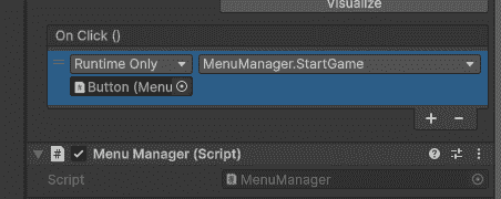
Step 2: Connect in Inspector
- Select Button → Find OnClick() section → Click "+"
- Drag GameObject (with script) into slot
- Select your function from dropdown
Output:
Pause Menu Example
When the game is paused, time stops and a menu appears. This script handles pausing and resuming.
public class PauseMenu : MonoBehaviour
{
    public GameObject pausePanel;
    public void Pause()
    {
        pausePanel.SetActive(true);  // Show pause menu
        Time.timeScale = 0f;         // Freeze game
    }
    public void Resume()
    {
        pausePanel.SetActive(false); // Hide pause menu
        Time.timeScale = 1f;         // Unfreeze game
    }
}
Time.timeScale = 0 freezes all movement, physics, and timers. Set back to 1 to resume normal gameplay. The pausePanel is a UI Panel that appears when paused.
Enable/Disable Button
Sometimes a button should not be clickable – like a "Buy" button when the player has no coins.
public Button buyButton;
void Update()
{
    if (playerCoins >= 100)
    {
        buyButton.interactable = true;   // Button works
    }
    else
    {
        buyButton.interactable = false;  // Button grayed out, no clicks
    }
}
interactable = false:disables the button, It becomes gray and ignores all clicks.interactable = true:re-enables it.
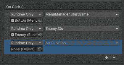
Multiple Actions on One Button
Click the "+" button multiple times in OnClick section. Each action runs in order when button is pressed.
Button Visual States
Button automatically changes appearance based on interaction:
- Normal: Default look
- Highlighted: Mouse hover
- Pressed: Clicking down
- Disabled: Not interactable (gray)
You can change colors for each state in the Button component under "Transition".
