A game looks unprofessional if UI elements are misplaced on different screens like buttons going off-screen on mobile or text getting cut on ultrawide monitors. Responsive UI design ensures your interface looks correct on every screen size. This article covers anchors, Canvas Scaler, and safe areas.
Responsive UI Design
Responsive UI means your interface automatically adjusts to different screen sizes and aspect ratios.
- A button at bottom-right should stay at bottom-right on all screens.
- Health bar at top-left should never go off-screen.
- Text should scale properly on mobile vs PC.
Problem Without Responsive Design
If you place a button at X = 500 on a 1920×1080 screen:
- On 1920×1080: Button is perfectly placed.
- On 1366×768: Button may go off-screen to the right.
- On 2560×1440: Button appears too far left.
Solution 1: Anchors
Anchors decide where a UI element sticks to the screen edges.
How to use:
- Select any UI element (Text, Button, Image).
- In Inspector, find the RectTransform component.
- Click the Anchor Preset box (star-shaped icon).
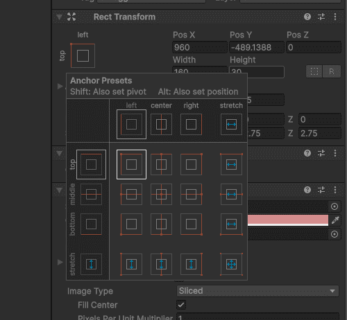
Common Anchor Settings:
| Anchor | Effect |
|---|---|
| Top-Left | Stays near top-left corner |
| Top-Center | Stays centered at top |
| Top-Right | Stays near top-right corner |
| Center | Stays in middle of screen |
| Bottom-Left | Stays near bottom-left |
| Bottom-Center | Stays centered at bottom |
| Bottom-Right | Stays near bottom-right |
| Stretch | Expands to fill width or height |
Practical Anchor Examples
1. Score Text (top-left):
- Click Anchor Preset - Select Top-Left
- Text stays at top-left regardless of screen size
2. Health Bar (top-center):
- Click Anchor Preset - Select Top-Center
- Health bar stays centered at top
3. Pause Button (bottom-right):
- Click Anchor Preset → Select Bottom-Right
- Button stays at bottom-right corner
Solution 2: Canvas Scaler
Canvas Scaler automatically scales all UI elements based on screen size.
Where to find: Select Canvas in Hierarchy - Inspector - Canvas Scaler component
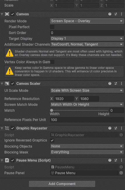
Important Settings:
| Setting | What it does | Best for |
|---|---|---|
| UI Scale Mode: Constant Pixel Size | No scaling | PC games (fixed resolution) |
| UI Scale Mode: Scale With Screen Size | Scales UI based on screen | Mobile, cross-platform |
| Reference Resolution | Base resolution to scale from | Set to your target (e.g., 1920x1080) |
| Screen Match Mode | Controls scaling (width, height, or both) | Set to 0.5 for balanced scaling |
Recommended settings for most games:
- Scale With Screen Size
- Reference Resolution: 1920 x 1080
- Screen Match Mode: 0.5
Safe Area - For Mobile Notch
Modern phones have notches, punch-holes, and rounded corners. UI can get hidden behind them.
Example:
public class SafeArea : MonoBehaviour
{
    void Start()
    {
        RectTransform rectTransform = GetComponent<RectTransform>();
        Rect safeArea = Screen.safeArea;
        Vector2 anchorMin = safeArea.position;
        Vector2 anchorMax = safeArea.position + safeArea.size;
        anchorMin.x /= Screen.width;
        anchorMin.y /= Screen.height;
        anchorMax.x /= Screen.width;
        anchorMax.y /= Screen.height;
        rectTransform.anchorMin = anchorMin;
        rectTransform.anchorMax = anchorMax;
    }
}
Attach this script to your Canvas. It automatically adjusts UI to avoid notches and rounded corners.
Complete Responsive
For most games:
- Canvas Scaler: Scale With Screen Size, Reference 1920×1080
- Anchors: Set each UI element to correct corner
- Safe Area script: Attach to Canvas for mobile
- Layout Groups: For dynamic lists (menus, inventory)
Common Mistakes
- Placing UI with absolute positions like X = 500, Y = 300 breaks on other screen sizes.
- Forgetting Canvas Scaler makes UI look tiny or huge on different resolutions.
- Not testing on different aspect ratios means 16:9 works but 21:9 may break.
- Ignoring safe areas on mobile causes UI to hide behind the notch.
