Bulma is an open-source CSS framework that provides pre-built components which can be combined together to make responsive websites and web applications. To use buttons as add-ons, we have to add a has-addons class on the field container. This will attach the buttons together.
Bulma Button addons Class:
- has-addons: If this class is added on a field container, the controls inside the container will attach together
Syntax:
<div class="field has-addons">
    <p class="control">
       <button class="button">
          ...
       </button>
    </p>
</div>
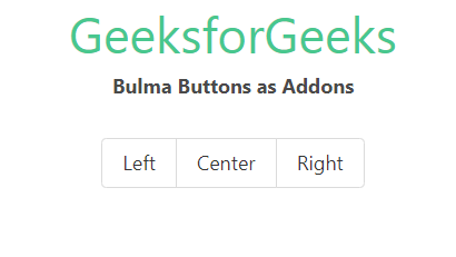
Example: In the example below, we used three buttons inside a field container and added a has-addons modifier to the field container.
<!DOCTYPE html>
<html>

<head>
    <title>Bulma Buttons as Addons</title>
    <link rel='stylesheet'
          href=
'https://cdn.jsdelivr.net/npm/bulma@0.9.3/css/bulma.min.css'>
    <style>
        .field.has-addons {
            justify-content: center;
        }
    </style>
</head>

<body class="has-text-centered">
    <h1 class="is-size-2 has-text-success">
      GeeksforGeeks</h1>
    <b>Bulma Buttons as Addons</b>
    <br><br>
    <div class="container">
        <div class="field has-addons">
            <p class="control">
                <button class="button">
                    Left
                </button>
            </p>


            <p class="control">
                <button class="button">
                    Center
                </button>
            </p>


            <p class="control">
                <button class="button">
                    Right
                </button>
            </p>


        </div>
    </div>
</body>

</html>
Output:
Reference: https://bulma.io/documentation/elements/button/#button-addons
