Bulma is an open-source, responsive, and lightweight CSS framework based on the Flexbox layout that provides ready-to-use front-end components. It is totally free you can easily combine it to build responsive web interfaces. It provides CSS classes to help you style your HTML code.
Bulma CSS Classes is a collection of CSS classes. CSS classes are used for style in our HTML code.
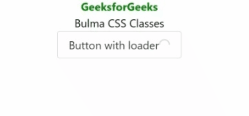
Example 1: Below example illustrates .loader class.
<!DOCTYPE html>
<html lang="en">

<head>
    <meta charset="UTF-8">
    <meta http-equiv="X-UA-Compatible" content="IE=edge">
    <meta name="viewport" content=
        "width=device-width, initial-scale=1.0">
    <link rel="stylesheet" href=
"https://cdn.jsdelivr.net/npm/bulma@0.9.3/css/bulma.min.css" />
    <style>
        * {
            text-align: center;
        }
    </style>
</head>

<body>
    <h1 style="color:green">
        GeeksforGeeks
    </h1>

    <h3 style="color:black">
        Bulma CSS Classes
    </h3>

    <button class="button">
        Button with loader
        <span class="loader"></span>
    </button>
</body>

</html>
Output:
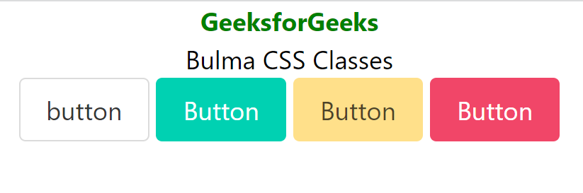
Example 2: Below example illustrates .button class.
<!DOCTYPE html>
<html lang="en">

<head>
    <meta charset="UTF-8">
    <meta http-equiv="X-UA-Compatible" content="IE=edge">
    <meta name="viewport" content=
        "width=device-width, initial-scale=1.0">
    <link rel="stylesheet" href=
"https://cdn.jsdelivr.net/npm/bulma@0.9.3/css/bulma.min.css" />

    <style>
        div {
            text-align: center;
        }
    </style>
</head>

<body>
    <div>
        <h1 style="color:green">
            GeeksforGeeks
        </h1>

        <h3 style="color:black">
            Bulma CSS Classes
        </h3>

        <button class="button">button</button>
        <button class="button is-primary">
            Button
        </button>
        <button class="button is-success">
            Button
        </button>
        <button class="button is-warning">
            Button
        </button>
        <button class="button is-danger">
            Button
        </button>
    </div>
</body>

</html>
Output:
Reference: https://bulma.dev/classes
