Bulma is a component-rich, modern, and lightweight CSS framework that is based on flexbox. It helps in building beautiful and responsive web interfaces easier and faster. In this article, we will be seeing what type of content can be used inside a dropdown component in Bulma.
So, an HTML <a> tag can be used directly as a dropdown item but we can also use an HTML <div> element as a dropdown item and fill the div element with whatever content we like. For example paragraphs, links, buttons, etc.
Variable Used:
| Variable-Name | Description | Type | Value | Computed Value | Computed Type |
|---|---|---|---|---|---|
| $dropdown-menu-min-width | This variable is used to provide the minimum width of the dropdown menu. | size | 12rem | ||
| $dropdown-content-background-color | This variable is used to provide the background color to the content of the dropdown. | variable | $scheme-main | hsl(0, 0%, 100%) | color |
| $dropdown-content-arrow | This variable is used to provide an arrow to the content of the dropdown. | $variable | $link | hsl(229, 53%, 53%) | color |
| $dropdown-content-offset | This variable is used to provide an offset to the content of the dropdown. | size | 4px | ||
| $dropdown-content-padding-bottom | This variable is used to provide bottom padding to the content of the dropdown. | size | 0.5rem | ||
| $dropdown-content-padding-top | This variable is used to provide top padding to the content of the dropdown. | size | 0.5rem | ||
| $dropdown-content-radius | This variable is used to provide a radius to the content of the dropdown. | variable | $radius | 4px | size |
| $dropdown-content-shadow | This variable is used to provide a shadow to the content of the dropdown. | variable | $shadow | 0 0.5em 1em -0.125em rgba($scheme-invert, 0.1), 0 0px 0 1px rgba($scheme-invert, 0.02) | shadow |
| $dropdown-content-z | This variable is used to provide an index to the content of the dropdown. | string | 20 | ||
| $dropdown-item-color | This variable is used to provide color to the item of the dropdown. | variable | $text | hsl(0, 0%, 29%) | color |
| $dropdown-item-hover-color | This variable is used to provide the hover effect to the item of the dropdown. | variable | $scheme-invert | hsl(0, 0%, 4%) | color |
| $dropdown-item-hover-background-color | This variable is used to provide background color to the hover effect in the dropdown. | variable | $background | hsl(0, 0%, 96%) | color |
| $dropdown-item-active-color | This variable is used to provide color to the active item of the dropdown. | variable | $link-invert | #fff | color |
| $dropdown-item-active-background-color | This variable is used to provide the background color to the active dropdown item. | variable | $link | hsl(229, 53%, 53%) | color |
| $dropdown-divider-background-color | This variable is used to provide background color to the divider of the dropdown. | variable | $border-light | hsl(0, 0%, 93%) | color |
Example 1: In the below code, we will make use of the above variable to modify the dropdown menu.
<!DOCTYPE html>
<html>

<head>
    <meta charset="utf-8">
    <meta name="viewport" content=
        "width=device-width,initial-scale=1">
    <link rel="stylesheet" href=
"https://cdn.jsdelivr.net/npm/bulma@0.8.0/css/bulma.min.css">
    <link rel="stylesheet" href="style.css">
    <title>Bulma Variable</title>
</head>

<body>
    <center>
        <h1 class="title" style="color:green;" >
            GeeksforGeeks
        </h1>
        <h3 class="subtitle">
            A computer science portal for geeks
        </h3>

        <div class='container has-text-centered'>
            <div class='columns is-mobile is-centered'>
                <div class='column is-5'>
                    <div class="dropdown is-active">
                        <div class="dropdown-trigger">
                            <button class="button"
                                    aria-haspopup="true"
                                    aria-controls="dropdown-menu">
                                <span>Language</span>
                                <span class="icon is-small">
                                    <i class="fas fa-angle-down"
                                       aria-hidden="true">
                                    </i>
                                </span>
                            </button>
                        </div>

                        <div class="dropdown-menu" id="dropdown-menu"
                             role="menu">
                            <div class="dropdown-content">
                                <a href="#" class="dropdown-item">
                                    C++
                                </a>
                                <a href="#" class="dropdown-item">
                                    JAVA
                                </a>
                                <a href="#" class="dropdown-item">
                                    C
                                </a>
                                <a href="#" class="dropdown-item">
                                    Python
                                </a>
                            </div>
                        </div>
                    </div>
                </div>
            </div>
        </div>
    </center>
</body>
</html>
SCSS Code:
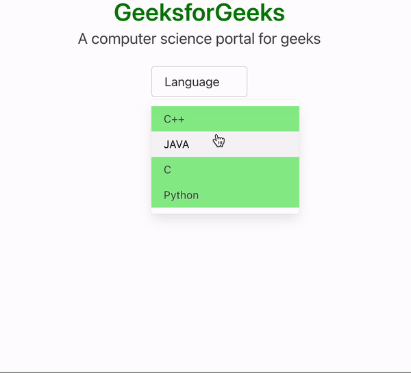
$dropdown-content-background-color: lightgreen;
a {
   background-color:$dropdown-content-background-color;
}
Compiled CSS Code:
a {
 background-color: lightgreen;
}
Output:
Example 2: In the below code, we will make use of the above variable to modify the dropdown menu.
<!DOCTYPE html>
<html>

<head>
    <meta charset="utf-8">
    <meta name="viewport" content=
        "width=device-width,initial-scale=1">
    <link rel="stylesheet" href=
"https://cdn.jsdelivr.net/npm/bulma@0.8.0/css/bulma.min.css">
    <link rel="stylesheet" href="style.css">
    <title>Bulma Variable</title>
</head>

<body>
    <center>
        <h1 class="title" style="color:green;" >
            GeeksforGeeks
        </h1>
        <h3 class="subtitle">
            A computer science portal for geeks
        </h3>

        <div class='container has-text-centered'>
            <div class='columns is-mobile is-centered'>
                <div class='column is-5'>
                    <div class="dropdown is-active">
                        <div class="dropdown-trigger">
                            <button class="button" aria-haspopup="true"
                                    aria-controls="dropdown-menu">
                                <span>Language</span>
                                <span class="icon is-small">
                                    <i class="fas fa-angle-down"
                                       aria-hidden="true"></i>
                                </span>
                            </button>
                        </div>

                        <div class="dropdown-menu" id="dropdown-menu"
                             role="menu">
                            <div class="dropdown-content">
                                <a href="#" class="dropdown-item">
                                    C++
                                </a>
                                <a href="#" class="dropdown-item">
                                    JAVA
                                </a>
                                <a href="#" class="dropdown-item">
                                    C
                                </a>
                                <a href="#" class="dropdown-item">
                                    Python
                                </a>
                            </div>
                        </div>
                    </div>
                </div>
            </div>
        </div>
    </center>
</body>
</html>
SCSS Code:
$dropdown-item-color: green;
.dropdown-item {
   color:$dropdown-item-color;
}
Compiled CSS Code:
.dropdown-item {
  color: green;
}
Output:

Reference: https://bulma.io/documentation/components/dropdown/#variables
