In this article, we will see the Bulma Form Control mixins sizes. The form control mixin size is a mixin that is used to create buttons and form controls in Bulma. Controls also have 3 more sizes other than normal size and they are as follows small, medium, and large.
Bulma Form Control mixins sizes Class: For creating a mixin, no specific class is provided by Bulma, instead we can create our class and then style the element with the help of SASS mixins.
Syntax:
<div class="bulma-control-mixin is-{size}">
    //statement
</div>

.bulma-control-mixin
{
      &.is-{size}
      {
        @include control-{size};
      }
}
Where {size} denotes {small, medium, large}.
Parameter: This mixin does not accept any parameter.
Note: You must know the implementation of SASS mixins for the below examples. Please see the pre-requisite given on the link and then implement the below code.
Example 1: Below example illustrates the Bulma Form Control mixins in small, and large sizes.
- index.html
<!DOCTYPE html>
<html lang="en">

<head>
    <link rel="stylesheet"
          href=
"https://cdn.jsdelivr.net/npm/bulma@0.9.3/css/bulma.min.css" />
    <script src=
"https://use.fontawesome.com/releases/v5.15.4/js/all.js">
    </script>
    <link rel="stylesheet" href="gfgstyles.css">
</head>

<body class="content container has-text-centered">
    <div>
        <p class="title is-1 text-success">
            GeekforGeeks
        </p>
        <p class="subtitle is-3">
            Bulma Form Control Mixins Sizes
        </p>
    </div>

    <div>
        <button class="bulma-control-mixin is-small">
            Form Control Small
        </button>
        <button class="bulma-control-mixin is-large">
            Form Control Large
        </button>
    </div>
</body>

</html>
- gfgstyles.scss
.text-success {
  color: darkgreen;
}

@mixin control-small() {
  border-radius: 7px;
  font-size: 14px;
  background: green;
  color: white;
}

@mixin control-large() {
  font-size: 28px;
  border-radius: 7px;
  background: green;
  color: white;
}

.bulma-control-mixin {
  &.is-small {
    @include control-small;
  }
  &.is-large {
    @include control-large;
  }
}
- gfgstyles.css
.text-success {
  color: darkgreen;
}
.bulma-control-mixin.is-small {
  border-radius: 7px;
  font-size: 14px;
  background: green;
  color: white;
}
.bulma-control-mixin.is-large {
  font-size: 28px;
  border-radius: 7px;
  background: green;
  color: white;
}
Output:

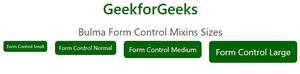
Example 2: Below example illustrates the Bulma Form Control mixins sizes mixin - All sizes.
- index.html
<!DOCTYPE html>
<html lang="en">

<head>
    <link rel="stylesheet"
          href=
"https://cdn.jsdelivr.net/npm/bulma@0.9.3/css/bulma.min.css" />
    <script src=
"https://use.fontawesome.com/releases/v5.15.4/js/all.js">
    </script>
    <link rel="stylesheet" href="gfgstyles.css">
</head>

<body class="content container has-text-centered">
    <div>
        <p class="title is-1 text-success">
            GeekforGeeks
        </p>
        <p class="subtitle is-3">
            Bulma Form Control Mixins Sizes
        </p>
    </div>

    <div>
        <button class="bulma-control-mixin is-small">
            Form Control Small
        </button>
        <button class="bulma-control-mixin">
            Form Control Normal
        </button>
        <button class="bulma-control-mixin is-medium">
            Form Control Medium
        </button>
        <button class="bulma-control-mixin is-large">
            Form Control Large
        </button>
    </div>
</body>

</html>
- gfgstyles.scss
.text-success {
  color: darkgreen;
}
$control-radius: 10px;
$control-border-width: 1px;

$control-height: 2.5em;
$control-line-height: 1.5;

$control-padding-vertical: calc(0.5em - #{$control-border-width});
$control-padding-horizontal: calc(0.75em - #{$control-border-width});

@mixin control() {
  -moz-appearance: none;
  -webkit-appearance: none;
  align-items: center;
  border: $control-border-width solid transparent;
  border-radius: $control-radius;
  box-shadow: none;
  display: inline-flex;
  font-size: 18px;
  height: $control-height;
  justify-content: flex-start;
  line-height: $control-line-height;
  padding-bottom: $control-padding-vertical;
  padding-left: $control-padding-horizontal;
  padding-right: $control-padding-horizontal;
  padding-top: $control-padding-vertical;
  position: relative;
  vertical-align: top;
  margin: 10px;
}

@mixin control-small() {
  border-radius: 7px;
  font-size: 14px;
}

@mixin control-medium() {
  font-size: 22px;
}

@mixin control-large() {
  font-size: 28px;
}

.bulma-control-mixin {
  @include control;
  background: darkgreen;
  color: white;
}

.bulma-control-mixin {
  &.is-small {
    @include control-small;
  }

  &.is-medium {
    @include control-medium;
  }

  &.is-large {
    @include control-large;
  }
}
- gfgstyles.css
.text-success {
  color: darkgreen;
}
.bulma-control-mixin {
  -moz-appearance: none;
  -webkit-appearance: none;
  align-items: center;
  border: 1px solid transparent;
  border-radius: 10px;
  box-shadow: none;
  display: inline-flex;
  font-size: 18px;
  height: 2.5em;
  justify-content: flex-start;
  line-height: 1.5;
  padding-bottom: calc(0.5em - 1px);
  padding-left: calc(0.75em - 1px);
  padding-right: calc(0.75em - 1px);
  padding-top: calc(0.5em - 1px);
  position: relative;
  vertical-align: top;
  margin: 10px;
  background: darkgreen;
  color: white;
}
.bulma-control-mixin.is-small {
  border-radius: 7px;
  font-size: 14px;
}
.bulma-control-mixin.is-medium {
  font-size: 22px;
}
.bulma-control-mixin.is-large {
  font-size: 28px;
}
Output: