Masonry Grid in CSS is a layout technique that arranges items in a way that resembles a masonry wall, where items of varying heights are placed in columns, filling in gaps and creating a staggered appearance. This can be done using Flexbox by allowing items to wrap and adjusting their heights to create a visually appealing, column-based layout.
These are the following approaches:
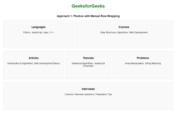
Flexbox with Manual Row Wrapping
In this approach, we are using Flexbox with manual row wrapping to create a masonry-like grid layout. By applying different flex values to the items, we simulate a masonry effect where items of varying sizes can be aligned, and Flexbox’s flex-wrap property makes sure they wrap appropriately within the container.
Example: The below example uses Flexbox with Manual Row Wrapping to create a Masonry grid with Flexbox in CSS.
<!DOCTYPE html>
<html lang="en">

<head>
    <title>Flexbox with Manual Row Wrapping</title>
    <style>
        body {
            display: flex;
            flex-direction: column;
            align-items: center;
            padding: 20px;
            font-family: Arial, sans-serif;
        }

        h1 {
            color: green;
        }

        h2 {
            margin-top: 20px;
            font-size: 1.2em;
            text-align: center;
        }

        .container {
            display: flex;
            flex-wrap: wrap;
            gap: 10px;
            max-width: 1200px;
        }

        .item {
            flex: 1 1 calc(33.333% - 10px);
            margin-bottom: 10px;
            background-color: #f9f9f9;
            border: 1px solid #ddd;
            border-radius: 5px;
            padding: 20px;
            box-sizing: border-box;
            text-align: center;
            min-height: 200px;
        }

        .item:nth-child(2) {
            flex: 1 1 calc(50% - 10px);
        }

        .item:nth-child(4) {
            flex: 1 1 calc(25% - 10px);
        }
    </style>
</head>

<body>
    <h1>GeeksforGeeks</h1>
    <h2>Flexbox with Manual Row Wrapping</h2>
    <div class="container">
        <div class="item">
            <h3>Languages</h3>
            <p>Python, JavaScript, Java, C++</p>
        </div>
        <div class="item">
            <h3>Courses</h3>
            <p>Data Structures, Algorithms,
              Web Development</p>
        </div>
        <div class="item">
            <h3>Articles</h3>
            <p>Introduction to Algorithms,
              Web Development Basics</p>
        </div>
        <div class="item">
            <h3>Tutorials</h3>
            <p>Advanced Algorithms,
              JavaScript Essentials</p>
        </div>
        <div class="item">
            <h3>Problems</h3>
            <p>Array Manipulation,
              String Matching</p>
        </div>
        <div class="item">
            <h3>Interviews</h3>
            <p>Common Interview Questions,
              Preparation Tips</p>
        </div>
    </div>
</body>

</html>
Output:
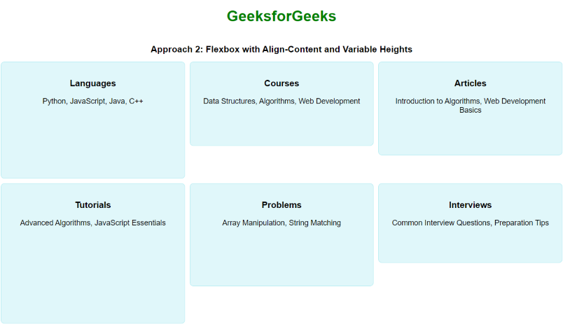
Flexbox with Align-Content and Variable Heights
In this approach, we are using Flexbox with align-content to manage the alignment of rows in the container, while setting variable heights for the items to create a masonry-like effect. This layout makes sure that items of different heights align neatly within the rows.
Example: The below example uses Flexbox with Align-Content and Variable Heights to Create a Masonry grid with flexbox in CSS.
<!DOCTYPE html>
<html lang="en">

<head>
    <title>Flexbox with Align-Content and Variable Heights</title>
    <style>
        body {
            display: flex;
            flex-direction: column;
            align-items: center;
            padding: 20px;
            font-family: Arial, sans-serif;
        }

        h1 {
            color: green;
        }

        h2 {
            margin-top: 20px;
            font-size: 1.2em;
            text-align: center;
        }

        .container {
            display: flex;
            flex-wrap: wrap;
            gap: 10px;
            max-width: 1200px;
            align-content: flex-start;
        }

        .item {
            background-color: #e0f7fa;
            border: 1px solid #b2ebf2;
            border-radius: 8px;
            padding: 15px;
            box-sizing: border-box;
            text-align: center;
            flex: 1 1 calc(33.333% - 10px);
            min-height: 150px;
        }

        .item:nth-child(1) {
            height: 250px;
        }

        .item:nth-child(2) {
            height: 180px;
        }

        .item:nth-child(3) {
            height: 200px;
        }

        .item:nth-child(4) {
            height: 300px;
        }

        .item:nth-child(5) {
            height: 220px;
        }

        .item:nth-child(6) {
            height: 170px;
        }
    </style>
</head>

<body>
    <h1>GeeksforGeeks</h1>
    <h2>Flexbox with Align-Content
      and Variable Heights</h2>
    <div class="container">
        <div class="item">
            <h3>Languages</h3>
            <p>Python, JavaScript, Java, C++</p>
        </div>
        <div class="item">
            <h3>Courses</h3>
            <p>Data Structures, Algorithms,
              Web Development</p>
        </div>
        <div class="item">
            <h3>Articles</h3>
            <p>Introduction to Algorithms,
              Web Development Basics</p>
        </div>
        <div class="item">
            <h3>Tutorials</h3>
            <p>Advanced Algorithms,
              JavaScript Essentials</p>
        </div>
        <div class="item">
            <h3>Problems</h3>
            <p>Array Manipulation, String Matching</p>
        </div>
        <div class="item">
            <h3>Interviews</h3>
            <p>Common Interview Questions,
              Preparation Tips</p>
        </div>
    </div>
</body>

</html>
Output: