A text divider is a visual element used to separate content within a web page providing clarity and improving readability. In CSS we can create text dividers using various approaches such as horizontal lines, background images, or pseudo-elements.
Below are the approaches to create a text divider with CSS:
Table of Content
Using a Horizontal Line
This approach utilizes the <hr> element, Which is a standard HTML element for horizontal lines and we can customize it with CSS to separate a text divider.
Example: Below example shows the implementation of the above-mentioned approach.
<!DOCTYPE html>
<html>
<head>
<title>CSS Divider Example</title>
<style>
hr.custom-divider {
border: none;
height: 1px;
background-color: #000;
margin: 20px 0;
}
</style>
</head>
<body>
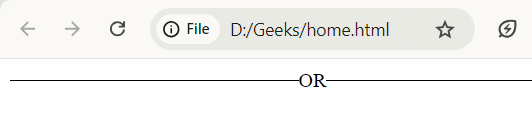
<hr class="custom-divider">
<p>Content after the divider</p>
</body>
</html>
Output:

Using Pseudo-Elements
This approach involves using the ::before or ::after pseudo elements to create dividers around text. This method provides greater flexibility in design.
Example: Below example shows the implementation of the above-mentioned approach.
<!DOCTYPE html>
<html>

<head>
    <title>CSS Divider Example</title>
    <style>
        .divider-with-pseudo::before {
            content: "";
            display: inline-block;
            width: 30%;
            height: 1px;
            background-color: #000;
            vertical-align: middle;
            margin-right: 10px;
        }

        .divider-with-pseudo::after {
            content: "";
            display: inline-block;
            width: 30%;
            height: 1px;
            background-color: #000;
            vertical-align: middle;
            margin-left: 10px;
        }
    </style>
</head>

<body>
    <p class="divider-with-pseudo">Content Divider</p>
</body>

</html>
Output:

Using Background Images or Gradients
We can create dividers using CSS background images or gradients allowing for complex and decorative designs.
Example: Below example shows the implementation of the above-mentioned approach.
<!DOCTYPE html>
<html>
<head>
<title>CSS Divider Example</title>
<style>
.text-divider-bg {
max-width: 700px;
background: linear-gradient(to right, #952222, transparent);
height: 5px;
margin: 20px 0;
position: relative;
}
.text-divider-bg span {
background: #fff;
padding: 0 10px;
position: relative;
top: -10px;
}
</style>
</head>
<body>
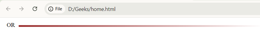
<div class="text-divider-bg">
<span>OR</span>
</div>
</body>
</html>
Output:
Using Flex box and Borders
Flex box can be used to create dividers by aligning text and borders in a row this method is ideal for creating centered or justified text dividers.
Example: Below example shows the implementation of the above-mentioned approach.
<!DOCTYPE html>
<html>

<head>
    <title>Using Flex box and Borders</title>
    <style>
        .flex-divider {
            display: flex;
            align-items: center;
            text-align: center;
        }

        .flex-divider::before,
        .flex-divider::after {
            content: '';
            flex: 1;
            border-bottom: 1px solid #000;
        }

        .flex-divider::before {
            margin-right: 10px;
        }

        .flex-divider::after {
            margin-left: 10px;
        }
    </style>
</head>

<body>
    <div class="flex-divider">OR</div>

</body>

</html>
Output:
Using CSS Grid
CSS grid allows for more complex layouts and can be used to create dividers that align with a grid structure.
Example: Below example shows the implementation of the above-mentioned approach.
<!DOCTYPE html>
<html>
<head>
<title>Using Css Grid</title>
<style>
.grid-divider {
display: grid;
grid-template-columns: 1fr auto 1fr;
align-items: center;
}
.grid-divider::before,
.grid-divider::after {
content: "";
height: 1px;
background-color: #000;
}
</style>
</head>
<body>
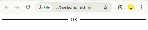
<div class="grid-divider">OR</div>
</body>
</html>
Output: