Customizing font size in Tailwind CSS involves using the text-[size] utility class, where [size] can be predefined size identifiers like xs, sm, md, lg, xl, or numerical values. Additionally, you can extend the default font sizes in the configuration file for more customization.
Syntax
<p class="text-lg">
    This text has a large font size.
</p>
Note: The font-size utility class in Tailwind CSS accepts numeric values ranging from 0 to 96, representing font sizes in pixels (px).
The below table illustrates the font size classes alongside their corresponding descriptions.
| Classes | Description |
|---|---|
text-xs | Extra small text. |
text-sm | Small text. |
text-base | Base text size (default). |
text-lg | Large text. |
text-xl | Extra-large text. |
text-2xl | 2 times extra-larger text. |
text-3xl | 3 times extra-larger text. |
text-4xl | 4 times extra-larger text. |
text-5xl | 5 times extra-larger text. |
text-6xl | 6 times extra-larger text. |
text-7xl | 7 times extra-larger text. |
text-8xl | 8 times extra-larger text. |
text-9xl | 9 times extra-larger text. |
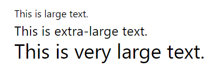
Example: Seting the different font sizes using Tailwind CSS.
<!DOCTYPE html>
<html>

<head>
    <script src="https://cdn.tailwindcss.com/3.4.16"></script>
</head>

<body>
    <p class="text-lg">This is large text.</p>
    <p class="text-2xl">This is extra-large text.</p>
    <p class="text-4xl">This is very large text.</p>
</body>

</html>
Output
Configuration (Optional)
// tailwind.config.js

module.exports = {
    theme: {
        extend: {
            fontSize: {
                '2xl': '1.75rem',
                '3xl': '2rem',
            },
        },
    },

    // Other Tailwind configurations...
};
Key Features
- Predefined Sizes: Tailwind provides predefined font sizes (
xs,sm,md,lg,xl) for quick and consistent styling. - Numerical Control: Use numerical values for precise control over font size, allowing pixel-perfect adjustments.
- Configuration Flexibility: Extend or customize font sizes in the
tailwind.config.jsfile for project-specific requirements. - Responsive Design: Apply responsive variants (
sm:,md:,lg:,xl:) to adapt font sizes based on different screen sizes.
