The Style animationTimingFunction property in HTML DOM defines the time of transition between the styles to make transitions smooth. It specifies the speed curve of an animation.
Syntax:
animation-timing-function: cubic-bezier(n1, n2, n3, n4)|linear
|ease|ease-in|ease-out|initial|inherit;
Return Values: It returns a String that represents the animation-timing-function property of an element
Property Values:
- cubic-bezier(n1, n2, n3, n4): Animation timings are specified using the cubic bezier function. The value of n1, n2, n3 and n4 lies between 0 to 1.
- linear: The animation plays with the same speed from start to end.
- ease: The animation starts slowly, then fast, and then finally ends slowly. It is the default value.
- ease-in: If this value is specified then the animation begins with a slow start.
- ease-out: The animation plays normally but ends slowly. This is similar to ease-in.
- ease-in-out: The animation both starts and ends slowly.
- initial: It sets the animationTimingFunction property to its default value.
- inherit: The animationTimingFunction property inherited from its parent element.
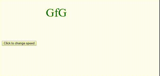
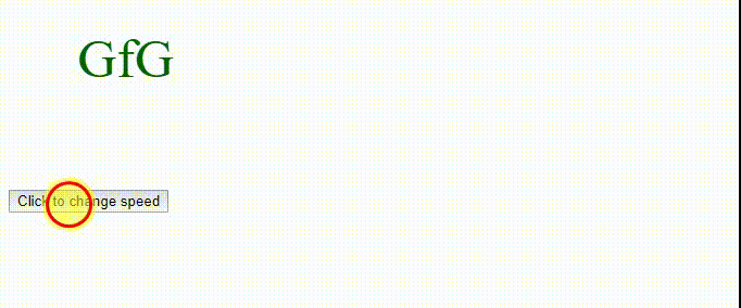
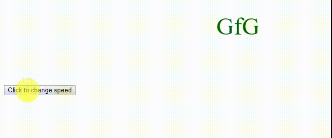
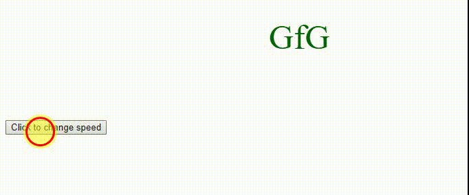
Example: cubic-bezier(n1, n2, n3, n4)
<!DOCTYPE html>
<html>

<head>
    <style>
        div {
            font-size: 50px;
            color: darkgreen;
            position: relative;
            height: 150px;
            width: 150px;
            animation: movement 5s infinite;
            -webkit-animation: movement 5s infinite;
        }

        @-webkit-keyframes movement {
            from {left: 50px;}
            to {left: 500px;}
        }

        @keyframes movement {
            from {left: 50px;}
            to {left: 500px;}
        }
    </style>
</head>

<body>
    <div id = "geeks">
        GfG
    </div>

    <button onclick = "myText()">
        Click to change speed
    </button>

    <script>
    function myText() {
    document.getElementById("geeks").style.WebkitAnimationTimingFunction
            = "cubic-bezier(0.7,0.1,0.3,0.2)";

    document.getElementById("geeks").style.animationTimingFunction
            = "cubic-bezier(0.7,0.1,0.3,0.2)";
    }
    </script>
</body>

</html>
Output:
- Before Click on the button:
- After Click on the button:
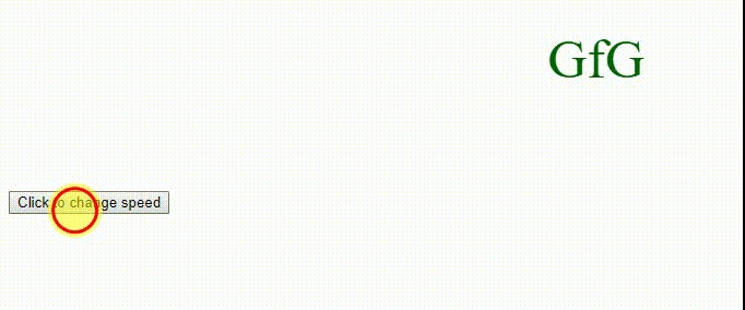
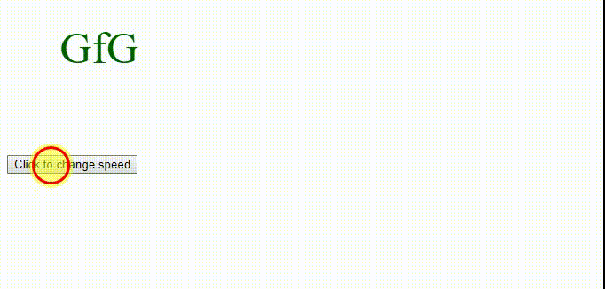
Example: linear
<!DOCTYPE html>
<html>

<head>
    <style>
        div {
            font-size: 50px;
            color: darkgreen;
            position: relative;
            height: 150px;
            width: 150px;
            animation: movement 5s infinite;
            -webkit-animation: movement 5s infinite;
        }

        @-webkit-keyframes movement {
            from {left: 50px;}
            to {left: 500px;}
        }

        @keyframes movement {
            from {left: 50px;}
            to {left: 500px;}
        }
    </style>
</head>

<body>
    <div id = "geeks">
        GfG
    </div>

    <button onclick="myText()">
        Click to change speed
    </button>

    <script>
    function myText() {
    document.getElementById("geeks").style.WebkitAnimationTimingFunction
            = "linear";

    document.getElementById("geeks").style.animationTimingFunction
            = "linear";
    }
    </script>
</body>

</html>
Output:
- Before Click on the button:
- After Click on the button:
Example: ease
<!DOCTYPE html>
<html>

<head>
    <style>
        div {
            font-size: 50px;
            color: darkgreen;
            position: relative;
            height: 150px;
            width: 150px;
            animation: movement 5s infinite;
            -webkit-animation: movement 5s infinite;
        }

        @-webkit-keyframes movement {
            from {left: 50px;}
            to {left: 500px;}
        }

        @keyframes movement {
            from {left: 50px;}
            to {left: 500px;}
        }
    </style>
</head>

<body>
    <div id = "geeks">
        GfG
    </div>

    <button onclick = "myText()">
        Click to change speed
    </button>

    <script>
    function myText() {
    document.getElementById("geeks").style.WebkitAnimationTimingFunction
            = "ease";

    document.getElementById("geeks").style.
            = "ease";
    }
    </script>
</body>

</html>
Output:
- Before Click on the button:
- After Click on the button:
Example: ease-in
<!DOCTYPE html>
<html>

<head>
    <style>
        div {
            font-size: 50px;
            color: darkgreen;
            position: relative;
            height: 150px;
            width: 150px;
            animation: movement 5s infinite;
            -webkit-animation: movement 5s infinite;
        }

        @-webkit-keyframes movement {
            from {left: 50px;}
            to {left: 500px;}
        }

        @keyframes movement {
            from {left: 50px;}
            to {left: 500px;}
        }
    </style>
</head>

<body>
    <div id = "geeks">
        GfG
    </div>

    <button onclick = "myText()">
        Click to change speed
    </button>

    <script>
    function myText() {
    document.getElementById("geeks").style.WebkitAnimationTimingFunction
            = "ease-in";

    document.getElementById("geeks").style.animationTimingFunction
            = "ease-in";
    }
    </script>
</body>

</html>
Output:
- Before Click on the button:
- After Click on the button:
Example: ease-out
<!DOCTYPE html>
<html>

<head>
    <style>
        div {
            font-size: 50px;
            color: darkgreen;
            position: relative;
            height: 150px;
            width: 150px;
            animation: movement 5s infinite;
            -webkit-animation: movement 5s infinite;
        }

        @-webkit-keyframes movement {
            from {left: 50px;}
            to {left: 500px;}
        }

        @keyframes movement {
            from {left: 50px;}
            to {left: 500px;}
        }
    </style>
</head>

<body>
    <div id = "geeks">
        GfG
    </div>

    <button onclick = "myText()">
        Click to change speed
    </button>

    <script>
    function myText() {
    document.getElementById("geeks").style.WebkitAnimationTimingFunction
            = "ease-out";

    document.getElementById("geeks").style.animationTimingFunction
            = "ease-out";
    }
    </script>
</body>

</html>
Output:
- Before Click on the button:
- After Click on the button:
Example: ease-in-out
<!DOCTYPE html>
<html>

<head>
    <style>
        div {
            font-size: 50px;
            color: darkgreen;
            position: relative;
            height: 150px;
            width: 150px;
            animation: movement 5s infinite;
            -webkit-animation: movement 5s infinite;
        }

        @-webkit-keyframes movement {
            from {left: 50px;}
            to {left: 500px;}
        }

        @keyframes movement {
            from {left: 50px;}
            to {left: 500px;}
        }
    </style>
</head>

<body>
    <div id = "geeks">
        GfG
    </div>

    <button onclick = "myText()">
        Click to change speed
    </button>

    <script>
    function myText() {
    document.getElementById("geeks").style.WebkitAnimationTimingFunction
            = "ease-in-out";

    document.getElementById("geeks").style.animationTimingFunction
            = "ease-in-out";
    }
    </script>
</body>

</html>
Output:
- Before Click on the button:
- After Click on the button:
Supported Browsers: The browser supported by DOM style animationTimingFunction property are listed below:
- Chrome 43.0 and above
- Edge 12.0 and above
- Firefox 16.0 and above
- Internet Explorer 10.0 and above
- Safari 9.0 and above
- Opera 30.0 and above
