BlueprintJS is a React-based UI toolkit for the web. This library is very optimized and popular for building complex data-dense interfaces for desktop applications. In this article, we will discuss React.js BluePrint Menu Component Dropdown.
A Menu is a list of interactive items. To display a Menu as a dropdown we can use Menu as the content property of the Popover Component provided by BlueprintJS. The Popover will be closed as soon as a MenuItem is clicked, to change this behavior, we can set the shouldDismissPopover of the MenuItem to false.
React.js BluePrint Menu Component Dropdowns Properties:
1. Popover Properties:
- content: This property can be used to assign a menu as the content of the popover.
- position: This property is used to choose the position of the popover content to be opened.
2. MenuItem Properties:
- shouldDismissPopover: This boolean property is used to disable the default behavior of closing the popover whenever a MenuItem is clicked.
Syntax:
<Popover content={<Menu>...</Menu>}
         position={...}>
   <Button text="..." />
</Popover>
Creating React Application And Installing Modules:
Step 1: Create a React application using the following command:
npx create-react-app myApp
Step 2: After creating your project folder i.e. myApp, move to it using the following command:
cd myApp
Step 3: After creating the ReactJS application, Install the required modules using the following command:
npm install @blueprintjs/core @blueprintjs/icons
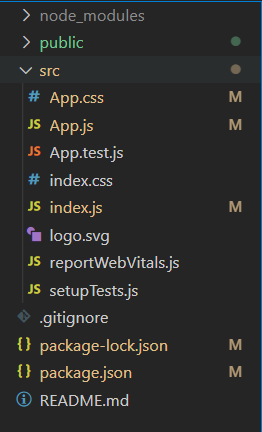
Project Structure: After following the above steps, the project structure will look as below:
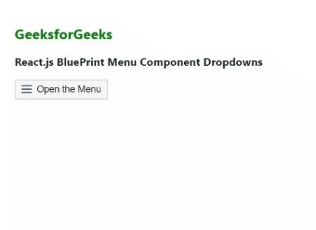
Example 1: Now write down the following code in the App.js file. In this example, assigned a Menu as the content of the popover to open it as a dropdown.
import React from 'react'
import { Menu, MenuItem, Icon, Position, Button }
    from '@blueprintjs/core';
import '@blueprintjs/core/lib/css/blueprint.css';
import '@blueprintjs/icons/lib/css/blueprint-icons.css'
import { Popover2 } from '@blueprintjs/popover2';

function App() {

    const menu = <Menu
        style={{
            backgroundColor: "#BFFFAF",
            width: "150px"
        }}>
        <MenuItem text="Your Profile" />
        <MenuItem icon="home" text="Home" />
        <MenuItem icon="build" text="Practice" />
        <MenuItem icon="book" text="Courses" />
        <MenuItem icon="cog"
            labelElement={<Icon icon="share" />}
            text="Settings..." intent="primary"
        />
    </Menu>

    const divStyle = {
        display: 'block', width: 500,
        padding: 30
    };
    return (
        <div style={divStyle}>
            <h2
                style={{ color: "green" }}>GeeksforGeeks
            </h2>
            <h3>
                React.js BluePrint Menu Component Dropdowns
            </h3>

            <Popover2
                content={menu}
                position={Position.BOTTOM_RIGHT}>
                <Button icon="menu">Open the Menu</Button>
            </Popover2>
        </div>
    );
}

export default App;
Steps to run the app: Execute the following command from your project folder to run the app.
npm start
Output:

Example 2: In this example, we set the shouldDismissPopover property to false so that the popover does not close when we click on the Home and Practice MenuItem.
import React from 'react'
import { Menu, MenuItem, Icon, Position, Button }
    from '@blueprintjs/core';
import '@blueprintjs/core/lib/css/blueprint.css';
import '@blueprintjs/icons/lib/css/blueprint-icons.css'
import { Popover2 } from '@blueprintjs/popover2';

function App() {

    const menu = <Menu
        style={{
            backgroundColor: "#BFFFAF",
            width: "150px"
        }}>
        <MenuItem text="Your Profile" />
        <MenuItem
            icon="home" text="Home"
            shouldDismissPopover={false} />
        <MenuItem
            icon="build" text="Practice"
            shouldDismissPopover={false} />
        <MenuItem icon="book" text="Courses" />
        <MenuItem icon="cog"
            labelElement={<Icon icon="share" />}
            text="Settings..." intent="primary"
        />
    </Menu>

    const divStyle = {
        display: 'block', width: 500,
        padding: 30
    };
    return (
        <div style={divStyle}>
            <h2
                style={{ color: "green" }}>GeeksforGeeks
            </h2>
            <h3>
                React.js BluePrint Menu Component Dropdowns
            </h3>

            <Popover2
                content={menu}
                position={Position.BOTTOM_RIGHT}>
                <Button icon="menu">Open the Menu</Button>
            </Popover2>
        </div>
    );
}

export default App;
Output:
Reference: https://blueprintjs.com/docs/#core/components/menu.dropdowns
