The Material UI (MUI) Grid layout is a responsive layout grid that adapts to screen size and orientation, ensuring consistency across layouts, built on CSS Flexbox to fluidly organize and structure your user interface. It streamlines complex web design by allowing you to:
- Utilize a 12-column architecture: Divide available space proportionally using a flexible, standardized column system.
- Scale responsively: Automatically adapt component sizing and arrangement across varying screen widths and devices.
- Align fluidly: Effortlessly position, space, and distribute elements utilizing modern Flexbox capabilities.
Syntax:
<Grid> ... </Grid>MUI Grid Layout Variants:
- Spacing: The spacing value can be any positive number, including decimals and any string.
- Responsive values: The grid layout supports all the responsive values like columns, columnSpacing, direction, rowSpacing, and spacing.
- Auto-layout: The Auto-layout makes the items equitably share the available space and can set the width of one item and the others will automatically resize around it.
- Nested Grid: The container and item props are two independent booleans and can be combined to allow a Grid component to be both a flex container and child acting as a nested grid.
- Columns: We change the default number of columns (12) with the help of columns prop.
- System props: The grid layout supports all system properties and can be used as props directly on the component.
Steps to Create React App and Installing Modules
Step 1: Initialize a React project. Check this post for setting up React app.
Step 2: After creating the ReactJS application, Install the required module using the following command:
npm install @mui/material @emotion/react @emotion/styledStep 3: Implement MUI Grid a given in below examples.
Step 4: Run the react app using the below command.
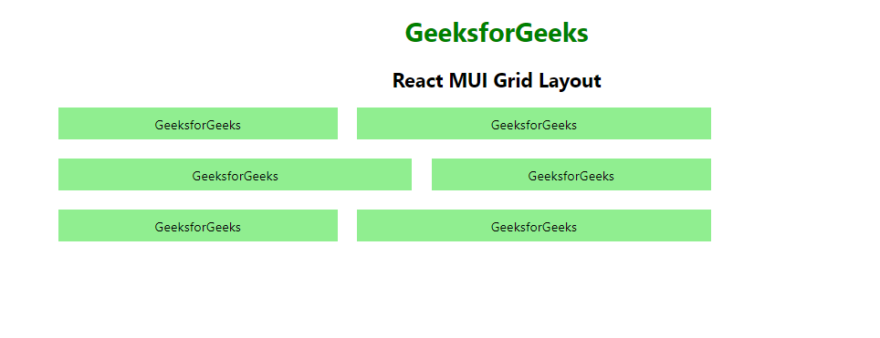
npm startExample 1: This example demonstrates the React MUI fluid grid layout.
import {
    Grid,
} from "@mui/material";
import { Box } from "@mui/system";
import * as React from "react";

function App() {
    return (
        <center>
            <div>
                <h1 style={{ color: "green" }}>GeeksforGeeks</h1>
                <h2>React MUI Grid Layout</h2>
            </div>
            <div style={{ width: "50%" }}>
                <Grid container spacing={3}>
                    <Grid item xs={4}>
                        <Box sx={{ backgroundColor: 'lightgreen',
                            padding: 1, textAlign: 'center', }}>
                            GeeksforGeeks
                        </Box>
                    </Grid>
                    <Grid item xs={5}>
                        <Box sx={{ backgroundColor: 'lightgreen',
                            padding: 1, textAlign: 'center', }}>
                            GeeksforGeeks
                        </Box>
                    </Grid>
                    <Grid item xs={5}>
                        <Box sx={{ backgroundColor: 'lightgreen',
                            padding: 1, textAlign: 'center', }}>
                            GeeksforGeeks
                        </Box>
                    </Grid>
                    <Grid item xs={4}>
                        <Box sx={{ backgroundColor: 'lightgreen',
                            padding: 1, textAlign: 'center', }}>
                            GeeksforGeeks
                        </Box>
                    </Grid>
                    <Grid item xs={4}>
                        <Box sx={{ backgroundColor: 'lightgreen',
                            padding: 1, textAlign: 'center', }}>
                            GeeksforGeeks
                        </Box>
                    </Grid>
                    <Grid item xs={5}>
                        <Box sx={{ backgroundColor: 'lightgreen',
                            padding: 1, textAlign: 'center', }}>
                            GeeksforGeeks
                        </Box>
                    </Grid>
                </Grid>
            </div>
        </center>
    );
}

export default App;
Output:
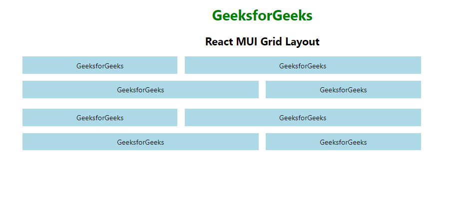
Example 2: Below example demonstrates the React MUI nested grid layout.
import {
    Grid,
} from "@mui/material";
import { Box } from "@mui/system";
import * as React from "react";

function GridComponent() {
    return (
        <React.Fragment>
            <Grid item xs={4}>
                <Box sx={{ backgroundColor: 'lightblue',
                    padding: 1, textAlign: 'center', }}>
                    GeeksforGeeks
                </Box>
            </Grid>
            <Grid item xs={6}>
                <Box sx={{ backgroundColor: 'lightblue',
                    padding: 1, textAlign: 'center', }}>
                    GeeksforGeeks
                </Box>
            </Grid>
            <Grid item xs={6}>
                <Box sx={{ backgroundColor: 'lightblue',
                    padding: 1, textAlign: 'center', }}>
                    GeeksforGeeks
                </Box>
            </Grid>
            <Grid item xs={4}>
                <Box sx={{ backgroundColor: 'lightblue',
                    padding: 1, textAlign: 'center', }}>
                    GeeksforGeeks
                </Box>
            </Grid>
        </React.Fragment>
    )
}

function App() {
    return (
        <center>
            <div>
                <h1 style={{ color: "green" }}>
                    GeeksforGeeks
                </h1>
                <h2>React MUI Grid Layout</h2>
            </div>
            <div style={{ width: "50%" }}>
                <Grid container spacing={3}>
                    <Grid container item spacing={2}>
                        <GridComponent />
                    </Grid>
                    <Grid container item spacing={2}>
                        <GridComponent />
                    </Grid>
                </Grid>
            </div>
        </center>
    );
}

export default App;
Output:
Reference: https://mui.com/material-ui/react-grid/
