Text can be Shrinked or condensed using some HTML and CSS properties, you can use this animation in your websites as headings or sub-headings, the below sections will guide you on how to create the desired effect.
HTML Code: In this section we have simple div element which contains the text separated with span tags.
<!DOCTYPE html>
<html lang="en">

<head>
    <meta charset="UTF-8">
    <meta name="viewport" content="width=device-width, initial-scale=1.0">
    <title>Shrink Text</title>
</head>

<body>
    <div>
        <span>G</span><span>EEKS</span>
        <span>F</span><span>OR</span>
        <span>G</span><span>EEKS</span>
    </div>
</body>

</html>
CSS Code: In this code first we design the div element using basic CSS properties and then to create the shrink effect we use the nth-child() Selector and set the letter spacing to -1em when we hover over the text.
<style>
    * {
        margin: 0;
        padding: 0;
    }

    /* designing the text*/
    div {
        position: absolute;
        top: 50%;
        left: 50%;
        transform: translate(-50%, -50%);
        display: flex;
        font-size: 2.5em;
        color: rgb(4, 110, 4);
    }

    /*creating the shrink animation*/
    span:nth-child(even) {
        overflow: hidden;
        letter-spacing: 0;
        transition: 1s;
    }

    div:hover span:nth-child(even) {
        letter-spacing: -1em;
    }
</style>
Final Code: It is the combination of the above two code sections.
<!DOCTYPE html>
<html lang="en">

<head>
    <meta charset="UTF-8">
    <meta name="viewport" content="width=device-width, initial-scale=1.0">
    <title>Shrink Text</title>
</head>
<style>
    * {
        margin: 0;
        padding: 0;
    }

    /* designing the text*/
    div {
        position: absolute;
        top: 50%;
        left: 50%;
        transform: translate(-50%, -50%);
        display: flex;
        font-size: 2.5em;
        color: rgb(4, 110, 4);
    }

    /*creating the shrink animation*/
    span:nth-child(even) {
        overflow: hidden;
        letter-spacing: 0;
        transition: 1s;
    }

    div:hover span:nth-child(even) {
        letter-spacing: -1em;
    }
</style>

<body>
    <div>
        <span>G</span><span>EEKS</span>
        <span>F</span><span>OR</span>
        <span>G</span><span>EEKS</span>
    </div>
</body>

</html>
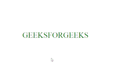
Output: