In this project, we'll craft a modern and responsive email subscription form, leveraging the simplicity of HTML and the power of Tailwind CSS for a clean design. We'll focus on an adaptive structure, seamlessly fitting all screen sizes by utilizing flexbox and media queries to ensure a superb user experience.
Prerequisites:
Build an Email Subscription Site
- Step 1: Set up your HTML with the Tailwind CSS CDN. Create a main
divto center content vertically and horizontally with abg-zinc-700background. - Step 2: Inside, build the main card
div(bg-zinc-800,rounded-2xl). Use a flex container (flex-col,md:flex-row) within it to arrange the image and content responsively. - Step 3: Add a
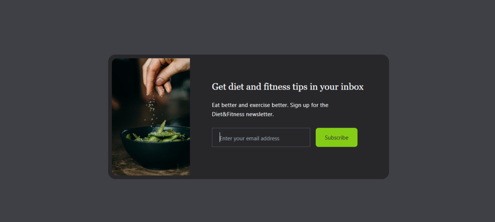
<img>tag for yourimage.jpgwith styling for size (h-80,md:h-64), rounded corners (rounded-xl), and hover effects (transform hover:scale-105). - Step 4: Create content
divwith padding. Include a<h2>for title and a<p>for description, applying text styling and responsive alignment. - Step 5: For the form, make another flex container
div(flex-col,md:flex-row). Inside, add a<input type="text">with placeholder text, a dark background, a border, and white text. - Step 6: Add the "Subscribe"
<button>styled with padding,text-xsrounded-mdbg-lime-500and interactive hover effects.
filename: index.html
<!DOCTYPE html>
<html lang="en">

<head>
  <meta charset="UTF-8" />
  <meta http-equiv="X-UA-Compatible" content="IE=edge" />
  <meta name="viewport" content="width=device-width, initial-scale=1.0" />
  <script src="https://cdn.tailwindcss.com/3.4.16"></script>
  <title>Email Subscribe</title>
</head>
<body>
  <!-- Background Container -->
  <div class="flex items-center justify-center h-screen bg-zinc-700">
    <!-- Card -->
    <div class="bg-zinc-800 p-2 mx-6 rounded-2xl">
      <!-- Flex Container -->
      <div class="flex flex-col md:flex-row rounded-l-xl">
        <!-- Image -->
        <img src="images/image.jpg" alt=""
          class="object-fit rounded-xl h-80 md:h-64 md:rounded-l-xl md:rounded-r-none transform hover:scale-105 hover:rounded-xl duration-200" />
        <!-- Content -->
        <div class="p-6 md:p-12">
          <h2 class="font-serif text-xl font-medium text-center text-white md:text-left">
            Get diet and fitness tips in your inbox
          </h2>

          <p class="max-w-xs my-4 text-xs leading-5 tracking-wide text-center text-white md:text-left">
            Eat better and exercise better. Sign up for the Diet&Fitness
            newsletter.
          </p>

          <div class="flex flex-col mt-5 space-y-4 md:space-x-3 md:flex-row md:space-y-0">
            <input type="text" placeholder="Enter your email address"
              class="p-2 px-4 text-center text-white bg-zinc-800 border border-zinc-600 placeholder:text-xs placeholder:text-center md:text-left placeholder:md:text-left focus:outline-none" />

            <button
              class="px-5 py-3 text-xs rounded-md text-zinc-800 bg-lime-500 hover:bg-lime-700 hover:text-white duration-500">
              Subcribe
            </button>
          </div>
        </div>
      </div>
    </div>
  </div>
</body>

</html>
Output:
Note: Experiment with your email subscribe site by adding interactive features to the navigation bar, header, body, and content containers. Think about hover effects, animated transitions, collapsible menus, or even dark mode toggles to deliver a more dynamic and user-friendly experience.
