


 本文深入探讨CSS定位,包括静态、相对、绝对、固定定位的原理和应用场景,以及z-index的使用,帮助理解元素的显示与隐藏机制。重点介绍了相对定位、绝对定位和固定定位的特点及实战案例。
文章目录
定位导读
1.1 为什么需要定位
定位可以让盒子自由地在某个盒子内移动位置或固定屏幕中的某个位置,并且可以压住其他盒子。
1.2 定位组成
定位 = 定位模式 + 边偏移
定位模式用于指定一个元素在文档中的定位方式,通过CSS的positon属性设置,其值可以分为四个:
| 值 | 语义 |
|---|---|
| static | 静态定位 |
| relative | 相对定位 |
| absolute | 绝对定位 |
| fixed | 固定定位 |
边偏移则决定了该元素的最终位置。
| 边偏移属性 | 示例 | 描述 |
|---|---|---|
| top | top:80px | 顶端偏移量,定义元素相对其父元素上边线的距离 |
| bottom | bottom:80px | 底部偏移量,定义元素相对其父元素下边线的距离 |
| left | left:80px | 左侧偏移量,定义元素相对其父元素左边线的距离 |
| right | right:80px | 右侧偏移量,定义元素相对其父元素右边线的距离 |
1.3 静态定位
static (静态定位)
在CSS的position中,设置static为默认值,它表示块保持在原本应该在的位置上,即该值没有任何的移动效果,这里就不详细说了。
1.4 相对定位(重要)
相对定位是元素在移动位置的时候,是相对于它原来的位置来说的
语法:
选择器 { position:relative ;}
相对定位的特点:
- 它是相对于自己的位置来移动的(移动位置的时候参照点是自己原来的位置)
- 原来在标准流的位置继续占有,后面的盒子仍然以标准流的方式对待它(不脱标,继续保留原来位置)
1.5 绝对定位(重要)
绝对定位是元素在移动位置的时候,是相对于它祖先元素来说的
语法:
选择器 { position:absolute ; }
绝对定位的特点:
- 如果没有祖先元素或者祖先元素没有定位,则以浏览器为准定位
- 如果祖先元素有定位(相对、绝对、固定定位),则以最近一级的有定位的祖先元素为参考点移动位置
- 绝对定位不在占有原先的位置(脱标)
1.6 子绝父相的由来
子级是绝对定位的话,父级要用相对定位
因为父级需要占有位置,因此是相对定位,子盒子不需要占有位置,则是绝对定位。
当然,子绝父相不是永远不变的,如果父元素不需要占有位置,字绝父绝也会遇到,子相父相同理。
1.7 固定定位fixed(重要)
语法
选择器 { position :fixed ; }
特点:
- 以浏览器的可视窗口为参照点移动元素
跟父元素没有任何关系
不随滚动条滚动 - 固定定位不占有原先的位置
脱标:可看作特殊的绝对定位
1.8 定位叠放次序 z-index
在使用定位布局时,可能会出现盒子重叠的情况。可以用z-index来控制盒子的前后次序(z轴)
语法:
选择器 { z-index :1 ;}
- 数值可正可负或0,默认auto,数值越大,盒子越靠上
- 如果属性值相同,则按照书写顺序,后来居上
- 数字后面不能加单位
- 只有定位的盒子才有z-index属性
1.8 定位的拓展
- 绝对定位的盒子居中
不能用margin:0 auto;实现水平居中,方法如下:
①left:50%;让盒子由左侧移动到父级元素的水平中心位
②margin-left:-100px(宽度一半); 让盒子向左移动到自身宽度的一半
垂直居中方法一样:①top:50%;②margin-top:-100px(高度的一半); - 定位特殊特性
行内元素添加绝对/固定定位,可直接设置高、宽度
块级元素添加绝对/固定定位,如果不给宽、高,默认大小为内容大小
- 脱标的盒子不会触发外边距塌陷
- 绝对定位(固定定位)会完全压住盒子
浮动只会压住标准流的盒子,不会压住下面标准流盒子里面的文字(图片),但绝对/固定会压住下面标准流里的所有内容。
浮动之所以不会压住文字,因为浮动产生的目的最初是为了做文字环绕效果的,文字会围绕浮动元素。
1.9 定位案例
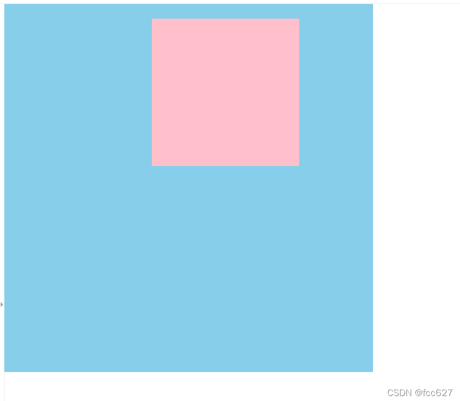
案例1:绝对定位之父级无定位
<style>
        * {
            margin: 0;
            padding: 0;
        }

        .father {
            width: 500px;
            height: 500px;
            background-color: skyblue;
        }

        .son {
            position: absolute;
            /* top: 20px;
            left: 20px; */
            top: 20px;
            right: 100px;
            width: 200px;
            height: 200px;
            background-color: pink;
        }
    </style>
</head>

<body>
    <div class="father">
        <div class="son"></div>
    </div>

</body>
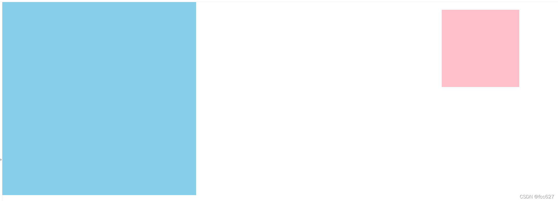
案例2:绝对定位之父级有定位
<style>
        * {
            margin: 0;
            padding: 0;
        }

        .father {
            position: relative;
            width: 500px;
            height: 500px;
            background-color: skyblue;
        }

        .son {
            position: absolute;
            /* top: 20px;
            left: 20px; */
            top: 20px;
            right: 100px;
            width: 200px;
            height: 200px;
            background-color: pink;
        }
    </style>
</head>

<body>
    <div class="father">
        <div class="son"></div>
    </div>
</body>
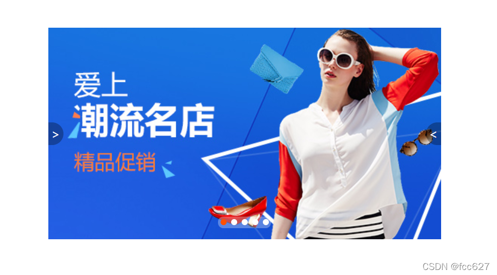
案例3:定位综合案例之淘宝轮播图
<style>
        * {
            margin: 0;
            padding: 0;
        }

        li {
            list-style: none;
        }

        .tb-promo {
            position: relative;
            width: 520px;
            height: 280px;
            background-color: pink;
            margin: 100px auto;
        }


        .tb-promo img {
            width: 520px;
            height: 280px;
        }

        /* 并集选择器可以集体申明相同的样式 */
        .prev,
        .next {
            position: absolute;
            top: 50%;
            margin-top: -15px;
            width: 20px;
            height: 30px;
            background: rgba(0, 0, 0, .3);
            text-decoration: none;
            text-align: center;
            line-height: 30px;
            color: #fff;
        }

        .prev {
            left: 0;
            border-top-right-radius: 15px;
            border-bottom-right-radius: 15px;
        }

        .next {
            right: 0;
            border-top-left-radius: 15px;
            border-bottom-left-radius: 15px;
        }

        .promo-nv {
            position: absolute;
            bottom: 15px;
            left: 50%;
            margin-left: -35px;
            width: 70px;
            height: 15px;
            background: rgba(255, 255, 255, .3);
            border-radius: 7px;


        }

        .promo-nv li {
            float: left;
            width: 8px;
            height: 8px;
            background-color: #fff;
            border-radius: 50%;
            margin: 3px;
        }

        .promo-nv .selected {
            background-color: #ff5000;
        }
    </style>
</head>

<body>
    <div class="tb-promo">
        <img src="images/tb.jpg" alt="">
        <!-- 左尖角制作 -->
        <a href="#" class="prev">></a>
        <!-- 右尖角制作 -->
        <a href="" class="next">
            < </a>
                <!-- 小圆角制作 -->
                <ul class="promo-nv">
                    <!-- 小圆点制作 -->
                    <li class="selected"></li>
                    <li></li>
                    <li></li>
                    <li></li>
                    <li></li>
                </ul>

    </div>

</body>
元素的显示与隐藏
2.1 display 属性
- display:none; 隐藏对象
- display:block; 除了转换为块级元素外,同时还有显示元素的意思
display隐藏元素后,不再占有原来的位置
2.2 visibility 属性
- visibility:visible; 元素可视
- visibility:hidden;元素隐藏
visibility隐藏元素后,继续占有原来的位置
2.3 overflow 溢出属性
| 属性 | 描述 |
|---|---|
| visible | 默认值,内容不会被修剪,多余的内容会呈现在元素框之外 |
| hidden | 溢出内容会被修剪,并且被修剪的内容是不可见的 |
| scroll | 溢出内容会被修剪,且浏览器会始终显示滚动条 |
| auto | 在需要时产生滚动条,即自适应所要显示的内容 |
2.4 仿土豆网显示隐藏遮罩案例
<style>
        .tudou {
            position: relative;
            width: 444px;
            height: 320px;
            margin: 30px auto;
            background-color: pink;

        }


        .tudou img {
            width: 100%;
            height: 100%;
        }

        .mask {
            /* 隐藏遮罩层 */
            display: none;
            position: absolute;
            width: 100%;
            height: 100%;
            background: rgba(0, 0, 0, .4) url(images/arr.png) no-repeat center;
        }

        /* 当鼠标经过 土豆 这个盒子,里面的遮罩层会显示出来 */
        .tudou:hover .mask {
            display: block;
        }
    </style>
</head>

<body>
    <div class="tudou">
        <div class="mask"></div>
        <img src="images/tudou.jpg" alt="">
    </div>
</body>
鼠标未经过时:
鼠标经过时:


 扫一扫
扫一扫


 932
932

 被折叠的 条评论
为什么被折叠?
被折叠的 条评论
为什么被折叠?
 到【灌水乐园】发言


