CSS Modules in Next.js provide locally scoped styling with better control over CSS specificity, helping prevent style conflicts in component-based applications.
- Generate unique class names for component-level styling.
- Avoid conflicts with other components or third-party libraries.
- Improve control over CSS specificity in large applications.
- Can be combined with component hierarchies for better style organization.
- Support dynamic styling using scoped variables.
Steps to Create Next.js application
Create the New Next.js Application by following the below commands in the VS code terminal.
npx create-next-app css-module-hierarchy
cd css-module-hierarchy
Project Structure
This project structure organizes a Next.js application into clear, purpose-driven folders to improve scalability, maintainability, and code clarity.
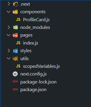
- .next/ : Auto-generated build output by Next.js.
- components/ : Reusable UI components (e.g., ProfileCard.js).
- pages/ : Defines application routes (e.g., index.js).
- styles/ : Contains global styles and CSS Modules.
- utils/ : Utility/helper files (e.g., scopedVariables.js for shared logic).
- node_modules/ : Installed project dependencies.
- next.config.js : Next.js configuration file.
- package.json / package-lock.json : Project metadata and dependency versions.
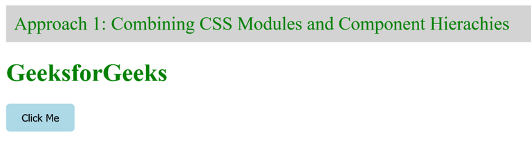
[Approach 1]: Combining CSS Modules and Component Hierarchies
This approach controls CSS Module specificity by leveraging the natural component hierarchy in a Next.js application.
- Each component is paired with its own CSS Module.
- Styles are scoped to the component, preventing leakage.
- Parent–child structure helps manage layout and styling clearly.
- Ensures better specificity and isolated styling across the app.
/* components/Button.module.css */
.button {
    padding: 10px 20px;
    background-color: lightblue;
    border: none;
    border-radius: 5px;
    cursor: pointer;
}
/* components/Header.module.css */

.header {
    background-color: lightgray;
    padding: 10px;
}

.nav {
    display: flex;
    justify-content: space-between;
    align-items: center;
}

.logo {
    color: green;
    text-decoration: none;
    font-size: 24px;
}
// components/Button.js

import React from "react";
import styles from "./Button.module.css";

const Button = ({ children }) => {
    return (
        <button className={styles.button}>
            {children}
        </button>
    );
};

export default Button;
// components/Header.js

import React from "react";
import styles from "./Header.module.css";

const Header = () => {
    return (
        <header className={styles.header}>
            <nav className={styles.nav}>
                <a className={styles.logo} href="#">
                    GeeksforGeeks
                </a>
            </nav>
        </header>
    );
};

export default Header;
// pages/index.js

import React from "react";
import Header from "../components/Header";
import Button from "../components/Button";

const Home = () => {
    return (
        <div>
            <Header />
            <h1 style={{ color: "green" }}>
                GeeksforGeeks
            </h1>
            <Button>Click Me</Button>
        </div>
    );
};

export default Home;
Run the application by executing the below command in the terminal
npm run dev
Output:
Syntax
.button {
    /* Button styling */
}
const Button = ({ children }) => {
    return <button className={styles.button}>
                    {children}
           </button>;
};
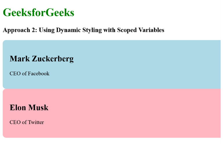
[Approach 2]: Using Dynamic Styling with Scoped Variables
This approach uses dynamic styling with scoped variables to create flexible and isolated component styles in a Next.js application.
- Styles are defined in a JavaScript utility (scopedVariables.js) using CSS variables.
- Component styles (e.g., ProfileCard) are controlled dynamically through props.
- CSS variables enable dynamic color and style changes.
- Ensures component-specific, isolated styling without conflicts.
// components/ProfileCard.js

import React from "react";
import generateScopedStyles from "../utils/scopedVariables";

const ProfileCard = ({
    name,
    backgroundColor,
    jobTitle,
}) => {
    const componentName = "profile-card";
    const dynamicStyles = generateScopedStyles(
        componentName,
        backgroundColor
    );

    return (
        <div
            className={componentName}
            style={{ backgroundColor }}
        >
            <h2>{name}</h2>
            <p>{jobTitle}</p>
            <style jsx>{dynamicStyles}</style>
        </div>
    );
};

export default ProfileCard;
// pages/index.js

import React from "react";
import ProfileCard from "../components/ProfileCard";

const Home = () => {
    return (
        <div>
            <h1 style={{ color: "green" }}>
                GeeksforGeeks
            </h1>
            <h3>
                Approach 2: Using Dynamic Styling with
                Scoped Variables
            </h3>
            <ProfileCard
                name="Mark Zuckerberg"
                jobTitle="CEO of Facebook"
                backgroundColor="lightblue"
            />
            <ProfileCard
                name="Elon Musk"
                jobTitle="CEO of Twitter"
                backgroundColor="lightpink"
            />
        </div>
    );
};

export default Home;
// utils/scopedVariables.js

const generateScopedStyles = (
    componentName,
    variableValue
) => `
  .${componentName} {
    --profile-card-bg-color: ${variableValue};
    background-color: let(--profile-card-bg-color);
    padding: 20px;
    border-radius: 10px;
  }
`;

export default generateScopedStyles;
Run the application by executing the below command in the terminal
npm run dev
Output:
Syntax
const generateScopedStyles = (componentName, variableValue) => {
    return `
        .${componentName} {
              --custom-variable: ${variableValue};
              /* Other styles using the custom variable */
         }
      `;
};
export default generateScopedStyles;
